Quad Charts: A visual approach to strategic planning
A Quad Chart is a simple visual management tool for strategic planning that divides information into four sections to explain a project’s objective, approach, benefits, and results — all on one page.
Contents
- What is a Quad Chart?
- How does a Quad Chart work?
- What are the benefits of a Quad Chart?
- What is the purpose of a Quad Chart?
- How can Quad chart help in strategic planning?
- An Example of a Quad Chart Diagram
- In what order do you read a Quad Chart?
- Digital Quad Chart vs traditional Quad Chart - Which drives more value?
- How is information organised in a digital Quad Chart?
- How do you make a good quad chart?
- What is a Quad Chart template?
- How to use a Quad Chart template?
- How do teams use a Quad Chart?
- Quad Chart vs other visual tools
- What makes a digital Quad Chart software right for your organisation?
- Is there a standard format for creating a Quad Chart?
- What software tools can you use to create a Quad Chart?
- How often should Quad Charts be updated?
- How Quad Charts enhance your project management operations?
- What are some common mistakes to avoid when creating Quad Charts?
- What industries benefit the most from Quad Chart analysis?
- Tips for designing an effective Quad Chart
- Quad Charts vs SWOT Analysis
- Visualising Key Performance Indicators (KPIs) using Quad Charts
- Using Quad Charts for Performance Evaluation in Organisations
- Quad Charts in Balanced Scorecard framework
- Integrating Artificial Intelligence for Advanced Quad Chart Analysis
- Real- life use cases of Quad Charts in different project scenarios
- Digitalise your Quad Charts with Data Point Software
Last updated on : June 10, 2026
What is a Quad Chart?
A Quad Chart is a one-page visual summary used in business, engineering, and project management. It splits a page into four clear sections to present key information at a glance. Teams use Quad Charts to communicate ideas quickly, compare options, and support decision-making. Quad Chart systems are widely utilised in various industries for effective project management, offering a structured approach to analysing complex information, enhancing communication, and making informed strategic decisions. Quad Charts streamline complex data for effective strategic planning, enhancing decision-making through clear visual representation.
How does a Quad Chart work?
A Quad Chart- the visual project summary works by organising complex information into four distinct quadrants, allowing for a clear and concise visual representation of key aspects. For example, a Quad Chart in project management can divide information into Goals and Objectives, Tasks and Milestones, Resources and Budget, and Risks and Issues. Each quadrant highlights specific project elements, enabling stakeholders to quickly grasp essential details without delving into lengthy reports. This structured format enhances communication, supports efficient decision-making, and aids in strategic planning by presenting critical information in a visually engaging manner.
What are the benefits of a Quad Chart?
- Enables clear Visualisation: Quad Charts provide a clear and structured visualisation of complex data by dividing information into four distinct categories, making it easier to understand and interpret.
- Helps in Efficient Communication: The organised format of Quad Charts enhances communication within teams and organisations. It lets stakeholders quickly grasp essential information without delving into lengthy reports, facilitating efficient decision-making.
- Utilised for Strategic Analysis: Quad Charts facilitate strategic analysis by highlighting key aspects of a situation. Whether used for business planning, project management, or risk assessment, Quad Charts help identify critical factors and devise strategies to address them.
- Provides Real-time Updates: Dynamic Quad Charts provide real-time insights into changing data, allowing businesses to adapt swiftly to evolving situations and make prompt decisions based on the latest information.
- Simplified Comparison: Quad Charts enable easy comparison between different categories by placing data side by side. Decision-makers can quickly compare strengths against weaknesses or opportunities against threats, aiding in prioritisation and resource allocation.
- Makes Effective Presentations: Quad Charts are useful for creating impactful presentations. The visual appeal and organised layout make them engaging and easy to follow during meetings or presentations, ensuring the audience understands the key points.
- Promotes Collaboration: When teams collaborate on creating Quad Charts, it encourages discussions and brainstorming sessions. Team members can contribute their insights, ensuring a comprehensive analysis of the situation and fostering a collaborative work environment.
- Aids in Scenario Planning: Scenario planning with Quad Charts enhances organisational flexibility. Businesses can quickly adapt to changing conditions by having pre-considered and analysed responses to various scenarios, reducing the time needed to implement necessary changes.
The effective way to present strategy? Quad Charts powered by Data Point
What is the purpose of a Quad Chart?
The purpose of a project proposal chart is to provide a structured and visually engaging format for presenting complex information, enabling clear communication, concise data representation, and informed decision-making in various contexts, such as strategic planning, project management, and communication of critical insights.
How can Quad chart help in strategic planning?
A Quad Chart as a one page charter is used in strategic planning as it offers a structured and visual format to analyse critical aspects of a situation. This concise representation allows decision-makers to quickly assess complex data, identify key factors affecting the organisation, and formulate effective strategies. The organised layout enhances communication, enabling stakeholders to grasp essential information efficiently. By providing a clear overview of internal strengths and weaknesses alongside external opportunities and threats, Quad Charts aid in informed decision-making, enabling businesses to align their strategies with current market conditions and make proactive, well-informed choices for future success.
An Example of a Quad Chart Diagram

A typical Quad Chart shows:
- Top left: Project objective
- Top right: Proposed solution
- Bottom left: Key benefits
- Bottom right: Expected results or timeline
Explaining Quad Chart with an example in Balanced Scorecard
Being an important Lean visual project tool, the Quad chart does not have predefined quadrants, allowing organisations to adapt them based on their specific requirements, processes, or chosen categories.
Let's discuss it with a quad chart example.

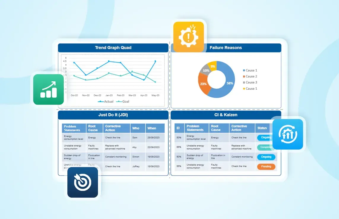
A quad chart used for KPI performance tracking within the shop floor can include quadrants like Trend Graph, Failure Reasons, Current Actions (JDI) and Actions for Improvement ( CI and Kaizen) as quadrant categories. All these quadrants give a comprehensive overview of current processes and can help enhance organisational performance.
- First Quadrant: In the Trend Graph quadrant, organisations can analyse the current trends of processes in a graphical format. The graph can be suitably changed into a pie, bar, or line chart. By analysing current performances, strategic planners can immediately identify bottlenecks and inefficiencies, enabling corrective actions. Trend graphs also identify and bridge the gaps between current strategies within the shop floor.
- Second Quadrant: In the Failure Reasons quadrant, the focus is to identify and prioritise various failure reasons with the help of a Pareto Chart. The primary objective here is to gain profound insights into shop floor failures by analysing Key Performance Indicators (KPIs) through the Pareto analysis. The Pareto Chart visualises the most significant factors contributing to failures, emphasising the '80/20' rule, where approximately 80% of the problems stem from 20% of the causes. This approach aids in focusing efforts on addressing the most critical issues first, leading to a more targeted and efficient resolution of shop floor challenges.
- Third Quadrant: The quadrant Current Actions (JDI) can focus on short-term action plans developed as corrective measures to tackle immediate challenges. JDI stands for "Just Do It," indicating that these actions are swift, practical, and can be implemented promptly to resolve issues. They do not require extensive planning, lengthy discussions, or complex approvals. Instead, they emphasise immediate execution to address the identified problems promptly. JDI actions can often be carried out by a small team or even a single person.
- Fourth Quadrant: Actions for Improvement ( CI and Kaizen) quadrant, is focused on action plans for Continuous Improvement (CI) or Kaizen, which plays a crucial role in long-term strategic planning within organisations. This quadrant helps implement sustainable practices for continuous improvement, specifically emphasising Kaizen principles. Long-term action plans require careful planning and execution due to their far-reaching impact on organisational performance.
Examples of Quad Chart frameworks in strategic planning
- SWOT Analysis: SWOT analysis divides information into Strengths, Weaknesses, Opportunities, and Threats. Each quadrant assesses internal strengths and weaknesses alongside external opportunities and threats, providing a comprehensive overview of an organisation's strategic position.
- PEST Analysis: PEST analysis evaluates Political, Economic, Social, and Technological factors influencing a business. By using a Quad Chart format for PEST analysis, organisations can systematically analyse the impact of these external factors, aiding strategic planning and risk management.
- Ansoff Matrix: The Ansoff Matrix explores strategic growth options, including Market Penetration, Market Development, Product Development, and Diversification. A Quad Chart format of Ansoff Matrix helps organisations assess these strategies individually, providing insights into market expansion and diversification opportunities.
- Quad Chart for Business Proposals and Product Development: Quad Charts enhance the professionalism and clarity of business proposals, aiding in securing contracts and partnerships. In product development, they streamline the presentation of product features, market analysis, competitive advantages, and potential challenges, facilitating efficient decision-making and stakeholder alignment. Quad Charts are pivotal in winning new opportunities and guiding product development by offering a structured and visually appealing framework.
Use Data Point’s Quad Chart — with trend graphs, failure analysis, and real-time tracking
In what order do you read a Quad Chart?
There isn't a strict order to follow when reading a Quad Chart. It's typically designed for flexibility in information consumption. Individuals can approach it based on their specific needs and interests. Some may start from the upper left quadrant, covering key objectives, then move to the upper right to assess milestones and progress. Others might be more interested in the lower left quadrant, focusing on potential risks and challenges, before exploring available resources and support in the lower right quadrant. The lack of a rigid sequence allows users to tailor their approach, extracting the most relevant and essential information according to their priorities, making the Quad Chart a versatile tool for diverse purposes in industries and organisational sectors.
Digital Quad Chart vs traditional Quad Chart - Which drives more value?
How is information organised in a digital Quad Chart?
Information in a digital Quad Chart is organised into four distinct quadrants, each dedicated to a specific category similar to the quadrants in a SWOT analysis framework, which consists of Strengths, Weaknesses, Opportunities and Threats. Relevant data, statistics, and key points related to each category are briefly presented within their respective quadrants. This structured layout enables a clear visual representation, allowing stakeholders to quickly grasp essential information without extensive reading. The categorisation helps in strategic planning, decision-making, and effective communication by presenting a comprehensive overview of critical factors in a concise and organised manner.
How do you make a good quad chart?
Creating an effective Quad Chart involves several key steps to ensure clarity, relevance, and impact.
Here are the steps to make a good Quad Chart:
Define your Purpose and Set specific Categories
Determine the actual objective of the Quad Chart. Decide whether it's for a project overview, strategic analysis, or presentation. Identify and define the specific categories within your Quad Chart, ensuring they align with the purpose.
Gather Relevant Information:
Gather appropriate data, statistics, and insights related to each category. Ensure the information is accurate, up-to-date, and directly contributes to the Quad Chart's purpose.
Design a Clear Layout:
Divide the chart into four distinct quadrants, dedicating each quadrant to one category. Use clear headings for easy identification. Incorporate visuals, such as charts, graphs, and icons to enhance understanding. Maintain a consistent colour scheme and font style for a professional look.
Craft Concise Content:
Write concise, clear statements for each category. Avoid jargon and use simple language to ensure easy comprehension. Highlight key points within each quadrant. Bullet points or short sentences can effectively convey information.
Ensure Relevance and Impact:
Double-check the information to ensure it directly aligns with the chosen categories and the overall purpose of the Quad Chart. Use impactful language to convey strengths, acknowledge weaknesses, emphasise opportunities, and address threats.
Review and Refinement:
Review the Quad Chart for spelling, grammar, and factual accuracy. Eliminate errors to maintain professionalism. Seek feedback from colleagues or team members to gain different perspectives. Make necessary adjustments based on their input if required. Additionally, consider formulating countermeasures and action plans to address any potential issues that may arise.
Practice Effective Presentation:
When presenting the Quad Chart, clearly explain each quadrant, emphasising key points and insights. It's important to be ready to respond to queries and offer more information if required. Please ensure that your answers are comprehensive and meaningful. Encourage meetings by asking questions, initiating discussions, and addressing concerns. Encouraging an interactive environment while conducting group discussions using the Quad Charts is essential.
What is a Quad Chart template?
A Quad Chart template is a pre-designed layout that provides a structured framework for organising information into four distinct quadrants. It serves as a visual guide featuring key categories or other relevant aspects of the strategic plan. These templates often include designated spaces for concise text, bullet points, charts, and graphics within each quadrant. Quad Chart templates help users create professional and visually appealing presentations or documents by ensuring consistency in design, making it easier to convey complex information clearly and concisely.
How to use a Quad Chart template?
Whether you’re setting corrective actions, doing root cause analysis, or planning improvements, the process of using Quad chart template is similar, only the tools differ.
Using the Excel Quad Chart template version
1. Open the pre-formatted file containing four quadrants (e.g., Problem Statement, Analysis, Actions, and Results).
2. Fill in each quadrant with clear, bullet-point information. Keep text short so it’s easy to read at a glance.
3. Insert visuals or charts (such as images, KPI graphs, or timelines) where needed.
4. Format for clarity - use consistent fonts, colours, and borders to make each section stand out.
5. Save and share the completed chart via email or print for team discussions.
Using the Digital Quad Chart Software version
1. Log in to the software and select the Quad Chart tool/template.
2. Enter information directly into each quadrant, using built-in text fields, image upload options, and data widgets.
3. Link live data sources (KPIs, project updates, or equipment readings) for automatic updates.
4. Collaborate in real-time - team members can edit, comment, and update simultaneously.
5. Export or share digitally with stakeholders for instant access, avoiding multiple file versions.
Get your free Quad Chart template and start driving results
How do teams use a Quad Chart?
Teams use Quad Charts to share project proposals, compare solutions, and update stakeholders. Common sections include:
- Objective or problem statement
- Proposed approach
- Benefits or impact
- Timeline, cost, or results
Quad Chart vs other visual tools
Unlike long project reports, a Quad Chart gives stakeholders a snapshot on one page. It works well alongside Lean visual boards, Gantt charts, and Balanced Scorecards. Kanban boards, SWOT analysis charts, and project roadmaps. This concise format improves communication efficiency by highlighting only the most critical data. In a digital format, a Quad Chart can integrate with real-time dashboards, KPI tracking tools, and project portfolio management software for faster, data-driven decision-making.
What makes a digital Quad Chart software right for your organisation?
A digital Quad Chart is ideal for any organisation aiming to enhance communication, streamline data presentation, and facilitate strategic decision-making. Its structured layout and clear categorisations of information into quadrants make it an effective tool for presenting complex data concisely. Digital Quad Charts enable a quick understanding of critical factors by highlighting key aspects, fostering informed discussions and aiding in strategic planning. Their versatility and simplicity make Quad Charts suitable for diverse industries, ensuring that organisations can effectively convey essential insights and align stakeholders with their strategic goals.
Read about streamlining KPI management and accelerating corrective actions with Digital Quad chart software.
Is there a standard format for creating a Quad Chart?
While there isn't a strict standard quadrant within a Quad Chart, common principles make it effective. A Quad Chart typically consists of four quadrants, each dedicated to a specific category, such as Strengths, Weaknesses, Opportunities, and Threats. It incorporates concise text, bullet points, charts, and graphics within each quadrant. Maintaining a consistent colour scheme, font style, and clear headings is essential for a professional and organised appearance. The goal is to provide a structured framework that allows for the clear and concise presentation of information relevant to the intended purpose, whether it's for strategic planning, project management, or communication.
What software tools can you use to create a Quad Chart?
Several software tools are suitable for creating Quad Charts, including Microsoft PowerPoint, Microsoft Word, and Microsoft Excel. These widely used office productivity software offer built-in templates and tools for creating visually appealing Quad Charts. Specialised data visualisation tools like Data Point,Tableau, Lucidchart, and Canva also provide advanced features and customisation options for designing dynamic and interactive Quad Charts. Users can consider factors such as the complexity of their Quad Chart, desired collaboration features, and ease of use when choosing software.
The Data Point Balanced scorecard software can also be utilised to create digital Quad Charts, as it integrates Quad Chart functionality within the framework. This integration enhances project management and strategic planning efficiency, allowing users to seamlessly align project objectives and resources within the Balanced Scorecard framework, encouraging a comprehensive approach to measuring performance and making informed decisions.
How often should Quad Charts be updated?
Quad Charts should be updated regularly to ensure the information remains accurate and relevant. The frequency of updates depends on the context and the nature of the data being represented. For dynamic projects or rapidly changing environments, Quad Charts may need to be updated weekly or daily to reflect real-time data. In more stable situations, monthly or quarterly updates are sufficient. It's crucial to align the updating frequency with the pace of organisational changes, allowing stakeholders to rely on current and precise information for strategic decision-making. Regular updates also ensure that Quad Charts continue to serve as reliable tools for communication and planning within the organisation.
How Quad Charts enhance your project management operations?
Quad Charts are highly effective tools for project management purposes. They provide a structured layout for organising project information into key categories such as Goals, Tasks, Resources, and Risks. Quad Charts enhance communication among team members, stakeholders, and project managers by visually representing project elements. This clear presentation aids in project planning, monitoring progress, identifying challenges, and making data-driven decisions. Quad Charts serve as dynamic snapshots of project status, ensuring everyone involved understands the project's key components and stays aligned with project goals, timelines, and potential risks.
What are some common mistakes to avoid when creating Quad Charts?
- Overcrowding Information: Avoid cluttering quadrants with excessive data; focus on key points to maintain clarity and readability.
- Lack of Consistency: Ensure consistent formatting, colour schemes, and font styles across all quadrants for a professional appearance.
- Neglecting Updates: Regularly update Quad Charts to reflect current information, ensuring accuracy and relevance.
- Insufficient Visuals: Incorporate charts, graphs, and icons where necessary to enhance visual appeal and comprehension.
- Lack of Focus: Stick to the main points; avoid unnecessary details that can overwhelm the audience and dilute the message.
- Complex Language: Use clear and straightforward language, avoiding technical or complex jargon that leads to confusion.
- Inadequate Proofreading: Thoroughly proofread the Quad Chart to eliminate errors, ensuring a polished and professional final product.
What industries benefit the most from Quad Chart analysis?
Quad Chart analysis is valuable across various industries, particularly in sectors where clear and concise communication of complex data is crucial. Automobile industries rely on Quad Chart software to showcase product features and competitive advantages. In healthcare, digital Quad Charts aid in visualising patient data and treatment plans for medical professionals. Aerospace and defence sectors use Quad Chart software to outline project goals and risk assessments. In business consulting, Quad Charts help analyse market trends and client strategies. Government agencies utilise Quad Charts for policy analysis and program evaluation. This versatile tool ensures effective communication and informed decision-making in various professional fields.
Whatever Your Industry, Data Point Builds the Quad Chart That Fits Your KPIs
Tips for designing an effective Quad Chart
- Clarity: Ensure clear and concise language, avoiding jargon or technical terms for broader understanding.
- Prioritise Key Points: Focus on essential information to prevent overcrowding and maintain focus.
- Consistency: Use consistent fonts, colours, and formatting for a professional and cohesive look.
- Visual Elements: Incorporate charts, graphs, and icons to enhance visual appeal and convey data effectively.
- Regular Updates: Keep Quad Charts current to reflect the latest information for accurate decision-making.
- Balanced approach: Maintain a balanced approach across quadrants, addressing each aspect equally for a comprehensive overview.
- Proofreading: Thoroughly proofread to eliminate errors and ensure a professional presentation.
Quad Charts vs SWOT Analysis
Quad Charts and SWOT Analysis serve as strategic tools but differ in format and application. SWOT Analysis divides information into Strengths, Weaknesses, Opportunities, and Threats, providing a comprehensive internal and external assessment. On the other hand, Quad Charts organise these categories into visually appealing quadrants, enhancing the presentation's clarity and impact. While SWOT Analysis offers an in-depth analysis, virtual Quad Charts focus on visual communication, making complex data more accessible to diverse audiences. Organisations often choose between the two based on their communication needs, with Quad Charts offering a visually engaging way to present SWOT data.
Visualising Key Performance Indicators (KPIs) using Quad Charts
Visualising Key Performance Indicators (KPIs) using digital Quad Charts is an effective strategy in performance management. Organising KPIs into distinct quadrants allows businesses to provide a clear and concise overview of their critical metrics, such as revenue growth, customer satisfaction, or operational efficiency. Each quadrant can represent specific KPI categories, allowing for a visual comparison of performance data. This method improves data interpretation, enabling quick trend identification. Quad Charts transform complex numerical data into accessible visual representations, aiding stakeholders in making informed decisions and fostering a data-driven organisational culture.
Using Quad Charts for Performance Evaluation in Organisations
Utilising Quad Charts for organisational performance evaluation offers a streamlined approach to assessing key metrics and achievements. Virtual Quad Charts enable a comprehensive view of organisational performance through different categories. These visual tools enhance the evaluation process by allowing direct comparisons of internal performance indicators, aiding in identifying areas for growth and addressing weaknesses. Virtual Quad Charts compare organisational metrics to industry benchmarks or competitors' data for competitive analysis. This visual representation simplifies complex data and promotes data-driven decision-making, enabling organisations to stay agile, responsive, and competitive in their respective markets.
Quad Charts in Balanced Scorecard framework
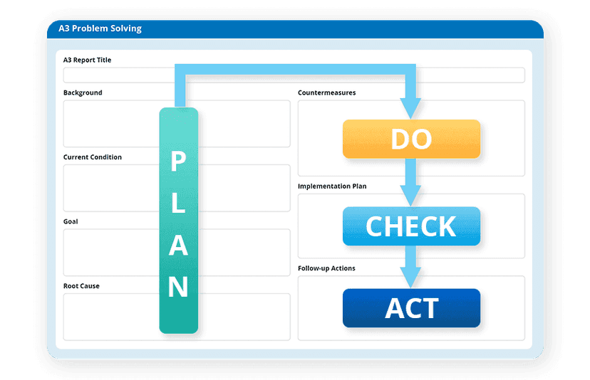
The Balanced Scorecard is a comprehensive strategic planning and management framework which integrates tools like quad charts, fishbone diagrams, huddle boards, A3 problem-solving and more tools to align strategic planning to the organisational goals in business operations. Quad Charts allow organisations to assess their strategy from various angles. The quad chart format divides the display into four quadrants, each dedicated to a specific category. Quad charts are valuable for communication and decision-making processes, helping stakeholders understand the organisation's progress, align objectives, and make data-driven decisions to improve overall performance and achieve strategic goals.
Integrating Artificial Intelligence for Advanced Quad Chart Analysis
Integrating Artificial Intelligence (AI) into digital Quad Chart software enhances strategic decision-making processes. AI algorithms can process vast datasets, identify patterns, and provide predictive insights, enabling advanced analysis of Quad Charts. By leveraging AI, organisations can better understand their Quad Chart data, extracting actionable intelligence for informed strategies. Machine learning algorithms can uncover hidden correlations within the categories, enabling more accurate forecasting and proactive decision-making. This integration improves Quad Chart analysis and empowers organisations with AI-driven strategic planning and insights.
Real- life use cases of Quad Charts in different project scenarios
Example 1: Quad Chart for product development pitch
A product development team can use a Quad Chart to pitch a new product idea to stakeholders. The top-left quadrant shows the market need or customer problem, the top-right outlines the proposed design or innovation, the bottom-left highlights expected benefits such as increased market share, and the bottom-right details the launch timeline and budget. This one-page format helps decision-makers compare ideas quickly.
Example 2: Quad Chart for R&D project funding
Research and development teams often use a Quad Chart to secure funding for new projects. In this case, the chart clearly displays the research goal, the planned methods or experiments, the potential impact or ROI for the company, and the estimated project duration and resource needs. This visual summary makes complex R&D proposals easy to review.
Example 3: Quad Chart for Lean process improvement
A Lean team can build a Quad Chart to outline a process improvement initiative. The problem quadrant defines the waste or inefficiency to fix, the solution quadrant explains the Lean method (like Kaizen or 5S), the benefits quadrant shows expected cost savings or quality improvements, and the results quadrant sets out the action steps and timeline. This clear snapshot supports faster approvals and better team alignment.
Digitalise your Quad Charts with Data Point Software
Discover how the Quad Chart enhances performance measurement within the Data Point Balanced Scorecard framework. The Quad Chart in Data Point serves as a dynamic visualisation tool, offering a holistic view of Key Performance Indicators(KPI) across four critical dimensions. By integrating seamlessly with the Balanced Scorecard methodology, this innovative feature empowers users to assess performance trends, identify areas for improvement, and make data-driven decisions with precision and efficiency. Gain access to exclusive content and unlock the full potential of your Balanced Scorecard implementation.

Amer Jumah, Senior Lean Consultant
Amer is co-founder of Agile Solutions and a certified Six Sigma Black Belt, Lean Black Belt, and PMP, with over nine years of experience implementing Lean, Six Sigma, and Agile principles across diverse industries. He specialises in process optimisation, waste elimination, and delivering cost savings through organisational change.
Your questions, answered!
Is there a tailored digital tool for creating professional quad charts?
Can I use a tool that updates quad charts automatically with live data
What is a Quad Chart used for?
What are the four parts of a Quad Chart?
Is there a Quad Chart template?
How do I make a Quad Chart in PowerPoint or Excel?
How to make a Quad Chart
What industries use Quad Charts?
Quad Chart vs Gantt Chart — what’s the difference?
Can a Quad Chart support Lean projects?
What are the headings for a quad chart?
What is the best Quad chart making tool?
Is Quad Chart and Quadrant Charts being same?
Can Quad Charts be used for tracking project milestones?
How can Quad Charts be used for stakeholder communication?
What are the key elements of a successful Quad Chart presentation?
How does a digital Quad Chart improve data visualisation?
Quad Charts: A visual approach to strategic planning
Get a Demo