Digital Fishbone Diagram tool: Visualise, analyse and solve problems in modern way
Ditch the whiteboards and spreadsheets—Data Point’s digital Fishbone or Ishikawa Diagram transforms root cause analysis into a real-time, collaborative process. Teams can capture data instantly, track causes, and move straight to solutions.
Why choose a digital Fishbone Diagram?
Key features of the digital Fishbone System – and the benefits you gain
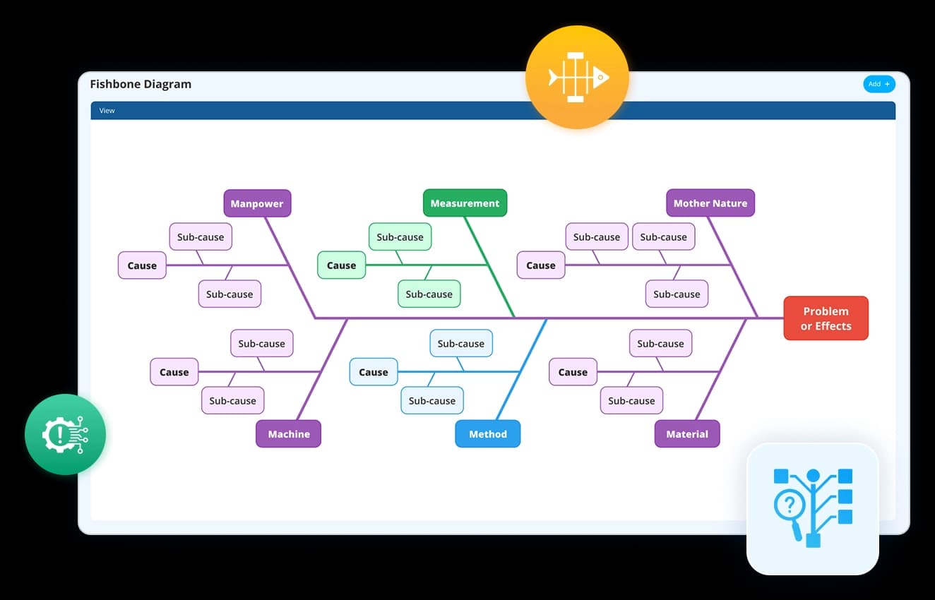
A Fishbone Diagram begins with the problem statement at its “head.” Our digital cause & effect tool lets you capture business challenges clearly and frame them as a structured starting point. No vague descriptions, no scattered notes—just a precise definition that aligns teams from the very beginning.
- Frame challenges in a clear, visual structure instantly
- Create and customise categories to fit your industry
- Ensure a systematic, real-time problem-solving process
Example use case: A manufacturing leader struggling with recurring equipment breakdowns can start by defining “Unplanned Downtime” as the central problem to investigate.
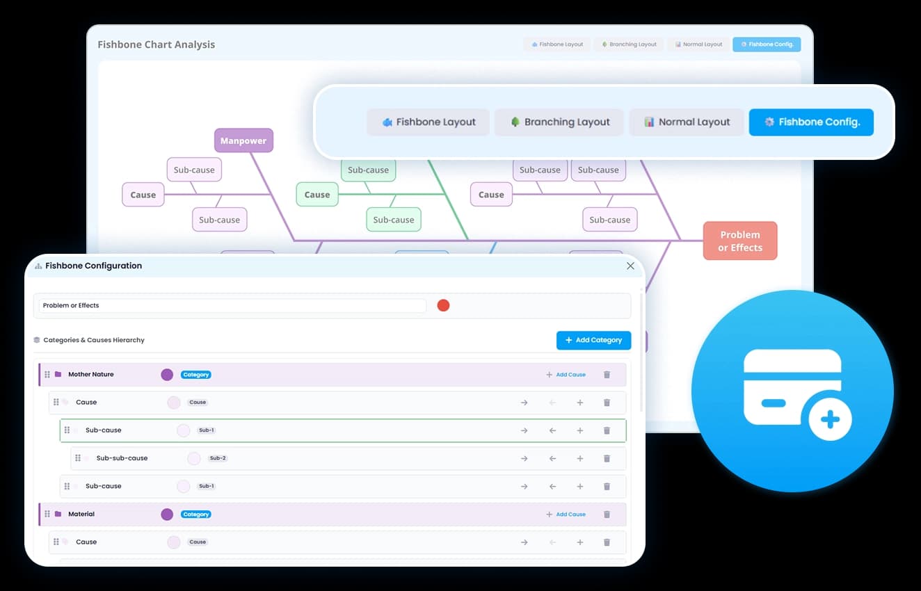

Traditionally, Fishbone Diagrams group causes under categories like People, Process, Equipment, and Environment. With Data Point Fishbone software, these categories are interactive and expandable, allowing leaders to organise, customise, and prioritise the factors driving issues.
- Assign tasks and responsibilities effortlessly
- Drill down into sub-causes with clarity
- Centralise discussions and insights for continuous improvement
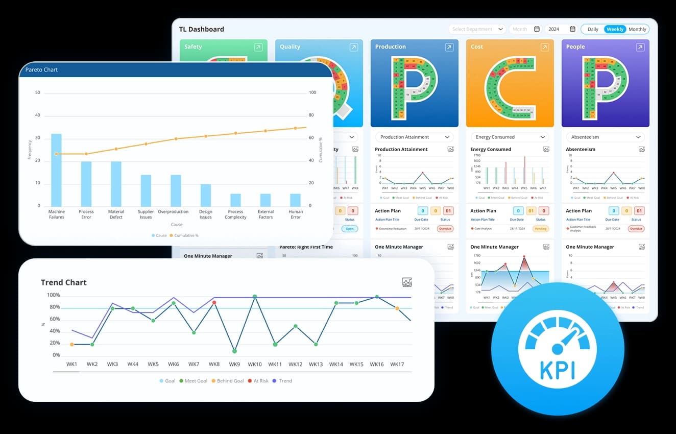
A static diagram shows possible causes—but leaders need evidence. Fishbone analysis system integrates performance metrics and historical data to validate assumptions and highlight the true root causes that drive recurring problems.
- Link causes directly to KPIs and real-time data
- Identify recurring trends using past performance
- Eliminate guesswork with data-backed insights
Example: If “Equipment Maintenance” is suspected, leaders can instantly review downtime reports and see that 70% of breakdowns stem from delayed servicing.
Identify, analyse, and resolve your recurring issues with interactive Fishbone Diagrams

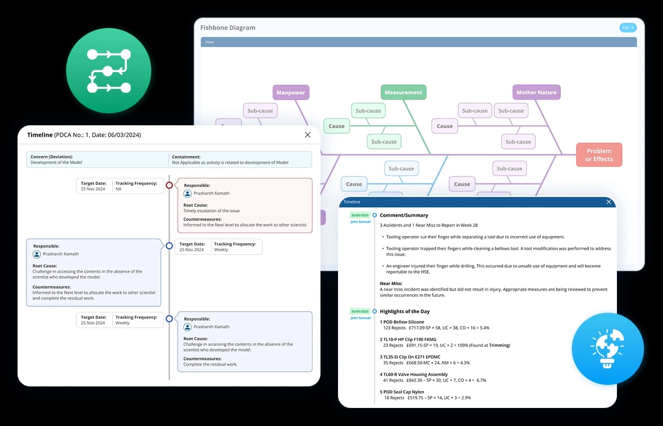
A Fishbone Diagram is not just about identifying causes—it’s about solving them. An Ishikawa software closes the loop by connecting each identified cause to corrective and preventive actions, ensuring accountability across the organisation.
- Link identified causes to corrective and preventive actions
- Assign ownership and set deadlines for accountability
- Monitor progress and verify successful implementation
Example: Once delayed maintenance is confirmed, tasks can be assigned to the maintenance team with deadlines, reducing future risk.
Instead of being a one-time exercise, the online Fishbone Diagram becomes a continuous improvement system. Every analysis is recorded, tracked, and used to inform future decisions—turning problem-solving into a repeatable business capability.
- Maintain a documented history of root cause investigations
- Learn from past issues to accelerate future resolutions
- Create a transparent culture of accountability and learning
Example: Over time, leaders can review past diagrams to see how downtime issues were resolved, preventing the organisation from repeating mistakes.
Assign, monitor, and document corrective actions linked to root causes and KPIs, all from one dashboard.
Choice of industry leaders and Fortune 500 companies


How does the Fishbone Diagram dashboard improve problem-solving?
Data Point Fishbone Diagram software replaces cluttered whiteboards with a clear, interactive tool backed by data, cutting problem-solving time in half. Teams work together faster, tackle root causes instead of quick fixes, and keep a record of solutions to prevent repeat issues.

Collaborative & cloud-based
Work with your team from anywhere.

Action-oriented
Identify issues and implement corrective actions faster.

KPI-linked analysis
Back every decision with real-time data.
Make your Root Cause Analysis Smarter with Data Point Fishbone
Digital Fishbone Diagram Tool: The Complete Guide to Root Cause Analysis and Problem Solving
Learn how a Digital Fishbone Diagram helps teams identify root causes, validate causes with data, manage CAPA actions, improve cross-functional collaboration, and build organisational learning through structured problem-solving.
What is the difference between a fishbone diagram and a 5 Whys analysis, and when should you use each?
Both are root cause analysis tools. The difference is in how they structure the investigation.
5 Whys works in a straight line. You ask why the problem happened, then why that happened, and keep going until you reach the origin. It is fast and effective when the failure has a single, clear cause chain. It falls apart when the problem has multiple contributing factors coming from different directions at once.
A fishbone diagram charts the whole casual landscape before drilling down. Causes are grouped by category, sub-causes branch off each one, and the full picture sits in front of the team before any assumptions are made about where the root cause lies. That structure matters most when the problem has been recurring without resolution, because recurring problems always have more than one driver. Investigating them in a straight line means you fix one cause and the problem comes back through a different one.
How does cause categorisation work, and why does the standard 6M framework not always fit?
The 6M framework – Man, Machine, Method, Material, Measurement, Mother Nature – is the default starting point for most fishbone analyses in manufacturing. It covers the majority of cause categories across most production environments and gives teams a consistent structure to work from.
The problem is that a standard framework applied rigidly can obscure causes that do not sit neatly inside it. In a service environment, “Machine” may be irrelevant. In a highly regulated industry, “Compliance” or “Documentation” may be significant enough to warrant their own category rather than being absorbed into Method. In a multi-site operation, “Communication” between sites may be a persistent cause driver that has no natural home in the standard model.
The categories in a fishbone are a lens, not a law. Customising them to fit the specific problem and industry context means the analysis reflects reality rather than forcing every cause into a predetermined box. The goal is a structure that the team recognises as accurate, not one that looks correct on paper but misses where the actual causes live.
How does a fishbone diagram connect to corrective and preventive action, and why does that connection matter?
A fishbone analysis that ends with a list of causes and no defined next step is an expensive meeting. The value of identifying root cause is entirely dependent on what happens after it is confirmed.
The connection to CAPA is where the analysis becomes an action. Each confirmed cause needs a corrective action assigned to specific owner with a deadline. The distinction between corrective and preventive matters here. A corrective action fixes the current instance. A preventive action addresses the conditions that allowed the cause to exist in the first place. Both are necessary. A corrective action without a preventive one means the same root cause can re-enter the system through the same route.
Keeping the cause-to-action link visible within the same system rather than transferring it to a separate tracker means:
The corrective action is always traceable back to the specific cause it was designed to address
Progress against each action can be monitored without losing the investigation context
If an action does not resolve the problem, the original analysis is still accessible for review
How does documenting fishbone analyses over time create organisational learning rather than just a record?
A single fishbone analysis answers one question: what caused this problem. A documented history of analyses across multiple problems and time periods answers a different question: what patterns keep appearing in how this operation fails.
If the Equipment category appears as a primary cause driver in six out of ten analyses over a twelve-month period, that is not six separate problems. That is a systemic maintenance or reliability issue that individual corrective actions are not resolving. The pattern is only visible when the analyses are stored, searchable, and comparable rather than filed separately after each investigation.
That accumulated record also shortens future investigations. When a new problem appears, the team can check whether a similar failure mode has been investigated before, what causes were confirmed, and whether the corrective actions from that investigation are still in place. The investigation starts from existing knowledge rather than from zero.
How do you define a problem statement that actually leads somewhere useful?
The problem statement sits at the head of the fishbone. Everything the analysis produces is shaped by how precisely that statement is written. A vague statement produces a vague investigation.
The distinction is between describing a symptom and defining a problem. “Quality is poor” is a symptom. “Defect rate on Line 3 has exceeded 4% for six consecutive weeks” is a problem. The second version tells the team what is being measured, where it is happening, and over what time period. That specificity determines which categories are relevant, which data needs to be pulled, and whether the team is investigating the right thing at all.
Framing the problem statement with a clear metric, a location, and a timeframe does three things:
- It stops the investigation from drifting into adjacent problems that are not the priority
- It gives the team a defined condition to test corrective actions against
- It creates a reference point for confirming whether the root cause identified actually explains the data
How do you use historical data and KPIs to validate a cause rather than just suspect it?
A fishbone diagram built from opinions is an organised guess. The causes identified in a brainstorm reflect what the team believes is driving the problem. Those beliefs are a useful starting point. They are not evidence.
Validation means connecting each suspected cause to data that either supports or rules it out. If “delayed maintenance” is listed under Equipment, the question is what the downtime records show. If maintenance delays account for a small percentage of downtime events, it is not the root cause regardless of how strongly the team believes it is. If it accounts for the majority, the data has confirmed the investigation direction before any corrective action is committed.
Linking causes directly to KPI performance data and historical records as part of the analysis does two things:
- It removes the most common failure mode in root cause analysis, which is acting on the most vocal opinion in the room rather than the strongest evidence
- It creates an auditable basis for the corrective action, so if the fix does not work, the investigation record shows exactly what was tested and ruled out
How does a fishbone diagram support cross-functional problem solving, and what breaks down when it does not?
Most recurring problems in manufacturing cross functional boundaries. A quality defect has causes in process, maintenance, materials, and operator training simultaneously. No single function owns all of them, which means no single function can resolve the problem alone.
A fishbone structure makes cross-functional investigation practical by organising causes into categories that map to different areas of ownership. The maintenance team owns the Equipment branch. The process engineering team owns the Method branch. Quality owns Measurement. Each function contributes to the analysis from their area of expertise without the investigation becoming a single-team exercise that misses half the picture.
What breaks down without that structure is accountability diffusion. When causes are not categorised and assigned, the investigation becomes a group conversation where everyone agrees the problem is complex and nobody commits to specific action. The fishbone format prevents that by making the cause-to-owner relationship explicit before the meeting ends.
How does a digital fishbone diagram support remote and multi-site teams differently from a physical one?
A physical fishbone on a whiteboard is only accessible to the people in the room. For a problem being investigated across two shifts, three departments, or multiple sites, that is an immediate constraint. The analysis captures whoever was present at the session. It excludes the people who were not, even if they have the most relevant knowledge.
A collaborative digital format means the investigation is not bounded by who was in the building at the time. A maintenance engineer on a different shift can add causes to the Equipment branch. A site manager at another location can review the analysis and flag whether the same pattern has appeared elsewhere. The diagram builds from the full range of relevant knowledge rather than from a single session.
For multi-site operations running continuous improvement programmes, this also means a root cause confirmed at one site can be shared across the organisation before the same failure mode develops somewhere else. The investigation becomes an asset rather than a local record that stays on one site’s whiteboard until someone wipes it clean.
Hear it from our customers

MARC ROBINSON
Director, Global Operational Excellence

“By providing a central location to input, analyse and share our KPIs, 'Data Point' enables site management to more easily focus on the entire business as a team. Its ability to allow automated data entry and trend analysis gives us more time for improvement rather than just reporting numbers. Combined with a disciplined approach within our SQDC meeting process, I believe 'Data Point' will help us continually focus on key issues and drive business excellence in all areas.”
Get to the root of operational challenges with Data Point
Take control of recurring issues by identifying, analysing, and resolving root causes using Data Point’s interactive Fishbone Diagram.
