How do Digital Quad chart software improve KPI management and accelerate corrective actions?
Last updated on : July 17, 2025
Did you know that a simple four-quadrant chart can transform how businesses track performance and drive improvements? Unlike traditional Quad Charts, modern Quad Chart software offers advanced visual templates with enhanced functionality, making them powerful tools for structuring and presenting complex information effectively. Let’s explore how they can transform data visualisation and decision-making.
As you know, Key Performance Indicators (KPIs) are fundamental elements in making business decisions. A systematic visualisation method is essential to tracking and responding properly to KPIs. The four-quadrant tool known as Quad Charts boosts KPI visibility by providing precise corrective action triggers.
Are you struggling to track and improve KPIs effectively? Every scattered KPI data can cause confusion and delays in identifying performance gaps and it impact progress. A structured visual approach is essential for every organisation—not just to monitor KPIs but to respond effectively when performance deviates from targets. This is why you need an advanced tool, offering a clear, real-time view of KPI trends while enabling swift corrective actions to prevent issues from escalating.
The digital quad chart templates of LTS Data Point Balanced Scorecard transform the quadrant visuals into a powerful strategic tool, helping teams monitor key metrics, analyse root causes, and take swift corrective actions—all in one place.
See how Quad Charts can transform your KPI management
In this blog, we'll explore how Quad Chart system improve KPI tracking, accelerate corrective actions for problem-solving, and optimise decision-making for manufacturing and business operations.
What is a Quad Chart?
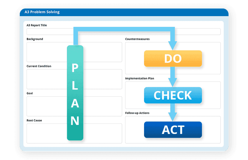
A Quad Chart, the structured four-quadrant diagram, functions as a data visualisation tool, strategic analysis method, and performance tracking system. Monitoring of KPIs becomes simpler through this system by transforming intricate data into easy-to-understand format trends, identifying root causes, and implementing corrective measures efficiently.
Looking for the best way to structure a Quad Chart tool for effective KPI visibility and performance management? Look at the structured approach given below and understand how organisations track performance efficiently and drive continuous improvement with it.
Example of components in a digital Quad Chart:
- Top-left quadrant: The key information goes into the top-left segment, along with objectives and problem statements.
- Top-right quadrant: Displays visual data presentations through charts and graphs, in addition to KPI performance indicators for analysis.
- Bottom-left quadrant: Displays important evaluation elements for identifying root causes, which contribute to challenges and constraints.
- Bottom-right quadrant: Corrective Actions – lists specific actions and ownership for resolution.
Data segmentation in this pattern enables organisations to analyse KPIs more efficiently while speeding up their reaction to performance gaps.
How to use quad charts for KPI analysis?
Choose your metric to track
The first step involves identifying KPI metrics for tracking purposes.
Select a few essential KPIs that support the organisational business objectives. The targeted KPI metrics can include production efficiency, as well as defect rates, downtime, or financial metrics.
Structure the Quad Chart
Structure the quadrants according to your need. Each quadrant should serve a specific purpose. For KPI tracking, a common format is:
Monitor and take action
Monitoring KPI development requires periodic updates of the Quad Chart to verify that implemented corrective actions produce desired outcomes.
Quad charts for root cause analysis: Uncover the real problem
You gain immense KPI visibility—but what happens when targets aren’t met? Before rushing to fix the issue, it’s crucial to understand why it happened. What you should do is understand the failure reasons and the key for it lies in root cause analysis.
Non-identification and non-resolution of root causes in businesses, especially in manufacturing, supply chain operations, or service delivery, result in substantial productivity loss, alongside decreased profitability and dissatisfied customers.
Quad charts, when applied to root cause analysis, help organisations isolate issues, understand their origins, and swiftly move to corrective actions—all in a concise, easy-to-digest format. This root cause analysis process enables organisations to investigate performance issues deeper than superficial symptoms.
Explore how an advanced digital Quad Chart tool enhances root cause analysis for deeper problem-solving:
- Consolidates scattered performance data into a structured format
- Provides instant visibility into issues
- Links performance deviations to underlying factors using quadrant segmentation
- Integrate real-time data, historical trends, and contributing factors
- Provides clarity for prioritising key problem areas
Identified the root cause? Here’s how to set corrective actions with Quad Charts
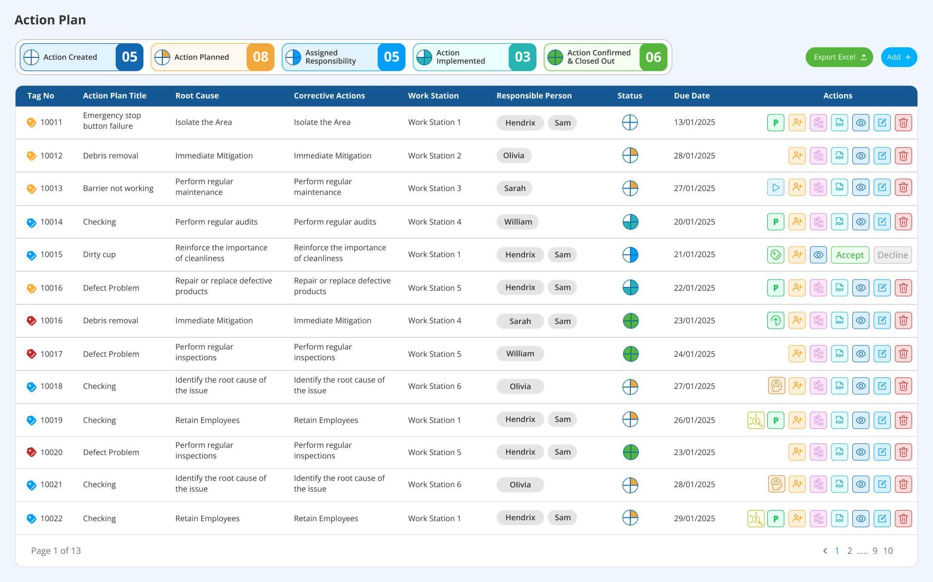
Once the root cause is identified, the next crucial step is implementing corrective actions. For every organisation, having continuous corrective action is vital for fostering a culture of continuous improvement. Corrective actions are necessary to eliminate the cause of product failures and prevent recurrence.
Organisations using data-driven systems ensure that they are always one step ahead while preventing problems from growing into critical issues. Instead of reacting to problems without a strategy, organisations can use Quad Charts to outline specific steps, assign responsibilities, and track progress. This visual format ensures that corrective measures are not only planned but also effectively executed, preventing recurring failures and driving continuous improvement.
Discover how an advanced digital Quad Chart tool streamlines corrective actions for sustained performance improvement.
- Aligns corrective actions with identified root causes for targeted resolution.
- Defines ownership and responsibilities for each corrective measure.
- Links actions to deadlines, ensuring timely implementation.
- Monitors real-time updates on corrective action effectiveness.
- Enables data-driven refinements to prevent issue recurrence.
The digital environment enables users to link corrective actions to distinct timelines, responsibilities, and progress tracking, which ensures efficient execution of such measures.
How to find the best quad chart template for KPI monitoring?
Adopting Quad Chart templates tailored for KPI tracking helps make better quad chart analysis easier and more fruitful. A Quad Chart template provides:
- Customisable quadrants for specific business needs.
- Real-time data automation that enables proactive decision-making through updated information.
- Easy integration with Balanced Scorecard, Lean, and Six Sigma methodologies.
Take control of your KPIs with the ideal Quad Chart Template
Quad charts boost KPI insights - but only when integrated into a digital system
Quad Charts are a game-changer for businesses aiming to enhance KPI visibility and implement corrective measures efficiently. With the help of digital quad charts, organisations can achieve faster strategic objectives, as well as minimise risks and drive continuous improvement. All stakeholders, including management teams, operators, and maintenance personnel, operate from a shared understanding of required actions and target results using a quad chart. This transparency fosters greater collaboration, accountability, and commitment to corrective actions
Get started with the Data Point's best digital quad charts today!
If you're looking to implement Quad Charts for KPI tracking in your manufacturing or business operations, explore Data Point Balanced Scorecard—an ideal platform to implement Quad Charts for your manufacturing or business operations that integrates with Quad Charts and other performance management tools, including MES and ERP.
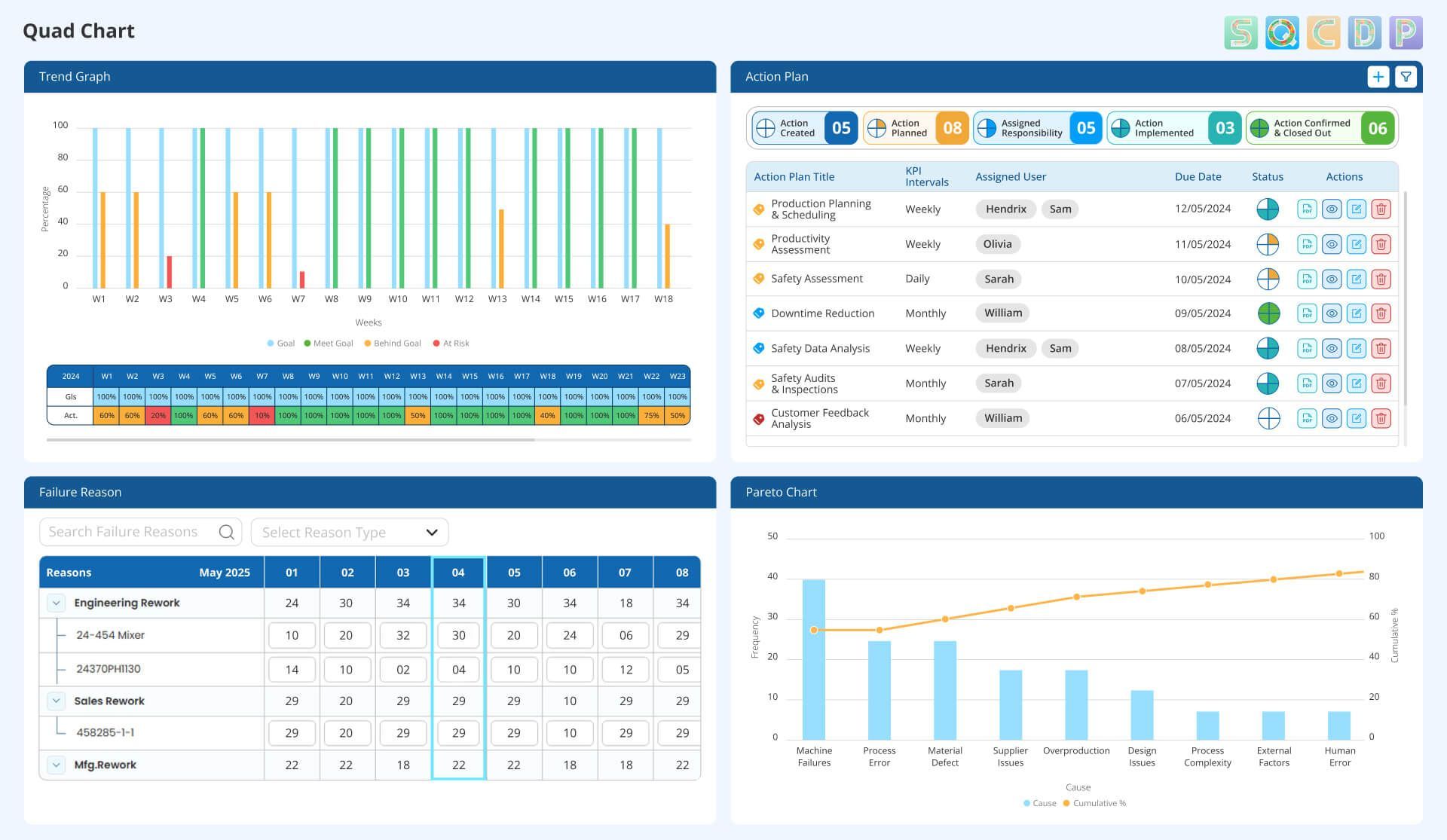
Here is the solutions Data Point offers for presenting graphical and textual summary of your entire project:
- Comprehensive KPI monitoring
- KPI trend graph, displaying actual vs. target values
- Root cause identification
- Pareto chart for highlighting the critical failure reasons
- Advanced filtering & customisation
- Seamless user experience
Gain real-time visibility into KPIs and corrective actions with Data Point’s powerful Quad Chart tool. Get your process excellence today!
FAQs
1. What is a Quad Chart as a strategic planning tool?
A quad chart shows consolidated data on a single page with a four-quadrant diagram. It helps in strategic planning by dividing the important organisational information into four quadrants.
2. How can we use Quad Charts for project management?
Organisations can structure the Quad Chart by including project goals, project progress, challenges, and action plans in the quadrants.
3. Can I create an interactive Quad Chart in Excel?
Excel lacks built-in interactivity for Quad Charts, making updates manual and time-consuming. A digital tool offers automation, real-time data integration, and user-friendly navigation.
4. How to choose the right Quad Chart template for your organisation?
A digital Quad Chart is the best option for any organisation aiming to streamline data presentation and enhance strategic decision-making. Choosing a customisable digital quad chart template, which incorporates concise text, bullet points, charts, graphics, and a consistent colour scheme, improves the scope for collaboration features and encourages a comprehensive approach to measuring performance.
5. What are the key advantages of using a digital Quad Chart over a PowerPoint version?
A digital Quad Chart offers real-time collaboration, easy updates, interactive elements, better data integration, and improved accessibility across devices, whereas PowerPoint is static and requires manual updates.
6. What is an example of using the Quad Chart in manufacturing?
In manufacturing, a Quad Chart is commonly used for process improvement, project tracking, and problem-solving. For example, a Quad Chart can display key metrics such as production efficiency, quality issues, corrective actions, and improvement initiatives in a single view.

Amer Jumah, Senior Lean Consultant
Amer is co-founder of Agile Solutions and a certified Six Sigma Black Belt, Lean Black Belt, and PMP, with over nine years of experience implementing Lean, Six Sigma, and Agile principles across diverse industries. He specialises in process optimisation, waste elimination, and delivering cost savings through organisational change.