Multiple interactive KPI Dashboards for performance tracking and strategic execution
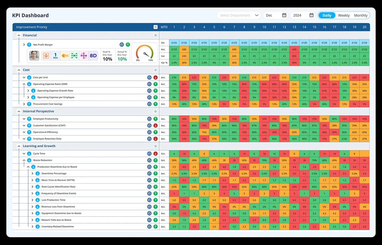
Streamline your management processes with balanced scorecard interactive dashboards in a single screen. Visualise, explore, and customise your KPIs in real-time to make informed decisions that drive success.
Enhance business performance with tailored interactive dashboards
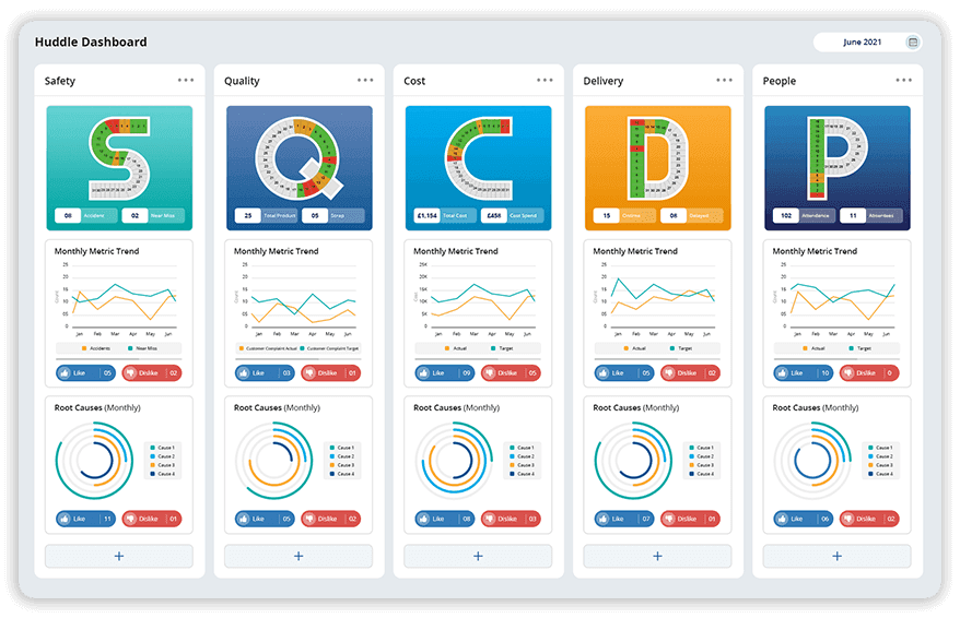
Facilitate daily stand-up meetings with user-friendly huddle boards. These dashboards provide a clear overview of team progress, goals, and key tasks, ensuring alignment and accountability across the board. Perfect for tracking updates and maintaining momentum.
Learn More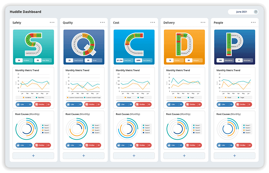
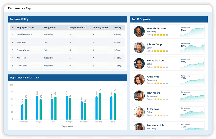
Track and analyse daily operational metrics to measure performance against set targets. With real-time data updates, these dashboards enable quick identification of gaps and opportunities for process improvements, driving consistent progress.
Stay on top of ongoing projects with detailed work-in-progress dashboards. Visualise tasks, allocate resources effectively, and manage timelines with ease. These dashboards are crucial for ensuring that projects remain on schedule and meet their objectives.
-dashboards-LTS-Data-Point.png&w=1920&q=75)

Optimise your equipment and production efficiency with Overall Equipment Effectiveness (OEE) dashboards. Monitor machine utilisation, downtime, and productivity in real-time to reduce waste and improve overall performance.
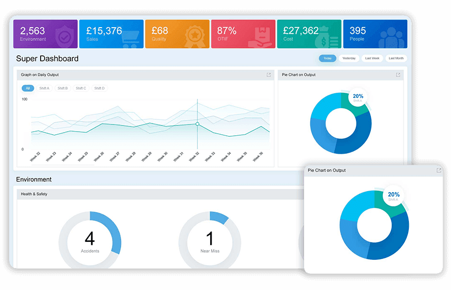
Designed for top management, Super Dashboards provide a graphical representation of critical KPIs, such as sales, quality, and delivery, segmented by respective sessions. These dashboards offer a bird’s-eye view of organisational performance, enabling high-level strategic decisions.

Align operations with your strategic objectives using Scorecard Dashboards. Track progress on organisational goals and measure outcomes against benchmarks to ensure teams stay focused on what matters most.
Focus on the metrics that matter most to your business. KPI Dashboards deliver deep insights into performance indicators, allowing teams to take swift and impactful actions based on data-driven results.

Empower team leaders with dashboards tailored to their needs. Analyse trends, pinpoint recurring issues, and track progress on team-specific KPIs. These tools ensure leaders can drive continuous improvements effectively.
Choice of industry leaders and Fortune 500 companies


















How interactive Balanced Scorecard dashboards transform your business?
Data Point interactive dashboards empower businesses by making complex data accessible, actionable, and impactful.

Real-Time data driven decisions
Quickly access live updates on KPIs, enabling faster, smarter decision-making.

Increased efficiency
Streamline operations by consolidating key metrics into one accessible platform, reducing data analysis time.

Customisable and collaborative solutions
Tailor dashboards to your specific needs and share insights seamlessly across teams.
Ready to unlock the full potential of your data?
Multiple Interactive KPI Dashboards for Performance Tracking & Strategic Execution
Explore how interactive KPI dashboards help teams monitor performance, support daily decisions, align operations with strategy, improve resource visibility, and enable leaders to make faster, data-driven decisions across the organisation.
How does a huddle board dashboard support daily stand-up meetings differently from a general KPI dashboard?
A general KPI dashboard is built for ongoing monitoring across an unspecified time window. A huddle board is built for a specific, recurring event: the daily stand-up, where a team needs to see progress, goals, and key tasks in the few minutes that meeting actually takes.
The distinction matters because a stand-up meeting fails when the team spends more time finding the relevant information than discussing it. A huddle board is structured to surface exactly what a short daily meeting needs: what happened since yesterday, what is blocking progress today, and who owns each open item. It is not a scaled-down KPI dashboard. It is a different format built around the constraints of a meeting that has to move fast and end with clear ownership, not a broad exploration of every available metric.
How does a Work in Progress dashboard help manage resource allocation across multiple concurrent projects?
Resource allocation decisions are difficult to make well when the only visibility into ongoing work is a status update from each project lead individually. Each update reflects that person's perspective on their own project, with no easy way to compare workload or timeline risk across projects run by different teams.
A WIP dashboard visualises tasks, resource allocation, and timelines across concurrent projects in a single view. This makes it possible to see where two projects are competing for the same resource before that conflict causes a delay in either one. For managers responsible for multiple ongoing initiatives simultaneously, this shared view removes the need to individually chase status updates before making a reallocation decision.
How does a Super Dashboard designed for top management differ from operational dashboards used by shift teams?
A shift team needs granular, real-time detail relevant to the specific line or process they are responsible for. A top management audience needs the opposite: a condensed, cross-functional view that shows organisational health across sales, quality, and delivery without requiring them to interpret line-level detail that is not relevant to their decisions.
The Super Dashboard is built for that second audience specifically. It is a bird's-eye view segmented by function rather than a detailed operational tool. This distinction matters because forcing leadership to work from the same granular dashboards operational teams use creates noise at the level where strategic decisions are actually made, while giving operational teams a leadership-level summary strips out the detail they need to act.
How does a dedicated KPI dashboard support faster action compared to a broader reporting tool?
A broader reporting tool often surfaces a wide range of information, some relevant to immediate decisions and some useful only for periodic review. Finding the specific metric that requires action within a broad report takes time, and that time delay is exactly what slows down the response to a developing issue.
A KPI dashboard is deliberately narrower. It focuses on the metrics that matter most to a specific team or function, giving deep insight into those indicators specifically rather than a wide but shallow view across everything the organisation tracks. This focus is what allows teams to move from seeing a deviation to acting on it without first filtering through information that is not relevant to the decision at hand.
How do daily performance dashboards differ from monthly or quarterly performance views what they are designed to catch?
A monthly performance view is built to show trend and trajectory. It answers whether the organisation is improving over time. A daily performance dashboard is built to answer a narrower question is today on track, and if not, where specifically is it falling short.
That narrower focus changes what the dashboard needs to do. Real-time data updates mean a gap identified on a daily dashboard can still be acted on within the same day, which is not true of a monthly view by the time it is reviewed. Daily performance dashboards are where process improvement opportunities get caught early, while a monthly dashboard is where the cumulative effect of those daily decisions becomes visible as a trend.
How does an OEE dashboard connect equipment-level data to broader production efficiency decisions?
Machine utilisation, downtime, and productivity are often tracked separately, at the level of the individual asset, without an aggregated view that shows how those factors combine into overall equipment effectiveness. A maintenance team might know downtime figures. Neither view alone tells the full efficiency story.
An OEE dashboard brings machine utilisation, downtime, and productivity together in real time, giving a combined efficiency picture rather than three separate metrics that need to be manually reconciled. This is particularly relevant where downtime and quality issues both affect the same line, since an isolated downtime figure does not show whether the equipment that was running was actually producing at the expected quality and rate.
How does a Scorecard Dashboard keep day-to-day operations visibly connected to strategic objectives?
It is possible for a team to hit every operational target on a given day while still drifting from the broader strategic direction the organisation has committed to, simply because the operational metrics being tracked were never explicitly connected to strategic goals in the first place.
A Scorecard Dashboard aligns operational tracking with strategic objectives directly, measuring outcomes against benchmarks tied to what the organisation is actually trying to achieve, not just what is operationally convenient to measure. This distinguishes it from a general KPI dashboard, which can track any metric regardless of whether that metric is explicitly tied to a stated strategic priority.
How does a Team Leader dashboard differ from the dashboards used by their own direct reports?
A team leader has a different scope of responsibility than the individuals they manage. An operator needs visibility into their own task or line. A team leader needs visibility across the whole team, with the ability to identify recurring issues and patterns that would not be visible from any single operator's individual view.
A Team Leader dashboard is built for that oversight role specifically, surface trend data and recurring issues across the team's combined KPIs rather than a single individual's metrics. This is what allows a team leader to drive continuous improvement at the team level, identifying a pattern across multiple people's work rather than reacting to isolated incidents one at a time as they are individually reported.
Hear it from our customers

MARC ROBINSON
Director, Global Operational Excellence


“By providing a central location to input, analyse and share our KPIs, 'Data Point' enables site management to more easily focus on the entire business as a team. Its ability to allow automated data entry and trend analysis gives us more time for improvement rather than just reporting numbers. Combined with a disciplined approach within our SQDC meeting process, I believe 'Data Point' will help us continually focus on key issues and drive business excellence in all areas.”
Transform your data into actionable insights with Data Point
Experience real-time insights, enhanced collaboration, and customised solutions designed to streamline your operations.