Generate automated insightful reports with ease and efficiency
Elevate your reporting process with fully customisable reports. Create, format, and download reports designed to fit your business goals. Save time, reduce errors, and gain a comprehensive understanding of your KPIs, tasks, and overall performance.
Transform business insights with customised report generation
- Multiple reports in the same amount of time
Spend time wisely in preparing and validating reports. Download your reports in a Click. Organisations can save time using automated reporting option. - Focus more on core responsibilities
Detailed analysis of various processes. Focus more on responsibilities by analysing auto-generated reports. Improve overall strategic planning and management. - Data visualisation is easy
There is nothing like data visualisation. Data visualisation enhances the information being shared. Compare multiple reports. - Increase frequency of analysis and decrease errors
Why wait for manual reports, when you have automated reports at hand. Manual Reports are prone to errors. Increase reliability with automated reports.
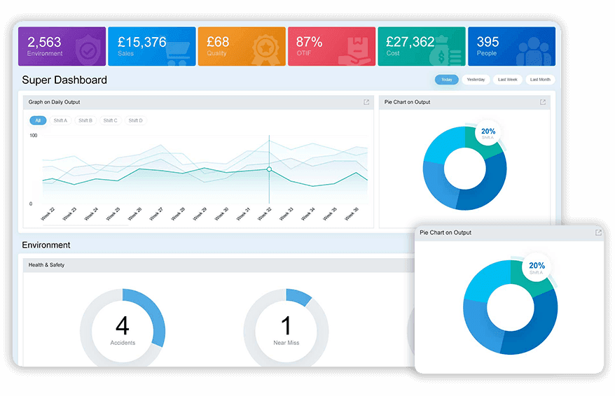
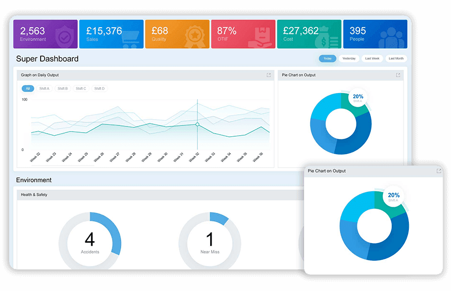
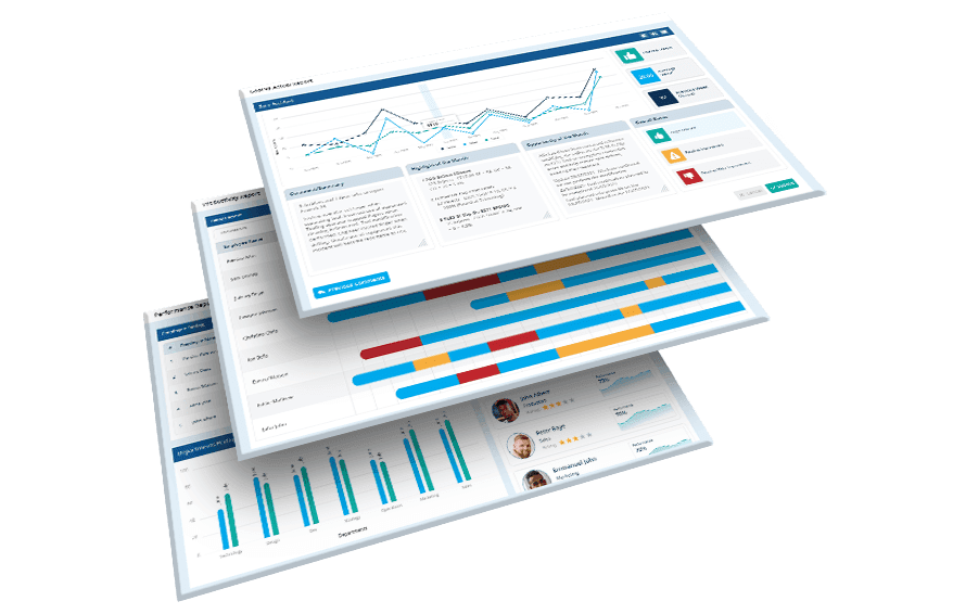
Super Dashboard gives an overview of environment, sales, quality, delivery, cost and people. It shows a graphical representation of each KPIs in respective sessions.
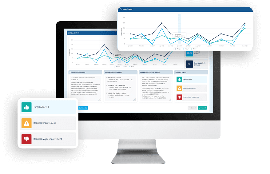
BSC analyses health and safety records and gives you a clear idea about the safety measures and to identify areas that require more attention.

Gain deeper insights with Data Point Reports

Data summary report gives an overview of the whole process that is going on. Overview of all related KPIs and metrics are available.
Dont be carried away. Keep track of your goals continuously and improve performance. Get reports on goal vs actual. No more delays, get things done on time.


Generate completion percentage report for each task separately. Analyse the performance of the assigned user. Keep track of the entire activity with detailed reports.
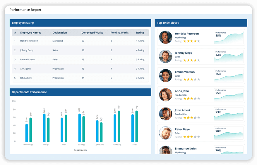
Reward the Best Performer! Identify the best performance amongst the team. Generate performance reports for each user. Select and compare performance of multiple users.

Get detailed reports on productivity. Analyse productivity by comparing current performance with the previous data. Improve efficiency of the team and identify what needs to be improved.
Create reports of your choice! Create report templates based on any criteria, with various formatting options. Gain control over all processes.
Choice of industry leaders and Fortune 500 companies


















How customised reports drive business success?
SeCustomised reports empower your business by providing the flexibility to create tailored insights that align with your specific goals.

Save time efficiently
Automate the generation of tailored reports, freeing your team to focus on critical goals.

Achieve unmatched accuracy
Rely on real-time, data-driven reports that eliminate manual errors and inconsistencies.

Gain actionable insights
Drill down into specific KPIs to understand trends, identify gaps, and make strategic decisions with confidence.
Make your decisions smarter with Data Point reports
Automated Reporting Software: The Complete Guide to Real-Time Reports, Dashboards and Performance Insights
Learn how Automated Reporting software helps generate real-time reports, consolidate KPI data, compare performance, automate recurring reports, reduce manual effort, and deliver accurate insights for faster decision-making.
How does the Super Dashboard differ from individual KPI reports, and when should you use it instead?
An individual KPI report tells you about one metric. The Super Dashboard exists for a different purpose: giving a single graphical view across Safety, Quality, Delivery, Cost, and People simultaneously, so a reviewer is not switching between five separate reports to understand overall organisational health.
This matters most in review settings where the audience needs the full picture before drilling into any one area. A plant manager preparing for a leadership review does not want five disconnected exports. They want one view that shows where each pillar stands, with the option to move into individual KPI detail only where a pillar is flagged. The Super Dashboard is built for that first pass. For deeper analysis of a specific metric within it, moving into the KPI tracking software gives the granularity the Super Dashboard is not designed to provide on its own.
How does a Task Completion Percentage report support accountability at the individual action level?
Action plans generated from root cause analysis or CAPA investigations are only as valuable as the follow-through on completing them. A list of assigned tasks with no visibility into completion rate leaves managers guessing about how much of the improvement programme is actually being executed versus sitting open.
A Task Completion Percentage report generated per task, rather than as a single aggregate figure, shows exactly where execution is happening and where it is stalling. This distinction matters because an aggregate completion rate can hide a specific individual or team that is consistently behind on their assigned actions while others are on track. Breaking the report down to the individual task level surfaces that pattern rather than averaging it away.
How does a Productivity Report enable comparison against historical performance rather than just a static benchmark?
A productivity figure on its own tells you where you are. It does not tell you whether that represents improvement, decline, or no meaningful change from where the team was previously. Without a historical comparison built into the report, every productivity review starts from a number with no context.
A Productivity Report that compares current performance against previous data gives that context automatically. A team producing at the same rate as six months ago despite process changes and additional training investment is a different signal than a team that has genuinely improved. This comparison is what turns a productivity figure from a snapshot into a trend, and trends are what actually inform decisions about where further improvement investment should go.
How does Custom Report template reduce the manual effort of building the same report structure repeatedly?
Most organisations have a small number of report formats they generate on a recurring basis: a monthly leadership summary, a quarterly compliance report, a specific format required by a customer or auditor. Building each of these from scratch every cycle wastes time on formatting and structure that never actually changes, only the underlying data does.
Custom Report templates, built once against defined criteria and formatting preferences, mean the recurring report is generated by populating the same structure with current data rather than rebuilding it. This is where the time savings in automated reporting compound. The first report in a new format takes effort to configure. Every subsequent report in that same format takes almost none.
How does a Goal vs Actual report keep teams accountable between formal review cycles?
A performance target set at the start of a period and only checked against actuals at the end of that period leaves a long window where drift can go unnoticed. By the time the goal vs actual comparison happens, the gap may already be too large to close within the remaining time.
A Goal vs Actual report generated continuously rather than at period-end means the comparison is always current. Teams can see whether they are tracking to plan at any point, not just retrospectively. This is particularly relevant for KPIs where interim course correction matters. A quarterly cost target that is already 15% off track in month one needs a different response than the same target flagged as off track in month three. The report’s value is in how early it surfaces the gap, not just in confirming it existed.
How does a Performance Report support comparison across multiple users or teams fairly?
Comparing performance across a team informally, through conversation or anecdote, tends to reflect whoever is most visible or most vocal rather than whoever is actually performing best. A structured Performance Report removes that bias by generating comparable figures for each individual based on the same underlying data and criteria.
The ability to select and compare performance of multiple users side by side means recognition and coaching decisions can be based on documented performance rather than impression. This is particularly useful in environments with shift rotation, where a manager may not personally observe every team member equally and needs a data-based view to identify genuinely strong performers versus those who happen to be more visible during the manager’s own working hours.
How does the Data Summary and Roll-Up report differ from a site-level dashboard view?
A dashboard is built for real-time monitoring. It shows the current state and updates continuously. A Data Summary and Roll-Up report is built for a different purpose: consolidating related KPIs and metrics into a single document that can be reviewed, distributed, and archived as a record of performance over a defined period.
This distinction matters for governance and audit purposes. A dashboard cannot easily be filed as evidence of what performance looked like on a specific date. A generated report can. For organisations that need to produce a periodic summary for stakeholders who are not actively logged into the live system, the roll-up report format serves a different function from the dashboard, even though both draw from the same underlying data.
How does automated report generation reduce the error rate compared to manually compiled reports?
A manually compiled report involves someone pulling data from one or more sources, formatting it, and checking it for accuracy before distribution. Each of those steps introduces an opportunity for error: a figure copied incorrectly, a formula that was not updated after a data source changed, a stale export used because the current data was not readily available at the time of compilation.
Automated reports pull directly from the live data in the system, which removes the manual transcription step entirely. The report reflects what the data actually shows at the point of generation, not what someone remembered to update or format correctly. For organisations generating multiple reports on a regular cycle, this reduction in manual handling is what allows reporting frequency to increase without a proportional increase in the risk of error or the time spent on quality-checking each report before it goes out.
Hear it from our customers

MARC ROBINSON
Director, Global Operational Excellence


“By providing a central location to input, analyse and share our KPIs, 'Data Point' enables site management to more easily focus on the entire business as a team. Its ability to allow automated data entry and trend analysis gives us more time for improvement rather than just reporting numbers. Combined with a disciplined approach within our SQDC meeting process, I believe 'Data Point' will help us continually focus on key issues and drive business excellence in all areas.”
Empower your decisions with tailored Data Point reports
Save time, enhance accuracy, and drive informed decision-making with actionable insights at your fingertips.