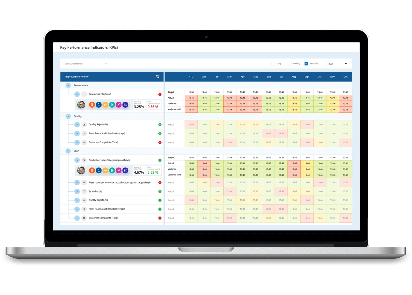
Real-time KPI tracking & Data visualisation with custom dashboards
Track, measure, and visualise your Key Performance Indicators (KPIs) with ease. Monitor real-time progress, identify areas for improvement, and drive strategic outcomes using dynamic, user-friendly dashboards.
Why are Key Performance Indicators important?
Measuring Key Performance Indicators is important to ensure the success of businesses. It ensures that all departments and teams are aligned in the same direction to achieve the set strategic goals. Here are a few reasons why Key Performance Indicators are important for organisational growth.

Monitor organisation’s health
KPIs are important to measure organisational success and failures. Get an overview of what is happening in your organisation and implement ways to improve overall performance. Make data-driven decisions.

Measure progress
Keeping track of Key Performance Indicators helps organisations track and monitor progress. It aligns teams’ performance with the long-term strategic goals of the organisation and determines whether you are moving in the right direction.

Stay on track
Key Performance Indicators will help organisations predict future trends. Keep teams on track by aligning strategic goals and plans with their performance. Focusing on the same goal helps in better strategy map execution.

Boost team performance
Create a culture of continuous improvement. Key Performance Indicators will help teams take the right steps to deliver high impact results. Identify pain points that hinder performance and implement actions to bridge the gaps.
Types of Key Performance Indicators
Key Performance Indicators are used at all levels in an organisation. While some KPIs are used to measure short-term goals, some focus on long-term goals. All these KPIs associated with short and long term goals finally ties together to the ultimate organisational strategic goals.


Strategic
These are the key performance indicators that monitor an organisation’s big-picture goals. Strategic KPIs tells how the organisation is progressing during a particular time. Examples of strategic KPIs are revenue per customer, gross value, return on investment (ROI) and market share.

Leading vs Lagging
Leading KPIs keeps an eye on changes and trends and help organisation or teams to manage the performance of various processes. Lagging KPIs shows us how well the system or process was managed. Organisations incorporate both types of KPIs to make. sure what they track is important.

Operational
These KPIs monitor and measure performance of a shorter time period. They focus on an organisation’s processes and their efficiencies. Operational KPIs enable businesses to derive meaningful conclusions on the outcomes. Lead-to-Opportunity Ratio, Delivery Time, Transportation Costs and Production Volume are some examples of Operational KPIs.
Configure and categorise KPIs to align with business objectives.
- Define KPI categories, unit types, intervals, and trend directions.
- Organise KPIs into structured groups like Safety, Quality, and People.
- Ensure flexibility with customised KPI settings for different departments.


Gain real-time insights with intuitive visual indicators.
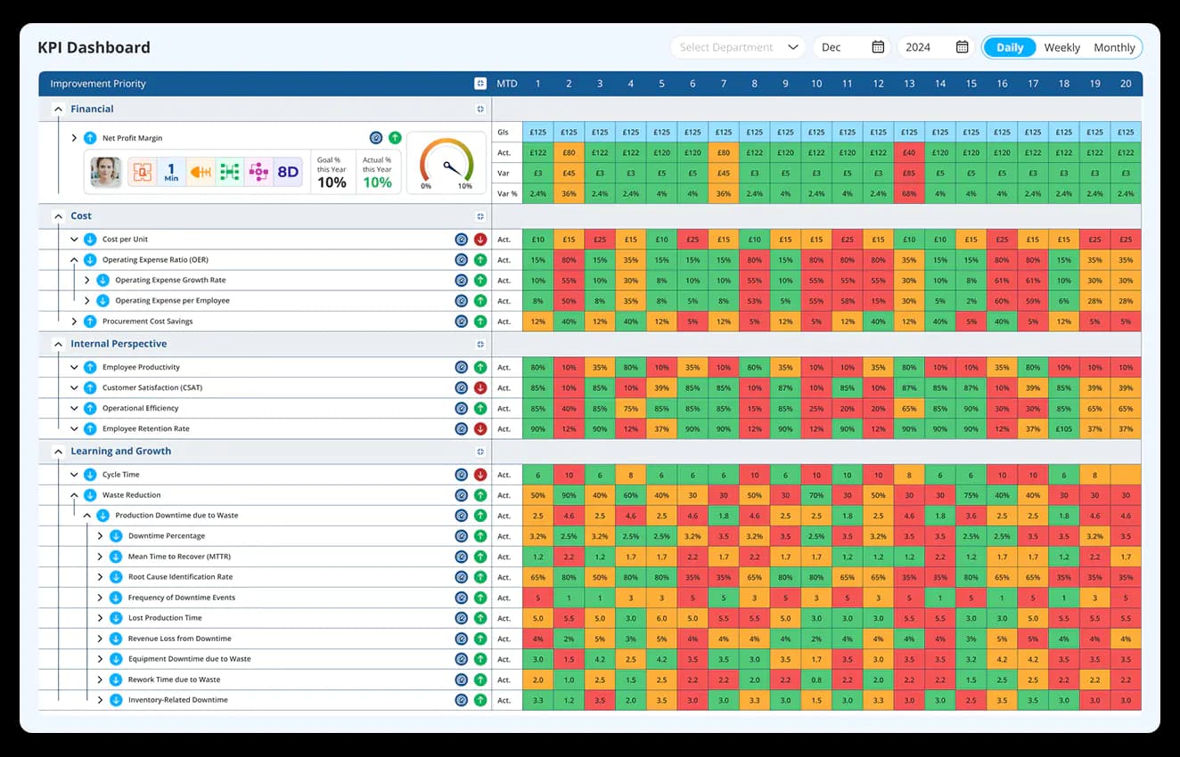
- Use RAG (Red, Amber, Green) color coding for easy performance tracking.
- Monitor KPI trends through interactive dashboards and visual reports.
- Identify deviations instantly with automated alerts and notifications.
Seamlessly navigate between high-level summaries and granular data.
- Drill down into specific KPIs for detailed analysis and reporting.
- Aggregate data across multiple KPIs for a holistic business view.
- Link parent and child KPIs for structured performance insights.

Navigate through high-level summaries with Data Point

Reduce manual effort with automated performance tracking.
- Configure custom formulas for real-time KPI calculations.
- Enable trend analysis for accurate performance measurement.
- Automate KPI updates based on predefined business logic.
Manage KPI settings and visual configurations with ease.
- Define and modify KPI formulas to match business requirements.
- Adjust the color settings to highlight performance deviations.
- Maintain consistency with centralised KPI governance and control.


Digital Balanced Scorecard is a visual strategic planning and management tool. It aligns day-to-day activities with enterprise vision, mission, and values. Using a Balanced Scorecard tool, an organisation can analyse the KPIs associated with each strategic goal and measure their performance. By measuring performance and analysing performance strategies, the organisation will realise where they are now and what needs to be done to achieve the long or short term goals. Keeping track of Key Performance Indicators helps organisations track and monitor progress. It aligns employees’ performance with the long-term strategic goals of the organisation and determines whether you are moving in the right direction.
Personalise your KPI Framework
How to develop Key Performance Indicators effectively?
Define your overall strategy and identify the area of business performance that you wish to measure. The identified areas will have their respective KPIs in the following stages, be it financial performance or business growth.

Make a list of KPIs and discuss with teams to identify the KPIs that are closely aligned with each strategy. Identify KPIs which promote the overall business processes and ensure that these KPIs are closely aligned with strategic plans.

Follow the S.M.A.R.T framework to ensure that the identified KPIs are worth measuring. Ensure the KPIs are Specific, Measurable, Achievable, Relevant and Time-specific. SMART Key Performance Indicators are essential as they will help the management team avoid metrics that don’t impact business.

Keeping the KPIs clear lets your teams understand the KPIs and make data-driven decisions to move in the right direction. Let them know what is happening within the organisation and find ways for continuous improvement.

As your organisation grows, revise the KPIs that you are currently measuring. Monitor what is relevant and avoid the KPIs that are no longer relevant. Keep on updating the list of relevant KPIs to stay on track.

Choice of industry leaders and Fortune 500 companies


















Revolutionise your business with advanced KPI visualisation and management
Effective KPI management ensures that your business is on track to meet both short-term and long-term objectives.

Real-Time data insights
Quickly access up-to-date KPIs for faster, smarter decision-making

Customisable dashboards
Tailor KPIs and dashboards to suit your team’s needs and organisational goals.

Cross-Departmental alignment
Ensure that all teams are aligned toward common goals, improving collaboration and performance.
Transform your business with data-driven KPI visualisation
KPI Dashboard Software: The Complete Guide to Real-Time Data Visualisation and Performance Monitoring
Learn how KPI Dashboard software helps organisations visualise real-time performance, automate KPI tracking, build custom dashboards, monitor trends, drill down into data, and improve decision-making across teams and sites.
How does parent-child KPI linking support roll-up reporting without losing shopfloor detail?
A single aggregated number at leadership level and a detailed metric at shopfloor level are often treated as separate reporting exercises, built and maintained independently. That separation means a leadership dashboard showing overall quality performance has no direct link back to the specific line or department driving the number.
Parent-child KPI linking connects the two. A site-level quality KPI is built from the department-level KPIs that feed into it, which are in turn built from line-level data. When the parent KPI shows a deviation, the link to its child KPIs means the source of that deviation is traceable without leaving the dashboard. Aggregation happens automatically as the underlying data updates, so the roll-up view is never a manually recalculated summary that lags behind what is actually happening at the level where the work is done.
How does asset-level KPI configuration differ from site-level tracking, and when is that granularity necessary?
Site-level KPI tracking tells you how a location is performing overall. It does not tell you which specific machine, line, or piece of equipment is driving that performance. For operations where a small number of assets account for a disproportionate share of downtime or quality issues, site-level aggregation can hide exactly the detail that matters most.
Asset-level KPI and RAG configuration allows performance to be tracked down to the individual machine or line, with its own targets, its own colour-coded status, and its own drill-down history. This is particularly relevant for maintenance and reliability tracking, where a site-level OEE figure might look acceptable while one asset is quietly underperforming and dragging down the average. Configuring KPIs at asset level surfaces that underperformance directly rather than letting it get absorbed into a broader number that looks fine on the surface.
How does automated KPI calculation using custom formulas reduce the risk of inconsistent reporting across departments?
When each department calculates the same type of KPI slightly differently, comparing performance across the organisation becomes an exercise in reconciling definitions before any actual comparison can happen. One department may calculate downtime as scheduled stoppage time excluded, another may not. The resulting numbers look comparable but are not.
Custom formulas configured once at the KPI definition level and applied automatically across every instance of that KPI remove that inconsistency. The calculation logic is defined centrally, and every department, site, or asset using that KPI produces a number using the same underlying formula. This does not prevent departments from having departments from having different KPIs suited to their specific context, but it ensures that where the same KPI is being tracked in multiple places, the numbers are genuinely comparable rather than superficially similar.
How does display-only mode support KPI visibility on shopfloor screens without exposing configuration controls?
A dashboard designed for detailed analysis, with drill-down menus, filters, and configuration options, is not the right interface for a screen mounted on a production floor for passive viewing. Operations walking past need a clear, readable status view, not an interface built for someone actively investigating a deviation.
Display-only mode strips the dashboard down to what is needed for a projection or wall-mounted screen: the KPI status, the trend, and the RAG indicator, without the interactive elements that a detailed review would require. This also reduces the risk of a screen accidentally being used to change a configuration or filter setting simply because it was left accessible in a public area. The same underlying data can be shown in the format that fits the context, whether that is a manager conducting a deep analysis at a desk or a full team viewing a simplified status board during a shift briefing.
How does RAG colour coding get configured to reflect a moving target rather than a fixed threshold?
A fixed RAG threshold works when a target does not change during the measurement period. Many operational KPIs work differently. A daily production target increases through the shift as cumulative output builds, which means a fixed red or green threshold set at the start of the day becomes meaningless by mid-shift.
Moving goal-based RAG configuration adjusts the colour status against the target as it progresses through the period rather than against a static end-of-day figure. This means the colour on the dashboard reflects whether the current pace is on track for that point in time, not just whether the final number will land above or below target. For teams monitoring performance in real time, this distinction is what makes the RAG status actionable throughout the shift rather than only meaningful in hindsight.
How does role-based access control distinguish between data entry rights and view-only visibility?
Not everyone who needs to see a KPI should be able to change its target, its formula, or its underlying data. Finance-related KPIs in particular require tighter control than general operational metrics, since an unauthorised change to a financial target or calculation has different consequences than an incorrect production figure.
Configuring access so that designated users can enter or modify data while others have view-only rights protects the integrity of the KPI without restricting visibility. Derived KPIs, which are calculated from other metrics rather than entered directly, can be restricted to management-level across where the underlying formula needs tighter control. This layered approach means the right people can act on the data while the data itself is protected from unintended or unauthorised changes.
How does KPI ownership assignment change accountability at review meetings?
A KPI without a named owner is everyone’s responsibility, which in practice means it is often no one’s. When a metric underperforms and the review meeting asks who is addressing it, the absence of a clear owner turns the conversation into a discussion about who should be responsible rather than a review of what is being done.
Assigning ownership to a specific individual at the point a KPI is configured removes that ambiguity before it becomes a recurring problem. The dashboard shows not just the metric and its status, but who is accountable for it. This also supports more targeted escalation. When a KPI is flagged as at risk, the notification goes to the person actually responsible for it rather than to a general distribution list that may not include someone positioned to act.
How does multi-language support affect KPI dashboard adoption in multi-site global operations?
A KPI dashboard is only as useful as the operator’s ability to read and act on what is shows. For global manufacturing organisations where the workforce at one site may not share a primary language with the team that configured the system, an English-only interface creates a barrier that has nothing to do with the quality of the KPI data itself.
Multi-language support means the same dashboard, the same KPI definitions, and the same underlying data can be presented in the language relevant to each site’s workforce. This matters for adoption specifically. A well-designed KPI system that operators cannot comfortably read will be used reluctantly or not at all, regardless of how good the underlying data and analysis capability is. Language support removes that adoption barrier without requiring separate configurations or duplicate systems for different regions.
Hear it from our customers

MARC ROBINSON
Director, Global Operational Excellence


“By providing a central location to input, analyse and share our KPIs, 'Data Point' enables site management to more easily focus on the entire business as a team. Its ability to allow automated data entry and trend analysis gives us more time for improvement rather than just reporting numbers. Combined with a disciplined approach within our SQDC meeting process, I believe 'Data Point' will help us continually focus on key issues and drive business excellence in all areas.”


Empower your teams with insightful KPI dashboards
Tailor dashboards to your specific needs and ensure your business stays agile and competitive. Begin your journey toward greater efficiency and growth today.