The hidden challenges of visual management in manufacturing—and how smart teams beat them
Last updated on : August 4, 2025
Clarity, speed, and consistency are the pillars of manufacturing sector. Visual management helps achieve all three by translating data and performance metrics into easily understood visuals, from floor-level boards to digital dashboards. These visuals empower teams to spot problems quickly, align actions with targets, and support continuous improvement.
However, implementing visual management systems is not without its difficulties. Many manufacturers introduce visual tools only to find that they become underused, misinterpreted, or disconnected from daily operations. Whether boards are too cluttered, inconsistently updated, or not aligned with strategic priorities, these challenges can reduce the overall effectiveness of visual management.
This blog highlights some of the most common challenges in manufacturing visual management—and offers practical ways to overcome them.
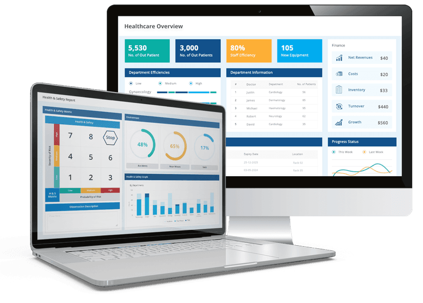
Master manufacturing visual management with the best digital tool
Common visual management challenges in manufacturing and practical ways to solve them
Struggling with visual clutter or lack of engagement? Discover smart solutions to the most common visual management challenges in manufacturing. Also learn how operational blind spots, cluttered visuals, and inconsistent updates can derail your system and how to regain control.
1. Lack of standardisation across teams and shifts
The challenge: Without clear guidelines, teams often use visual boards in different ways. One shift might update metrics regularly while another neglects them. The displayed Key Performance Indicators (KPIs) may also vary by team or department, making it difficult to get a consistent view of operations.
The solution: Develop a visual management standard across all departments and shifts. Decide what needs to be displayed, how often it should be updated, and how information should be formatted. Provide training and written guidance and assign team members to maintain consistency. Where possible, use digital tools to ensure uniform updates.
2. Manual tracking methods reducing speed and accuracy
The challenge: Many manufacturers still rely on whiteboards, printed charts, or handwritten updates. These manual methods can be time-consuming, prone to human error, and often lead to outdated or incomplete data being displayed.
The solution: Introduce digital tools where appropriate—such as automated KPI dashboards. These systems reduce the risk of error and ensure that the information shown is current. For operations that must remain manual, define clear update times, provide structured templates, and assign accountability to specific individuals.
3. Overloading boards with too much information
The challenge: Visual boards can easily become cluttered if every possible metric or update is included. When too much data is shown, it becomes hard to read, and key information gets lost in the noise.
The solution: Focus on displaying only the most relevant and actionable information. Categorise metrics (e.g., SQCDP- safety, quality, cost, delivery, people) and prioritise what’s most critical for each area. Use visual hierarchy—bold fonts, colour blocks, icons—to guide attention to key details. Keep in-depth data in layered dashboards, accessible when deeper analysis is needed.
4. Low engagement from frontline staff
The challenge: Visual management tools are only effective if the people using them are engaged. If teams feel that boards are only for supervisors or are never used to drive decisions, they lose interest and stop updating or referring to them.
The solution: Involve frontline staff from the start. Let them help design the layout, select metrics, and define routines. Make visual boards a part of daily stand-ups or shift handovers. When team members see their input being valued and the tools being used to solve problems, their engagement increases naturally.
If your production boards aren’t driving action, it’s time to rethink visual management
5. Visuals not aligned with organisational goals
The challenge: Visual boards sometimes focus on local issues without reflecting broader strategic objectives. This can create a disconnect between daily tasks and company goals, reducing alignment and effectiveness.
The solution: Use a tiered visual management system. Tier 1 boards focus on local, operational KPIs; Tier 2 links departmental goals; Tier 3 aligns with strategic objectives. Ensure that visual tools help teams see how their efforts contribute to the bigger picture. Use goal cascades and KPI alignment frameworks like the balanced scorecard to maintain clarity.
6. Poorly designed visuals causing confusion
The challenge: If a board is difficult to read—due to poor layout, inconsistent colours, or confusing symbols—then the message is lost. In worst cases, teams may misinterpret data or ignore the visuals altogether.
The solution: Design visual tools with clarity in mind. Use clear labels, consistent colours, and standard symbols. Place critical information at eye level and in prominent positions. Avoid mixing data types without clear separation. Test new board designs with small groups before wider rollout,and make adjustments based on user feedback.
7. Outdated data leading to poor decisions
The challenge: Visual management tools are only as good as the information they display. If boards are not updated regularly—or rely on data that is several hours or days old—teams may act on incorrect assumptions.
The solution: Create strict update routines, with assigned responsibilities and regular check-ins. Whenever possible, automate data collection and integrate it directly into visual boards. Use real-time tools for critical metrics like machine performance, quality issues, or delivery status. Establish review points throughout the day to verify accuracy.
8. Resistance to change from existing processes
The challenge: Some teams are comfortable with their current methods and see new visual tools as unnecessary or burdensome. This resistance can stall or even reverse improvements.
The solution: Introduce changes gradually. Start with pilot areas, demonstrate clear benefits, and let employees experience quick wins. Communicate why the changes are being made and how they support better outcomes. Provide hands-on training and create opportunities for feedback and adaptation. Make it clear that the goal is to simplify work, not add extra tasks.
9. Visual tools limited to production only
The challenge: Visual management is often seen as a production tool, leaving departments like maintenance, logistics, or quality without visibility or coordination.
The solution: Extend visual practices to all functional areas. Maintenance can use visual schedules or breakdown trackers. Quality teams can maintain visible issue logs and improvement actions. HR can track training or engagement metrics. A cross-functional visual culture helps break silos and drives collaboration across the value stream.
10. Difficulty maintaining visual management over time
The challenge: After initial implementation, boards often become neglected. Data becomes stale, updates are missed, and the system loses credibility. Without ongoing reinforcement, visual management fades into the background.
The solution: Make visual boards part of everyday routines. Use them in daily huddles, weekly reviews, and problem-solving sessions. Assign board champions or area leaders to maintain them. Recognise teams that keep their boards updated and use the data effectively. Review visual systems monthly to assess relevance, accuracy, and user feedback.
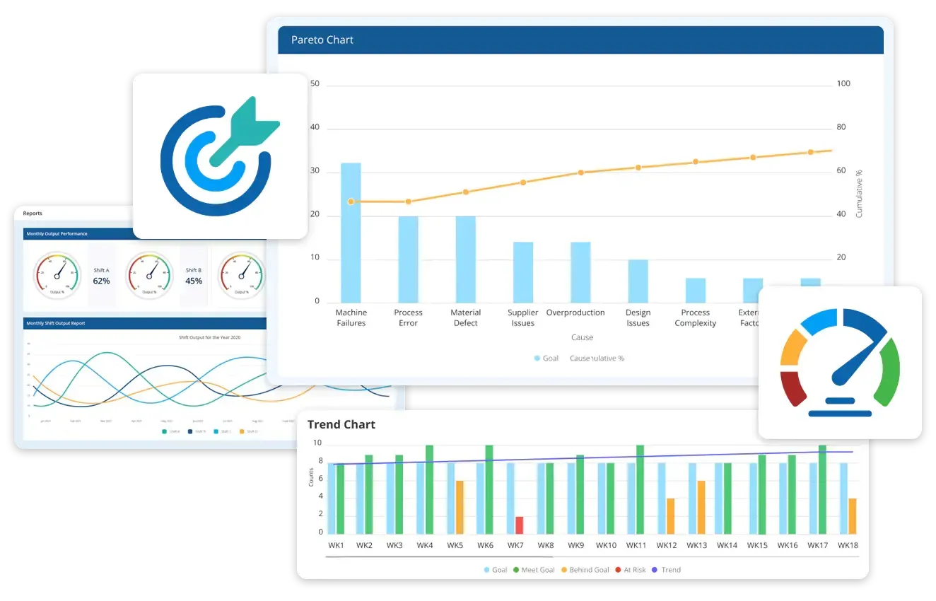
Data Point is more than a KPI dashboard—it’s your all-in-one production tracking tool for lean execution
What modern digital visual tools offer manufacturers today?
Modern digital dashboards and software platforms go far beyond basic metric display. They integrate real-time data, automate updates, and connect people, processes, and performance across multiple departments and locations. Here’s what today’s advanced visual tools offer:
1. Real-time data visualisation
Digital systems pull live data directly from machines, sensors, and enterprise systems. This eliminates the delays and inaccuracies of manual updates, giving teams instant visibility into production performance, quality issues, equipment downtime, and more.
2. Customisable dashboards
Modern visual platforms allow users to customise views based on roles, departments, or specific metrics. Whether it’s an operator checking hourly output or a plant manager reviewing strategic KPIs, dashboards can be tailored to deliver relevant insights at a glance.
3. Cross-functional connectivity
Digital tools break down silos by integrating data from production, maintenance, quality, HR, and logistics. This ensures that everyone—from shop floor teams to senior leadership—is working with a shared understanding of progress, issues, and priorities.
4. Interactive alerts and notifications
Automated alerts notify teams of deviations, bottlenecks, or failures in real time. These features drive faster reactions, reduce downtime, and help prioritise corrective actions without waiting for the next shift meeting or manual update.
5. Trend analysis and historical tracking
Unlike static boards, digital systems archive data over time, allowing teams to review trends, identify patterns, and conduct root cause analysis. This supports continuous improvement and strengthens decision-making.
6. Remote accessibility
With cloud-based platforms, teams can view dashboards and updates from any location—ideal for multi-site manufacturers, remote managers, or integrated supplier networks. This enables better coordination and faster response times.
7. Integrated problem-solving and action tracking
Many digital visual tools now include features for logging problems, assigning actions, tracking follow-ups, and documenting resolutions—all within the same system. This makes improvement efforts visible, accountable, and measurable.
Explore Data Point—your complete digital visual management solution for tracking KPIs
Transform your visual management with Data Point Balanced Scorecard
Visual management should do more than decorate walls or display yesterday’s numbers—it should drive action, accountability, and alignment in real time. That’s exactly what LTS Data Point balanced Scorecard software delivers.
LTS Data Point is a powerful digital visual management platform built for modern manufacturing environments. Whether you're on the shop floor, in daily hurdles, or reviewing strategic performance across multiple sites, Data Point provides the clarity and control you need to stay ahead.
With a wide range of configurable boards and advanced features, it helps manufacturers go beyond static visuals and embrace dynamic, data-connected, and role-specific dashboards.
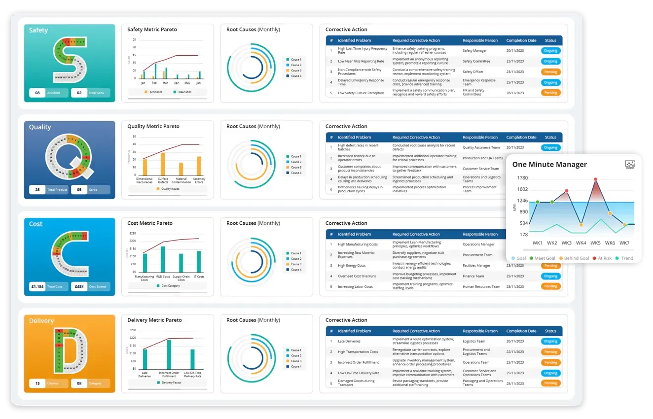
Some of the visual boards you can build and customise in Data Point:
- Huddle boards – for daily team discussions, task tracking, and performance snapshots
- One Minute Manager : for managers who need clarity about real-time insights, instant feedback, and clear progress updates
- Lean daily management boards (SQDCP boards) – real-time display of safety, quality, delivery, cost, and people metrics or other custom metrics.
- Custom performance boards – tailor KPIs, colours, visuals, and team views as per your department’s focus
- Hoshin Kanri boards – cascade strategic goals into measurable actions across all levels
- Strategy maps – visualise objectives and cause-effect relationships for long-term planning
- Problem-solving frameworks – such as A3, 8D, and PDCA for structured issue resolution
- Quad charts – communicate issues, analysis, and action plans in a single, shareable layout
- Fishbone (Ishikawa) diagrams – identify and track root causes of persistent problems
- Gemba boards – support daily walks and visualise real-time operational updates from the floor.
Ready to upgrade your visual management?
Whether you're starting with digital huddle boards or scaling strategic execution across plants, Data Point gives you the tools to build a connected, proactive, and results-driven manufacturing culture.
Take the first step towards smarter visual management today
FAQs
1. What is the main goal of visual management in manufacturing?
The goal is to make performance, issues, and priorities visible at a glance. Visual tools help teams monitor key metrics, identify problems early, align actions, and support continuous improvement without relying on lengthy reports or meetings.
2. How do digital visual management tools improve over traditional whiteboards?
Digital tools provide real-time data, automatic updates, and easier customisation. Unlike static whiteboards, they integrate directly with machines and systems, send alerts, and allow remote access—making them more reliable and scalable for modern operations.
3. What if some areas of the shop floor can’t go fully digital?
A hybrid approach works well. You can keep physical boards in areas where digital adoption is limited but standardise the update process and eventually integrate with digital displays for key metrics. The transition can be gradual and team-specific.
4. Which metrics should I prioritise on a visual management board?
Start with high-impact metrics like safety, quality, delivery, cost, and people (SQDCP). Then add area-specific KPIs or custom indicators that support your goals. Avoid overloading the board—clarity is more important than quantity.
5. How do I keep teams engaged with visual management tools over time?
Make the boards part of daily routines. Use them in stand-ups, problem-solving, and performance reviews. Involve teams in design and updates, recognise their efforts, and show how the visuals help improve results they care about.

Abel Jiménez, Lean Consultant
Abel is a Lean Consultant with over 30 years of expertise in operational analysis, process improvement, and organisational change across Mexican industries. Currently serving as Director of Insurance Promotions at CESCEMEX, he helps organisations leverage technology and lean practices to improve efficiency and manage change with continuity.