Management Reporting: A Complete Guide to Streamlined Business Insights

Last updated on : March 5, 2026
Are you drowning in spreadsheets, struggling with inconsistent reports, and wasting hours on manual data compilation? These challenges are common – and costly. Without clear, accurate management reporting, businesses risk poor decisions, missed opportunities, and inefficiency.
Management reporting is the structured process of collecting, analysing, and presenting operational and financial data to help leaders monitor performance, identify trends, and make informed business decisions. When this process lacks consistency or clarity, organisations are left reacting to fragmented insights rather than steering performance with confidence.
This guide will show you what management reporting is and why it matters, the key components involved, different types of management reporting, practical steps to create effective reports, and the tools and templates that can simplify the entire process.
Find more about LTS Data Point tools
What is management reporting?
Management reporting involves preparing regular documents (daily, monthly, or live) that summarise Key Performance Indicators (KPIs), financial results, operational metrics, and strategic progress.
These reports are customised for internal use by managers at various levels – shopfloor, department heads, senior leaders – to support planning, tracking, and continuous improvement.
Usual formats include:
- KPI dashboards
- Balanced scorecards
- Operational performance summaries
- Predicting and variance data
- Strategy execution reports (Hoshin Kanri X Matrix)
Purpose of management reporting
The core purpose of management reporting is to allow better decision-making by providing managers with precise, relevant, and timely information.
Key goals include:
- Aligning teams with organisational goals: Reports connect daily performance with strategic objectives, making sure everyone works toward the same targets.
- Tracking performance: Show how well functions, teams, and departments are performing through KPIs, trends, and benchmarks.
- Identifying problems early: Flags deviations, risks, delays, or bottlenecks so managers can act before issues escalate.
- Backs planning and predicting: Assists leaders forecast future performance, assign resources, and schedule improvements.
- Improving accountability: With clear aims and visibility, teams understand their responsibilities and progress.
Why management reporting matters
Management reporting is necessary because it directly affects an industry’s ability to compete, grow, and respond quickly to change.
- Enables faster and better decisions: Instead of waiting for manual updates, managers get access to real-time perception to make informed decisions quickly.
- Drives efficiency and cost savings: By uncovering inefficiencies and waste, reports help streamline operations and reduce functional costs.
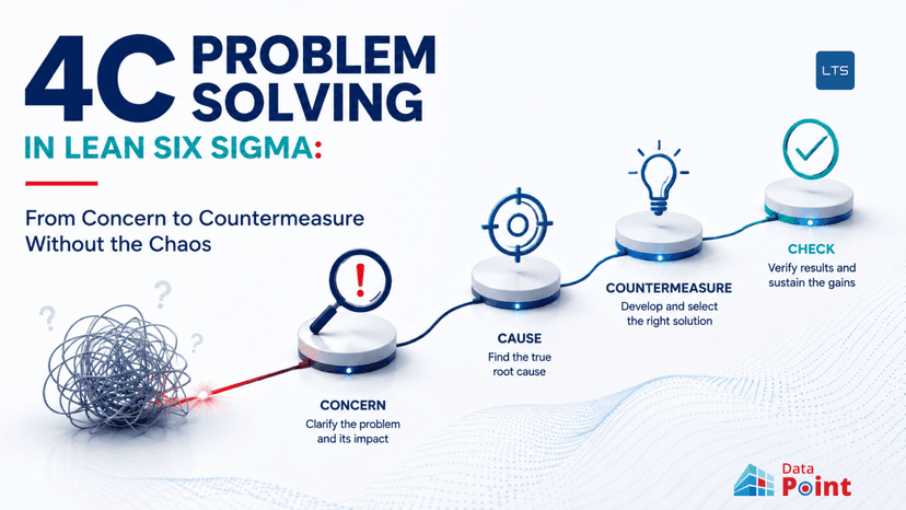
- Encourage continuous improvement: Structured documenting aids PDCA, Lean Daily Management, and a culture of continuous improvement.
- Offers transparency: Clear visibility across processes creates trust and lowers uncertainty among teams and leaders.
- Strengthens strategic execution: Without proper reporting, strategies remain on paper. Management reports convert strategy into quantifiable actions.
Key components of management reporting
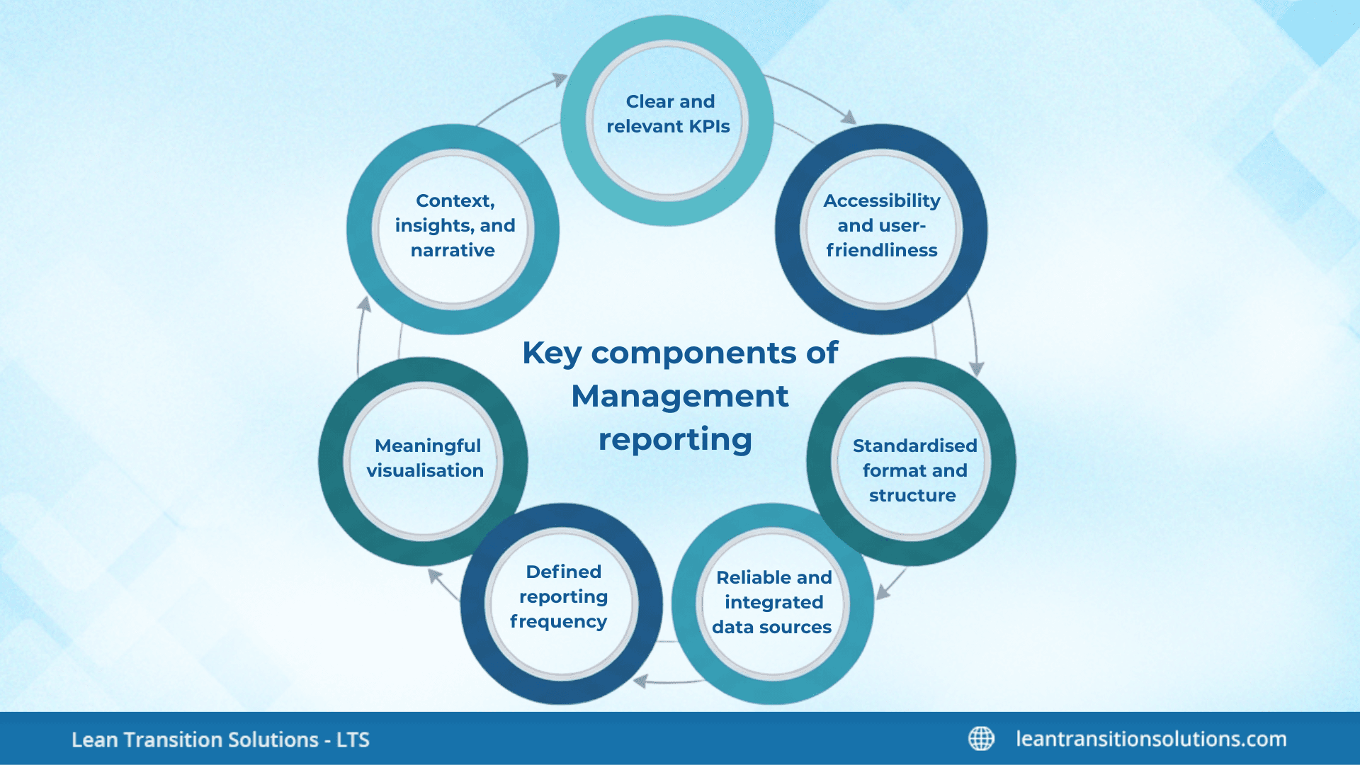
- Clear and relevant KPIs: Effective management reporting starts with KPIs that truly mirror industrial goals and operational priorities. These KPIs must be aligned with strategic aims, measurable in a consistent manner, and practical so managers can respond quickly when performance shifts. They should provide a balanced view across quality, cost, delivery, safety, people, and growth, and each KPI must have a clear owner responsible for monitoring and enhancing it.
- Reliable and integrated data sources: Strong reporting depends on precise data drawn from unified and authentic sources such as ERP, MES, HR systems, and shopfloor tools. When data is updated in real time or near real time, managers can react faster and make more data-driven decisions. Standardised data definitions and automated data capture reduce confusion and human error, while audit trails help ensure data integrity.
- Meaningful visualisation: It is pivotal because it turns raw information into insights that can be comprehended immediately. Effective reports use charts, dashboards, and scorecards that clearly show performance against goals, brings out deviations, and expose trends over time. Clean layouts, colour-coded signals, and drill-down options help managers interpret the data quickly without unnecessary clutter.
- Defined reporting frequency: An effective reporting system gives information at the right speed so that problems are addressed before they escalate. Day-to-day documenting aids shopfloor decision-making, weekly reviews help leaders analyse departmental performance, and monthly reports offer a broader view of financial and operational trends. Quarterly reports keep an eye on strategic progress, while live dashboards provide instant visibility into critical metrics and alerts.
- Context, insights, and narrative: Numbers on their own do not result in well-informed decisions; the real value comes from the explanation behind them. Every report should clearly state why the metric has changed, what risks or opportunities the change presents, and what actions need to be taken next. Adding narrative and context makes the document meaningful, actionable, and easier to communicate to teams.
- Standardised format and structure: Using a consistent structure makes sure that reports are easy to read, compare, and assess over time. A standard format typically includes overview of KPIs, evaluation of trends and variances, root cause analysis, action plans, and clear accountability. This uniformity minimises ambiguity and assists managers prioritise insights rather than deciphering layouts.
- Accessibility and user-friendliness: Reports are only effective when people can easily access and use them. Digital dashboards that work across devices make it simple for teams to see the information they need, while role-based views make sure that each user sees KPIs important to their duties. Searchable, interactive designs with drill-through abilities make data more engaging and reasonable for decision-makers.
Management reports: Different types you must know
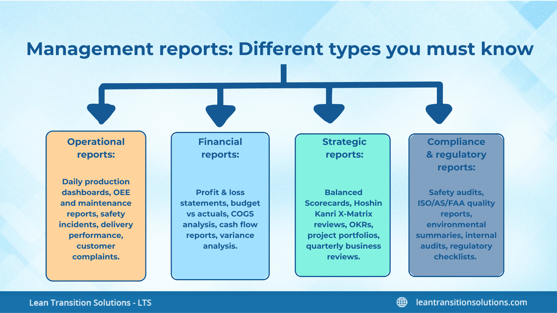
- Operational reports: Monitor the day-to-day activities of the industry and help leaders verify processes are running smoothly. They underline live performance, bottlenecks, and problems that need immediate attention. Examples: Daily production dashboards, OEE reports, maintenance updates, safety incident logs, delivery performance, and customer complaint summaries.
- Financial reports: Show the organisation’s financial health and support decisions related to budgeting, cost control, and profitability. They offer clarity on revenue, expenses, margins, and cash flow. Examples: Profit and loss statements, budget vs actual reports, COGS breakdowns, cash flow summaries, and variance assessments.
- Strategic reports: Aims on long-term goals and progress toward initiatives. They aid leaders align teams, track priorities, and examine whether the industry is moving in the right path. Examples: Balanced Scorecards (BSCs), Hoshin Kanri X Matrix updates, OKR reviews, project portfolios, and quarterly business reviews.
- Compliance and regulatory reports: Ensure the industry meets required standards, certifications, and legal obligations. They assist in minimising risks and maintain operational integrity. Examples: Safety compliance audits, ISO/AS/FAA quality reports, environmental impact summaries, internal audit logs, and regulatory checklists.
Step-by-step guide to create a management report
Let's get to the most awaited part – steps to create an effective management report. Knowing why you need it does not complete everything. Knowing how to prepare a management report is also a must. Let's see how:
Define the objective and audience
- Decide why this report exists (inform, escalate, recommend action, monitor strategy) and who will use it – frontline managers, executives, or both.
- Specify the decisions the report must support so every data point ties back to those decisions.
- Set the reporting rhythm (daily, weekly, monthly, live) and the delivery channel (dashboard, PDF, email).
Choose the right KPIs and metrics
- Select 3-5 KPIs that are aligned with the goal and practical for the audience.
- Make sure each KPI has a clear definition, unit of measure, data owner, and target or threshold.
- Include a mix of leading indicators and lagging indicators so the report indicates status and forecasts future performance.
Identify and gather data sources
- List the systems that hold the required data (ERP, MES, CRM, spreadsheets, manual logs) and the specific fields you’ll extract.
- Pick automated feeds or integrations; if manual entry is required, build simple templates and validation rules to minimise errors.
- Log data refresh frequency and any known gaps or assumptions so users understand data freshness.
Clean, validate, and transform the data
- Standardise names, units, and time periods across sources to make sure same category comparisons.
- Confirm data with quick checks (summaries, min/max, null counts) and highlight anomalies for review.
- Apply simple transformations – aggregates, rolling averages, or variance calculations – that make the metrics decision-ready.
Design the report logically
- Begin with a one-line executive summary that states the status and recommended action.
- Place high-level KPIs and key indicators at the top, followed by trend charts, variance analysis, and a short root-cause section.
- Complete the clear actions, owners, and deadlines so the document becomes a driver of accountability.
Visualise for clarity and speed
- Use chart types that fit the data: line charts for trends, bar charts for comparisons, and gauges or traffic lights for target status.
- Keep visuals uncluttered – label axes, show targets or benchmarks, and offer short captions explaining what the chart means.
- Allow drilldowns or links for users who need the detail behind the summary visuals.
Add narrative and insight
- Explain why numbers moved, not just what moved; call out risks, opportunities, and likely impacts.
- List prioritised recommendations (what to do), the owner (who will do it), and the timeframe (by when).
- If uncertainty exists, state it and note the data or analysis required to lower the uncertainty.
Review and quality-assure the report
- Run a quick peer review with one stakeholder to check accuracy, readability, and practicality.
- Verify that calculations match source systems and that visuals render correctly on the chosen device.
- Keep a version history or change record to track edits and who approved them.
Distribute and present appropriately
- Publish the document through the agreed channel and format (interactive dashboard for operations, PDF summary for executives).
- When displaying, lead with the one-line summary and recommend actions, then use the rest of the report for supporting detail.
- Capture decisions and assigned actions from the meeting back into the report as follow-ups.
Iterate and improve
- Collect feedback from users after each cycle – what's missing, what’s noisy, what’s unnecessary.
- Tune KPIs, visuals, and cadence based on usage and business changes; reports should evolve with the industry.
- Periodically retire metrics that no longer inform decisions and replace them with more relevant measures.
Streamlined management reporting relies on automation, accuracy, and alignment with business goals. Automated data capture and real-time dashboards reduce manual effort and errors, while consistent data standards ensure reports remain trustworthy. Focusing only on KPIs that support strategic and operational priorities keeps reports clear and meaningful, supported by simple visuals, standardised templates, and role-based access. Adding context, explaining performance shifts, and recommending actions turn reports into practical decision-making tools, and regularly reviewing metrics ensures reporting stays relevant as the organisation evolves.
Get expert guidance on how to do effective management reporting with LTS Data Point
Tools and templates to make your management reporting simple and easy: LTS Data Point edition
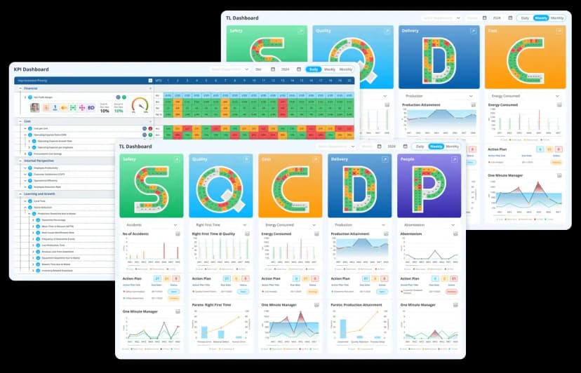
- Balanced Scorecard: Provides ready-made scorecard templates for Safety, Quality, Delivery, Cost, and People (SQDCP), assisting teams in KPI tracking in a structured, visual format.
- Live KPI dashboards: Offers interactive dashboards with drilldowns, trend charts, and traffic-light indicators, making it easy to monitor performance at the shopfloor, departmental and leadership levels.
- Hoshin Kanri X Matrix tool: Includes a digital X Matrix template that connects strategic goals, annual objectives, metrics, and improvement initiatives in one integrated view.
- Daily Management (LDMS) templates: Supplies digital templates for daily accountability boards, tier meetings, action logs, and escalation boards – automating daily operational reporting.
- Integrated CAPA and root cause reporting tool: Simplifies problem tracking with pre-built templates for 5 Why, Fishbone diagram, corrective actions, and closure validation, all connected to KPI performance.
- Skill matrix and workforce reporting: Offers colour-coded skill matrices and training dashboards that streamline competency monitoring and manpower planning.
- Real-time production and operational reporting: Uses digital production boards, OEE dashboards, downtime logs, and shift reports to eliminate manual reporting and deliver precise operational insights instantly.
- Automated email and PDF generator: Enables scheduled or event-triggered distribution of daily, weekly, or monthly reports with consistent formatting.
- Data integration and consolidation tool: Pulls data automatically from ERP, MES, and other systems into a unified reporting environment, removing the need for spreadsheet consolidation.
- Customisable report templates library: Provides downloadable templates for management reviews, KPI decks, monthly performance summaries, strategy execution updates, and audit reports.
Management reporting doesn’t have to be complicated. With the right approach, clear KPIs, and a few smart tools, you can turn data into decisions that actually make a difference. Start small, keep reports focused, and build on what works. The goal isn’t just to share numbers – it’s to give your team the insight they need to act quickly and confidently. Ready to make reporting easier? Try out the tips and templates in this guide and see how much time and stress you can save.
FAQs
1. What is the difference between management reporting and financial reporting?
Management reporting focuses on operational and strategic insights for internal decision-making, while financial reporting is for external stakeholders and compliance.
2. How often should management reports be updated?
It depends on your business needs – daily for operations, weekly for performance reviews, and monthly or quarterly for strategic updates.
3. Can management reporting be automated?
Yes. Modern BI tools and ERP integrations allow automated data collection and real-time dashboards, reducing manual effort and errors.
4. What industries benefit most from management reporting?
All industries benefit, but manufacturing, healthcare, retail, and finance rely heavily on management reporting for efficiency and compliance.
5. What skills are needed to create effective management reports?
Data analysis, KPI selection, visualisation design, and storytelling are key skills for creating reports that drive decisions.
6. How does management reporting support continuous improvement?
By highlighting trends, variances, and root causes, reports help teams identify issues early and implement corrective actions quickly.
7. What are common mistakes in management reporting?
Including too many metrics, ignoring data validation, poor visualisation, and lack of actionable insights are common pitfalls.