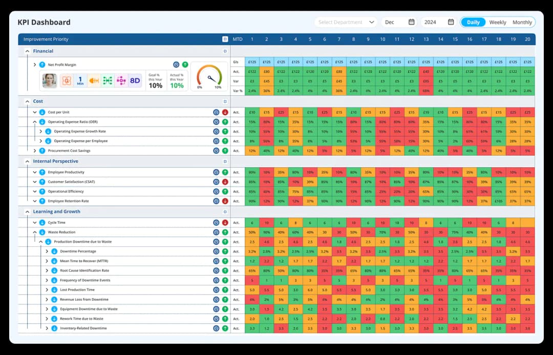
KPI Tracking Software- Not just to track, but fix the broken KPIs
LTS Data Point is the only KPI (Key Performance Indicator) Tracking software that connects strategic goals to shop-floor execution with built-in Lean tools for root cause analysis and corrective actions. Transform your KPIs from static numbers into live, actionable insights by connecting strategy, operations, and continuous improvement.
One Platform for Every KPI, Every Role.
Leave behind spreadsheets, manual updates, and disconnected tools. Use one live KPI system where leaders, managers, and frontline teams work together to connect strategy to daily execution.


Why is LTS Data Point the Best KPI Tracking Software?
Most KPI tools show what happened. LTS Data Point shows what to do next. Beyond visualisation, this intelligent KPI tracking software automates reports, delivers deep analysis, and makes built-in action plans for continuous KPI improvement.
95%
KPI Accuracy
Real-time data sync 100+ Data Sources - ERP, CRM, MES, SharePoint & more. No manual errors.
50+
Frameworks Built-In
From SQDCP to FCIL — tailor your KPI views for any industry or department.
$1.8 M
Average Annual Savings
Through automation and reduced reporting time
From 5-Hour Meetings to 2-Hour Wins
"With LTS Data Point, monthly review meetings dropped from five hours to just over two, giving 71 leaders clear visibility of KPIs"
Vice President of Operations
Manufacturing & Infrastructure Solutions
Turning Strategy into a Daily Habit
"Earlier, strategy reviews were disconnected. Now every department track bowler charts monthly as part of a regular rhythm. The simplicity of LTS Data Point helped everyone adopt it quickly. "
Director of Continuous Improvement
Industrial Manufacturing
Visibility That Reached the Boardroom
"We no longer spend meetings asking what happened; it’s all right there, traceable and visual. Our President now shares KPI dashboards directly with the Board and CEO"
Plant Manager
Heavy Equipment Manufacturing
Multiple KPI Tools Brought Together in One system
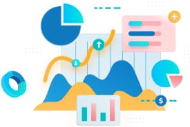
KPI Data Visualisation
Transform complex data into intuitive graphs or summary scorecards.
Explore More
KPI Analytics & Reports
Analyse KPI trends across any time period makes automated reports.
Explore More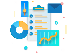
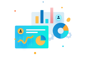
KPI Bowling Chart
Visualise your progress toward goals with the Balanced Scorecard framework.
Explore MoreNot Sure Where to Begin? You don’t need to.
Get personalized guidance and support to kickstart your KPI journey.
Talk to our Expert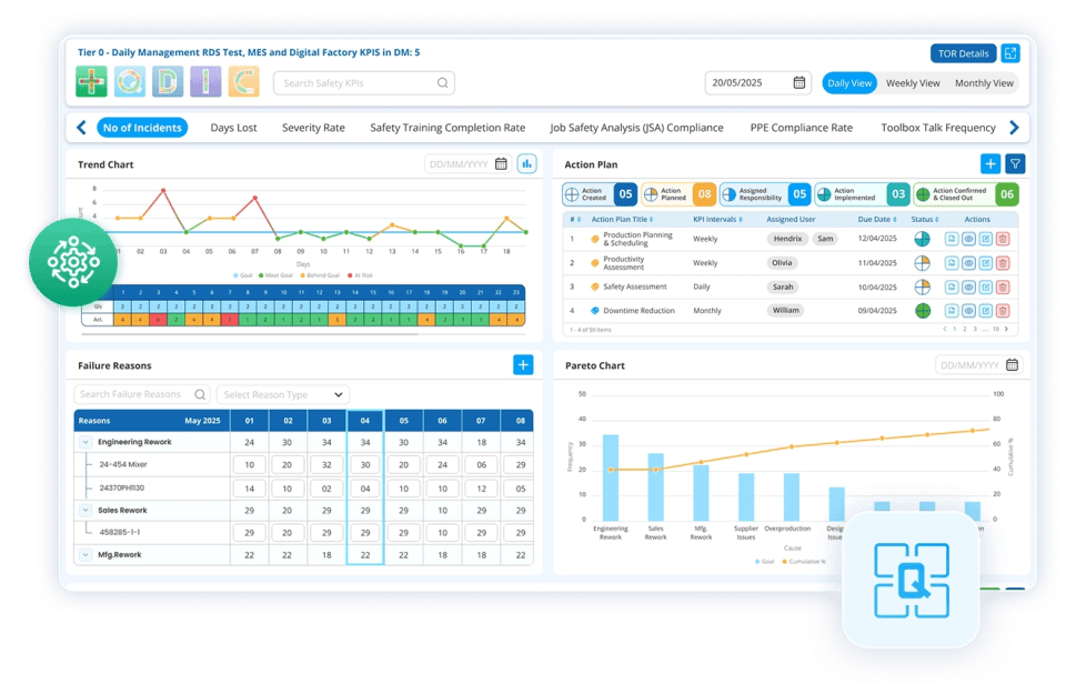
Transform How You Track and Improve KPIs with LTS Data Point

Automated Data Aggregation
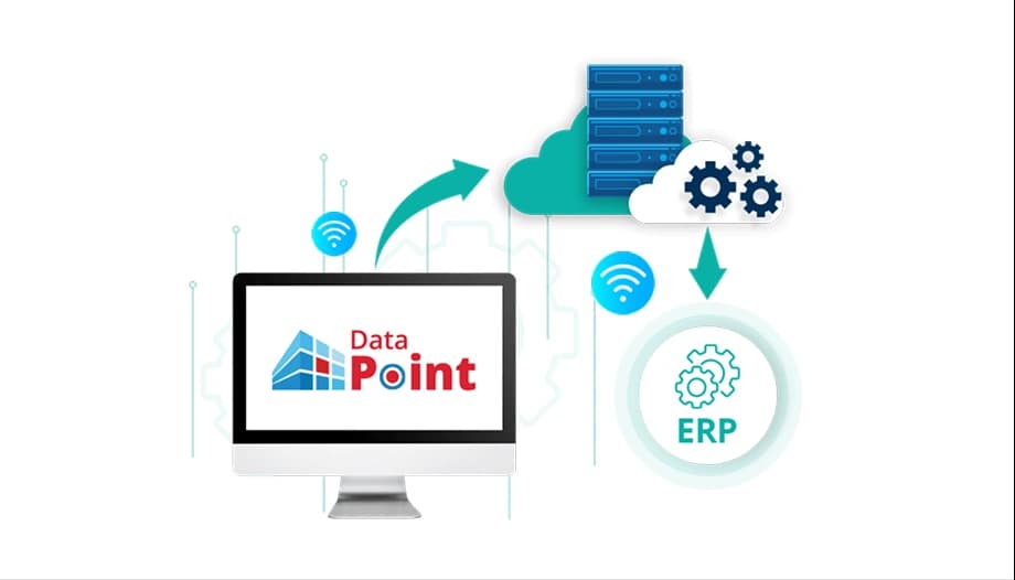
Connect to 100+ data sources (ERP, CRM, Databases, Spreadsheets, APIs) automatically.

Single Source of Truth
Everyone in your organisation sees the same, real-time numbers on beautifully simple dashboards.

Real-Time KPI alerts
Monitor performance live. Get alerts the moment a KPI trends off target.

Collaborative Insights
Annotate, discuss, and assign actions directly on the dashboard to drive accountability.
How the KPI tracking software Works?
Here is your path to data-driven performance with the KPI reporting software in 3 simple steps.

Connect & Consolidate
Securely connect to your essential business systems. Our setup wizards get you to live in days.

Define & Visualise
Choose from 50+ pre-built KPI templates or build your own. Drag and drop to create custom dashboards.

Analyse & Act
Spot trends, identify root causes, and set up automated alerts, and make confident decisions.
Why choose LTS Data Point over other KPI systems?
Unlike generic BI dashboards that just show charts, Data Point helps teams act fast and fix what’s broken with the best KPI dashboards. Already using BI tools? Integrate them with Data Point and unlock twice the clarity and control.
| Capability | LTS Data Point | Generic BI Tools | Static Spreadsheets |
|---|---|---|---|
| KPI Focus | Pre-built & Custom KPIs | Generic Charts | Manual Formulas |
| Ease of set up | Days (Guided Wizards) | Weeks/Months (Complex) | Ongoing Manual Work |
| Real-Time Data | Yes (Automated) | Often Manual Refresh | No |
| Lean Integration | Built-in Hoshin, 8D, Fishbone | Manual Process | No Standard Framework |
| Action Orientation | Automated Action Plans, Collaboration and alerts | Static Reporting | Manual Follow-ups |
| Strategic Alignment | Digital X-Matrix & Bowling | Basic Goal Setting | Disconnected |
| Industry Specific | SQCDP, FCIL Templates | Generic Metrics | Custom Built |
| Problem Resolution | Structured Workflows | Data Visualisation Only | Ad-hoc |
| Total Cost of Ownership | Predictable Subscription | High (License + IT Time) | Very High (Labor Hours) |
Core Features That Make KPI Management Platform Stand Out
Explore how LTS Data Point transforms KPI tracking into smarter decisions and continuous improvement.

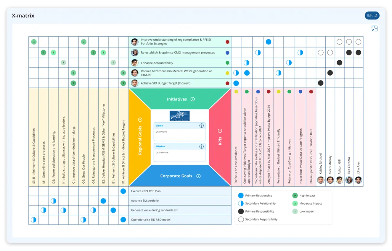
Strategy & Hoshin Kanri
Connect daily activities to strategic objectives with the Catchball process for organisational alignment
- Digital Hoshin Kanri X-Matrix for planning and deployment
- Objective Flow Chart to map dependencies and priorities
- Line of Sight Alignment from leadership to teams
See Real-World Results: How does KPI software Impact Organisations?
Explore how leading organisations are transforming KPI tracking into a measurable impact. Here are real case studies of organisations using LTS Data Point KPI Tracking Software across industries.
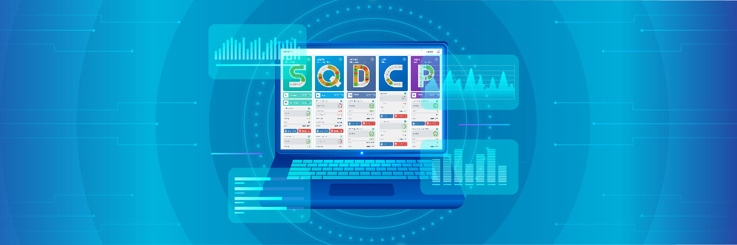
PCI Pharma streamlined continuous improvement efforts
PCI Pharma Services' Bridgend facility in the UK can easily track, monitor, and evaluate their SQDCP metrics with Data Point in-depth analysis of KPIs.
Result: Improved issue resolution speed by 67% through proactive KPI tracking.
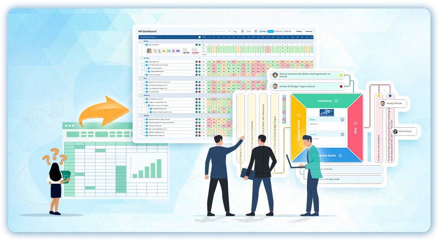
Aerospace company achieved real-time KPI visibility with digital Hoshin Kanri
A UK-based aerospace and defence manufacturer implemented Data Point Digital Hoshin Kanri X-Matrix to connect KPIs with daily execution.
Result: Achieved 95% strategic goal alignment through end-to-end visibility.
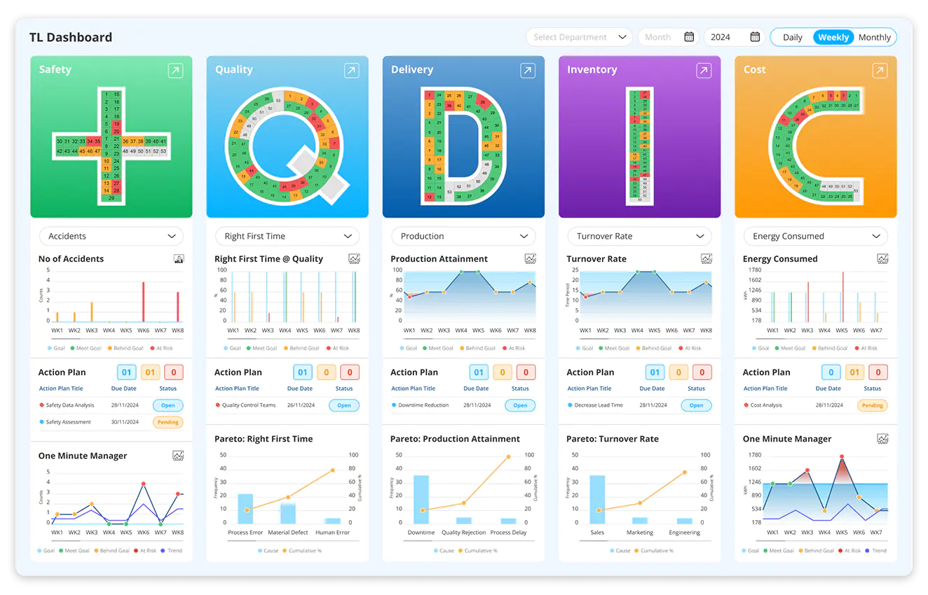
Food Manufacturer Cut Downtime by 25% with KPI Dashboards
A mid-sized US-based food and beverage manufacturer integrated real-time data and advanced KPI dashboard to overcome manufacturing issues.
Result: Reduced quality incidents by 42% with structured KPI monitoring.
Real-world organisations are improving with LTS Data Point. It’s your turn.
KPI Tracking Software: The Complete Guide to Real-Time Performance Management and Continuous Improvement
Learn how KPI Tracking software helps automate data collection, monitor performance in real time, trigger corrective actions, align KPIs with business goals, and drive continuous improvement across teams and sites.
How does automated data aggregation from 100+ sources eliminate the manual reporting cycle?
Manual KPI reporting follows a predictable pattern. Someone requests data from multiple systems. Another person compiles it into a format suitable for review. By the time it reaches a dashboard or a meeting, it is days old and the people who produced it have spent hours on preparation that adds no analytical value.
Automated aggregation from ERP, MES, CRM, SharePoint, databases, and spreadsheets removes that cycle entirely. Data flows into the platform continuously rather than being pulled and consolidated on a schedule. The KPI values on the dashboard reflect the current state of the operation, not the state it was in when someone last ran an export. For operations where the gap between a performance event and its appearance in a management report is currently measured in days, that reduction in latency is what makes the dashboard a management tool rather than a historical record.
How do real-time KPI alerts change the response time between a deviation and a corrective action?
A deviation that is visible at the moment it occurs creates a different response window from one that surfaces in a weekly report. The corrective action started on day one of a deviation looks very different from the same action started on day seven.
Real-time KPI alerts fire the moment a metric trend off target. The relevant owner is notified immediately, not at the next scheduled review. For organisations where monthly review meetings have historically been the primary mechanism for identifying underperforming KPIs, this shifts the response from reactive and periodic to immediate and continuous. The practical outcome is that deviations are contained earlier, the gap between target and actual is smaller by the time it is addressed, and the corrective action is working with fresher context about what caused the deviation. This is particularly relevant for maintenance-specific metrics like MTBF and MTTR, where the gap between a failure and the response directly drives cost - see our guide to KPIs for maintenance managers for the metrics that benefit most from this kind of real-time visibility.
How does KPI hierarchy and drill-down capability support tiered review across different organisational levels?
A plant manager and a department supervisor need different levels of detail from the same KPI data. The plant manager needs a consolidated view across all departments. The supervisor needs the department-level breakdown that sits behind it. A system that shows both the same view is giving one of them information that is too granular and the other information that is not granular enough.
KPI hierarchy with drill-down allows leadership to start from a summary view and move into site, department, or asset-level detail within the same platform. A metric that appears amber at site level can be investigated to the department where the deviation is concentrated without switching systems or requesting a separate report. For organisations running tiered review structures, this means each tier is working from the appropriate level of detail rather than either drowning in granularity or missing the underlying cause of a summary-level signal. This same principle extends to how dashboards themselves are built , see our guide on creating custom KPI dashboards for different roles and teams.
How does the platform support organisations already using Power BI or other BI tools?
Replacing an existing BI investment is rarely the right conversation. Organisations that have built dashboards and reports in Power BI have embedded significant configuration and institutional knowledge into those tools. The question is not whether to replace them but whether they are sufficient on their own.
Power BI produces charts and visualises. It does not generate automated action plans for underperforming KPIs, trigger structured root cause investigations, or connect daily performance to strategic deployment frameworks. Integrating Power BI with the platform means the existing visualisation investment is preserved while the action orientation, lean tooling, and strategic alignment layer is added on top. The BI tool continues to do what it does well. The platform adds what BI tools do not do by design. For a broader look at what a business intelligence dashboard is and how it fits into performance management generally, see our complete guide
How does a single source of truth change how multi-site organisations manage KPI data?
Multi-site organisations running separate systems at each location face a specific problem at review meetings. Each site presents its own data in its own format. The conversation becomes a reconciliation exercise before it can become a decision-making one. Differences in how KPIs are defined, calculated, and reported across sites mean numbers that look comparable often are not.
A single platform where every site’s data flows into the same structure produces a genuinely comparable picture. A KPI defined the same way, calculated the same way, and displayed the same way across all locations means the regional or group-level review is working from a consistent baseline. Drill-down from regional aggregate to site level to department level is available in the same view, which means a leadership team can move from a consolidated picture to a specific site’s performance without requesting a separate report from that location.
How does automated action plan creation for failed KPIs close the gap between identifying a problem and managing the response?
Most KPI review end with a list of underperforming metrics and a verbal commitment to investigate. That commitment rarely has a formal owner, a deadline, or a defined scope at the point is made. The follow-up at the next review starts from the same place: the KPI is still underperforming and the action from last time was never formally tracked.
Automated action plan creating means that when a KPI fails, the platform generates a structured response immediately. Ownership is assigned. A deadline is set. The action is linked to the specific KPI it was created to address. Progress is tracked in the same system where the KPI is monitored, so the connection between the underperforming metric and the corrective effort is visible and accountable. The review meeting at the following cycle is not starting from a verbal recollection of what was agreed. It is starting from a documented record of what was committed and whether it was done.
How does the KPI bowling chart connect daily performance to strategic goals?
A KPI dashboard that shows operational performance without connecting it to strategic objectives creates a visibility gap at leadership level. The operation knows whether it hit its daily targets. Leadership cannot easily see whether hitting those targets is moving the organisation toward its annual goals.
The KPI bowling chart visualises progress toward goals within the Balanced Scorecard framework, showing month-by-month performance against the strategic plan rather than isolated point-in-time snapshots. For organisations running Hoshin Kanri planning cycles, the Bowling Chart is where the X Matrix objectives become measurable in practice. Each strategic goal has a trajectory. Each monthly actual either confirms the organisation is on track or signals that the plan needs to be revisited. That connection between daily operational performance and annual strategic commitment is what turns a KPI system from a reporting tool into a strategic management one.
How does escalation flagging prevent underperforming KPIs from being carried forward without resolution?
The most common failure mode in KPI reviews is not that problems go unnoticed. It is that they get acknowledged, noted as ongoing, and deferred to the next review without a defined resolution path. The same underperforming metric appears in three consecutive meetings with progressively less urgency attached to it because familiarity has replaced accountability.
Escalation flagging creates a visible record of issues that have been carried over between reviews without resolution. An issue that has been open for two cycles without a verified corrective action is not treated the same as one that was identified this week. The system surfaces the pattern rather than allowing it to be absorbed into the background noise of a long agenda. For teams running continuous improvement programmes alongside daily KPI management, this also means systemic issues that are appearing repeatedly in the KPI data are flagged for structured investigation rather than managed indefinitely through the same review cycle. Pairing this escalation data with a gemba board gives teams a visual, physical complement to the digital alerts, reinforcing accountability directly on the shop floor.
Hear it from our customers

MARC ROBINSON
Director, Global Operational Excellence


“By providing a central location to input, analyse and share our KPIs, 'Data Point' enables site management to more easily focus on the entire business as a team. Its ability to allow automated data entry and trend analysis gives us more time for improvement rather than just reporting numbers. Combined with a disciplined approach within our SQDC meeting process, I believe 'Data Point' will help us continually focus on key issues and drive business excellence in all areas.”
Start Your Free Trial to See the Difference
Build Your KPI Dashboards in Minutes & See how your KPIs perform live in 7 days