Data visualisation tool trends in 2026: From static dashboards to real-time decision intelligence
Last updated on : April 1, 2026
Imagine trying to run a city using yesterday’s traffic camera snapshots. You might see where congestion happened, but you wouldn’t know where it’s building right now – or which signal needs adjusting. That's how many organisations still treat performance data. A modern data visualisation tool in 2026 isn’t just a static map of what already occurred; it functions more like a live urban control room – connecting signals, spotting patterns as they emerge, and helping leaders respond before minor slowdowns become systemic gridlock. The innovation shift isn’t about prettier dashboards. It's about moving from delayed visibility to coordinated, real-time performance clarity.
Explore how LTS Data Point connects KPIs, governance, and execution in one system
Why the data visualisation tool is shifting from reporting to real-time performance monitoring in 2026
For years, organisations relied on dashboards as retrospective reports – useful but delayed. In 2026, that model is no longer sufficient. A modern data visualisation tool is evolving from static reporting software into a real-time performance monitoring system that actively supports decision-making.
Here's what’s driving the shift:
1. From static dashboards to real-time data dashboards
- Traditional dashboards show what happened last week or last month
- Modern real-time data dashboards display live key performance indicators (KPIs) as operations unfold
- Alerts and visual indicators highlight deviations instantly
- Leaders can intervene early instead of reacting after impact
Static visibility is being replaced by continuous performance awareness.
2. The rise of live operational dashboards
- Operations teams now rely on live operational dashboards for daily execution
- Production, quality, supply chain, and service metrics update dynamically
- Cross-functional teams view the same performance indicators simultaneously
- Decision cycles shorten because data does not need manual consolidation
Dashboards are no longer presentation tools – they are operational control panels.
3. The challenges of manual reporting and spreadsheet-based reporting risks
- Manual data collection slows down reporting cycles
- Version control issues create confusion across departments
- Spreadsheet-based reporting risks include formula errors and inconsistent KPIs
- Reporting often becomes backward-looking rather than action-oriented
As data volume increases, manual reporting models simply do not scale.
4. The growing need for live performance monitoring
- Markets shift faster in 2026 than ever before
- Delayed visibility leads to missed opportunities and compounding problems
- Real-time performance monitoring enables proactive management
- Teams can track leading indicators, not just lagging results
Organisations are prioritising immediacy over periodic review.
5. Addressing dashboard fatigue
- Too many disconnected dashboards overwhelm decision-makers
- Conflicting KPIs reduce trust in data
- Over-designed visualisations obscure what truly matters
- A consolidated data visualisation tool reduces noise and improves clarity
The shift isn’t about more dashboards – it's about smarter, connected visibility that supports action.
What defines a modern data visualisation tool in 2026?
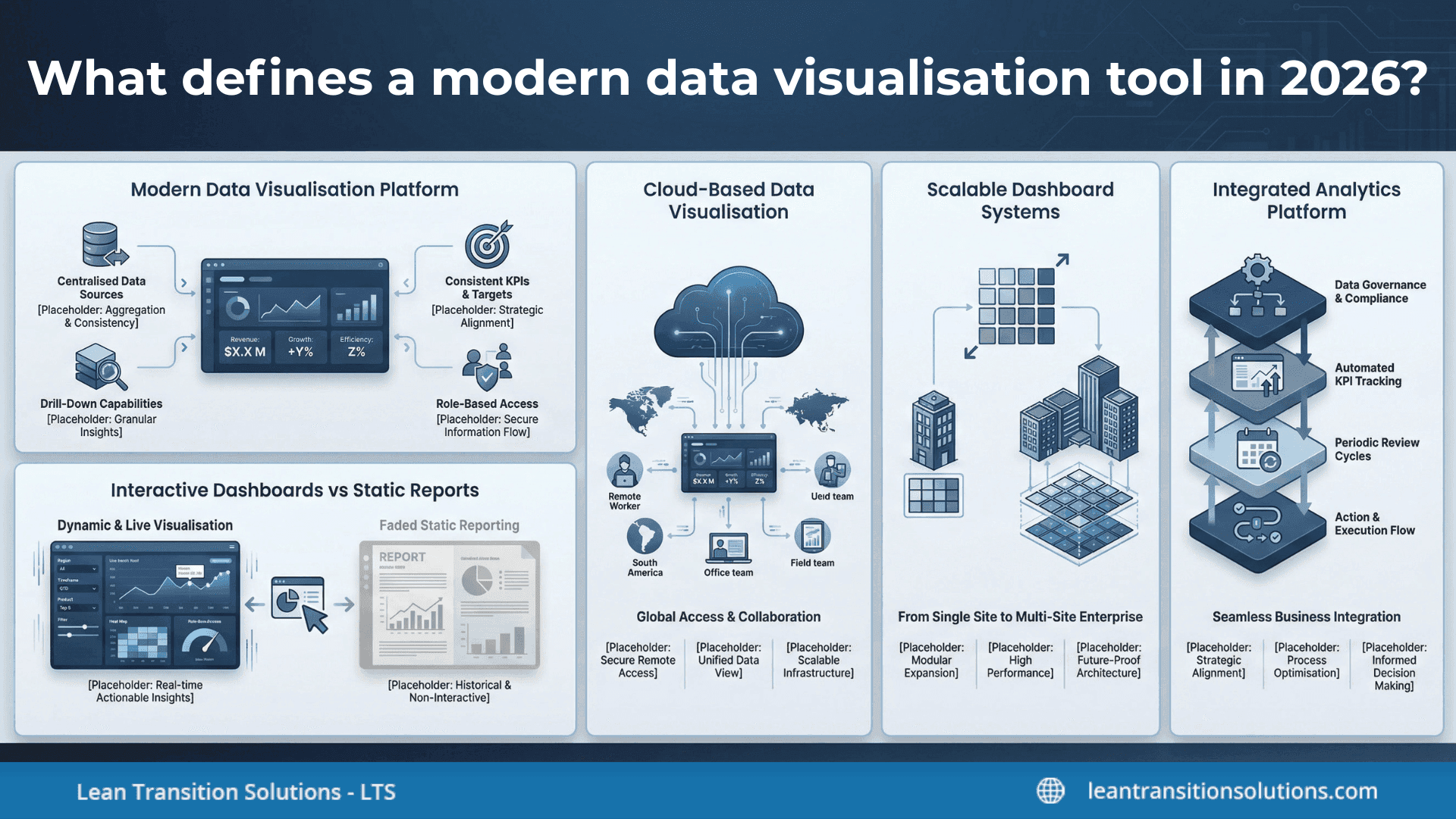
A modern data visualisation tool in 2026 is no longer defined by attractive charts alone. It is defined by how well it connects data, scales across the organisation, and supports continuous performance visibility – not just periodic reporting.
Here's what separates modern platforms from legacy reporting tools:
1. Characteristics of a modern data visualisation platform
- Centralises data from multiple operational systems
- Provides consistent KPI definitions across departments
- Enables drill-down from summary metrics to root causes
- Supports role-based access for executives, managers, and frontline teams
- Aligns visual metrics with measurable business objectives
A modern data visualisation platform focuses on clarity, consistency, and decision relevance.
2. Interactive business dashboards vs static reports
- Interactive business dashboards allow filtering by site, time period, product, or function
- Users can drill into variances without requesting new reports
- Performance trends update dynamically as data changes
- Static reports, by contrast, freeze information at a single point in time
In 2026, dashboards are expected to be explorable – not just viewable.
3. Cloud-based data visualisation
- Enables remote access across distributed teams
- Reduces dependency on on-premises infrastructure
- Supports faster updates and system-wide visibility
- Simplifies integration with other digital systems
Cloud-based data visualisation ensures that performance data is accessible wherever decisions are made.
4. Scalable dashboard systems
- Designed to support growth from a single site to multi-site operations
- Handles increasing data volumes without slowing performance
- Maintains KPI consistency across locations
- Adapts to new business units, products, or processes
Scalability is no longer optional – it is essential for enterprise-wide performance management.
5. Embedded within a broader integrated analytics platform
- Connects operational data with strategic objectives
- Links KPI tracking with performance governance workflows
- Reduces data silos by integrating across systems
- Supports structured review cycles and execution tracking
In 2026, a data visualisation tool does not operate in isolation. It functions as part of an integrated analytics platform that connects visibility, accountability, and execution.
How a data visualisation tool improves cross-functional and multi-site visibility
As organisations grow, complexity increases. Different departments track different metrics, and multi-site operations often rely on disconnected systems. A structured data visualisation tool helps unify this landscape – turning fragmented reporting into coordinated visibility.
Here's how:
1. Solving data silos in organisations
- Consolidates performance data from production, quality, supply chain, and finance
- Standardises KPI definitions across departments
- Reduces dependency on isolated spreadsheets and local trackers
- Creates a single, reliable performance view
By addressing data silos in organisations, visibility becomes shared rather than departmental.
2. Enabling cross-functional data visibility
- Allows leadership teams to view performance across functions in one interface
- Highlights how one department’s metrics influence another
- Encourages accountability through shared KPI ownership
- Supports structured performance review meetings with consistent data
Cross-functional data visibility shifts conversations from blame to coordinated action.
3. Benefits of data visualisation tool for multi-site operations
- Compares KPIs across locations using consistent benchmarks
- Identifies high-performing sites and improvement opportunities
- Supports regional and global performance roll-ups
- Reduces manual consolidation from individual site reports
A data visualisation tool for multi-site operations ensures performance alignment without increasing reporting burden.
4. The importance of a centralised reporting system
- Eliminates duplicate data entry across teams
- Provides one source of truth for executive reporting
- Ensures real-time updates across all locations
- Improves auditability and traceability of performance data
A centralised reporting system strengthens data integrity and speeds up decision-making.
5. Strengthening operational transparency tools
- Makes KPI trends visible to both leadership and operational teams
- Clarifies performance ownership at site and function level
- Surfaces deviations early to enable corrective action
- Builds a culture of measurable accountability
In 2026, transparency is not optional. A modern data visualisation tool acts as a structured operational transparency tool – connecting sites, functions, and strategy within a unified performance view.
Choosing the right data visualisation tool for enterprise performance management
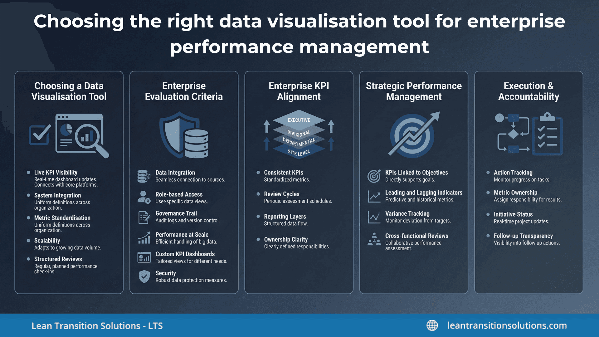
Not every data visualisation tool is designed for enterprise-scale performance management. In 2026, selection decisions must go beyond interface design and focus on governance, scalability, and execution alignment.
Here’s how to evaluate the right fit:
1. How to choose a data visualisation tool
When assessing options, industries should ask:
- Does the tool support live KPI visibility across functions?
- Can it integrate with existing operational systems?
- Does it standardise metrics across departments and sites?
- Is it scalable as data volume and business complexity grow?
- Does it support structured performance reviews – not just reporting?
Understanding how to choose a data visualisation tool means evaluating operational impact, not just visual features.
2. Evaluation criteria for enterprise data visualisation software
Enterprise environments demand more than basic dashboards. Key evaluation criteria include:
- Robust data integration capabilities
- Role-based access controls
- Governance and audit trails
- Performance at scale
- Custom KPI dashboards
- Security and compliance readiness
Enterprise data visualisation software must support both visibility and control.
3. Aligning with enterprise KPI dashboard software needs
A data visualisation tool should integrate seamlessly with broader enterprise KPI dashboard software requirements:
- Consistent KPI definitions across the organisation
- Structured monthly and quarterly review cycles
- Site-level and executive-level reporting layers
- Clear ownership for each metric
Without alignment, dashboards remain disconnected from performance management processes.
4. Supporting strategic performance management
Modern industries require visibility that connects operations to strategy. The right tool should:
- Map KPIs to strategic objectives
- Track both leading and lagging indicators
- Provide variance analysis and trend tracking
- Support cross-functional performance reviews
Strategic performance management depends on connecting data with direction – not just displaying numbers.
5. The role in execution tracking tools and accountability tracking software
Beyond visibility, a data visualisation tool increasingly supports:
- Action tracking linked to KPI deviations
- Defined metric ownership at department and site level
- Status monitoring for improvement initiatives
- Transparent follow-up mechanisms
When integrated with execution tracking tools and accountability tracking software, dashboards evolve into structured performance management systems.
From dashboards to decision impact: The strategic role of a data visualisation tool
In 2026, the real value of a data visualisation tool is no longer measured by how clearly it displays metrics – but by how effectively it influences decisions. Organisations are moving beyond operational reporting towards strategic data visualisation that directly shapes direction, priorities, and execution.
Here's how that shift unfolds:
1. The transition to strategic data visualisation
- Moves beyond daily operational metrics to long-term performance trends
- Connects leading indicators with strategic outcomes
- Highlights risk areas before they affect quarterly targets
- Prioritises insights that influence resource allocation
Strategic data visualisation ensures dashboards are aligned with future direction – not just historical performance.
2. Connecting to business strategy alignment tools
- Links KPIs to organisational objectives and initiatives
- Clarifies how departmental performance supports broader goals
- Makes strategic trade-offs visible through measurable data
- Reinforces cross-functional alignment through shared metrics
When integrated with business strategy alignment tools, visibility becomes structured and purpose driven.
3. Supporting performance governance frameworks
- Standardises review cycles across departments and locations
- Ensures consistent KPI definitions and ownership
- Enables traceability of performance discussions
- Supports compliance and audit readiness
Strong performance governance frameworks rely on structured, transparent performance data – not isolated reports.
4. Enabling decision support systems
- Provides trend analysis to support forward-looking planning
- Surfaces exceptions and performance anomalies early
- Offers drill-down capability for root cause analysis
- Reduces decision latency by presenting contextual data
A data visualisation tool becomes part of a broader decision support system when it actively guides action rather than simply presenting numbers.
5. Driving enterprise performance visibility
- Consolidates operational and strategic metrics into one connected view
- Aligns site-level and executive-level reporting
- Improves accountability through transparent performance tracking
- Strengthening confidence in enterprise-wide data
Enterprise performance visibility ensures leadership decisions are based on consistent, organisation-wide insight.
At this stage, a data visualisation tool evolves from a reporting interface into a strategic infrastructure layer – one that connects visibility, governance, and execution across the enterprise.
Where an enterprise-grade data visualisation tool fits in connected performance ecosystems
In complex organisations, a data visualisation tool cannot operate as a standalone dashboard layer. It must sit within a broader performance management structure – connecting visibility, governance, and execution in one coordinated environment.
This is where an enterprise-grade solution such as LTS Data Point performance management software fits within ecosystem.
1. Position within a performance management dashboard software landscape
Within the wider performance management dashboard software category, LTS Data Point performance is designed to:
- Centralise operational and strategic KPIs in one structured system
- Replace fragmented spreadsheets and disconnected reporting tools
- Provide role-based dashboards for site, regional, and executive levels
- Support consistent performance visibility across functions
Rather than functioning as a reporting add-on, it operates as a core visibility layer within the performance management architecture.
2. Designed for organisations needing operational excellence software platform capabilities
For organisations pursuing operational excellence, visibility alone is insufficient. The system must also support:
- Standardised KPI frameworks across departments
- Structured performance review workflows
- Ownership tracking for metrics and actions
- Alignment between daily operations and strategic targets
LTS Data Point performance management software is typically used when organisations require operational excellence software platform capabilities that extend beyond dashboarding into structured governance.
3. Best suited for enterprises requiring structured KPI governance
Enterprise environments demand discipline in how KPIs are defined, reviewed, and escalated. In this context, the platform:
- Enforces consistent KPI definitions across sites
- Supports defined review cycles (daily, weekly, monthly)
- Clarifies accountability at department and location levels
- Maintains traceability of performance discussions
It is best suited for enterprises that prioritise structured KPI governance rather than ad hoc reporting.
4. Functional explanation of how it supports measurable outcomes
From a functional perspective, the platform supports measurable outcomes by:
- Linking KPI visibility with structured review processes
- Connecting deviations to assigned corrective actions
- Enabling roll-up reporting from site-level to enterprise-level
- Providing a single source of truth for leadership decisions
This integration of visibility, accountability, and execution transforms a data visualisation tool from reporting interface into a connected performance management system.
In a 2026 innovation landscape, enterprise-grade data visualisation is no longer about isolated dashboards. It is about embedding structured visibility within a connected ecosystem – where performance data drives governance, alignment, and measurable results.
In 2026, the data visualisation tool is no longer defined by charts and dashboards alone – it is defined by its role in driving measurable performance. The shift from static reporting to real-time data dashboards reflects a broader transformation in how organisations manage visibility, governance, and execution. Modern platforms must solve data silos, enable cross-functional and multi-site transparency, and integrate seamlessly within structured performance management environments. For enterprises, the real value lies not in displaying KPIs, but in connecting them to strategy, accountability, and decision-making. As performance ecosystems become more interconnected, choosing the right data visualisation tool becomes less about visual appeal and more about building a scalable foundation for enterprise-wide performance clarity and sustainable outcomes.
Get expert guidance on building a connected performance ecosystem with LTS Data Point
FAQs
1. What industries benefit most from a data visualisation tool?
A data visualisation tool is particularly valuable in manufacturing, healthcare, logistics, retail, and multi-site enterprises where performance tracking spans multiple functions and locations. Industries with high operational complexity gain the most from structured, real-time visibility.
2. How is data visualisation tool different from traditional business intelligence software?
Traditional business intelligence software often focuses on data analysis and reporting. A data visualisation tool designed for performance management emphasises KPI clarity, governance, structured review cycles, and execution tracking alongside visual reporting.
3. Can a data visualisation tool integrate with existing ERP or MES systems?
Yes. Most enterprise-grade platforms are designed to integrate with ERP, MES, CRM, and other operational systems. Integration ensures consistent data flow and reduces manual consolidation efforts.
4. What common mistakes should organisations avoid when implementing a data visualisation tool?
Common mistakes include replicating spreadsheet logic in dashboards, tracking too many KPIs without prioritisation, failing to define metric ownership, and launching dashboards without structured review processes.
5. How long does it take to implement an enterprise data visualisation tool?
Implementation timelines vary based on system complexity, integration requirements, and organisational readiness. Enterprises typically phase deployment, beginning with core KPI areas before expanding across sites and functions.
6. Does a data visualisation tool replace spreadsheets entirely?
Not immediately. While a data visualisation tool reduces dependency on spreadsheets for reporting, spreadsheets may still be used for local analysis. The goal is to centralise official KPI reporting in a controlled system.
7. How does a data visualisation tool support compliance and audits?
By maintaining consistent KPI definitions, structured review records, and traceable performance data, a data visualisation tool can strengthen audit readiness and improve documentation reliability.
8. What is the ROI of investing in a data visualisation tool?
Return on investment typically comes from faster decision cycles, reduced manual reporting effort, improved cross-functional alignment, and early identification of performance deviations that prevent larger operational losses.

Abel Jiménez, Lean Consultant
Abel is a Lean Consultant with over 30 years of expertise in operational analysis, process improvement, and organisational change across Mexican industries. Currently serving as Director of Insurance Promotions at CESCEMEX, he helps organisations leverage technology and lean practices to improve efficiency and manage change with continuity.