Pareto Chart Explained: How Lean Manufacturing Teams Separate the Vital Few Causes from the Trivial Many
Learn what a Pareto chart is, how to create one, and how manufacturers use it to identify and prioritise the most significant defects and causes of downtime.
Contents
- What is a Pareto Chart, and where does the 80/20 rule actually come from?
- Why a Pareto Chart needs verified data, not an assumed ranking
- Pareto Chart Example (LTS Data Point)
- The real cost of ranking by the wrong measure
- How teams build Pareto Charts today, and where it breaks
- How to build and read a Pareto Chart
- Pareto Chart vs Fishbone Diagram vs 5 Whys: Where each one earns its place
- Common pitfalls that undermine a Pareto Chart
- How LTS Data Point automates Pareto Analysis
- Where this leaves your next Pareto Review
Last updated on : September 30, 2026
A structured way to rank problem categories by impact so operations teams can separate the vital few causes from the trivial many and decide what to fix first instead of spreading effort thin across everything at once.
A Pareto Chart is a combination bar-and-line graph that ranks problem categories from most to least significant, with a cumulative percentage line showing how much of the total each one adds. Built on the 80/20 rule, it turns a long list of defects, stoppages, or complaints into a clear answer to one question:
What should get fixed first?
On a bad week, a dozen problems compete for attention, but only a couple can realistically get fixed. A Pareto Chart cuts through that by showing exactly where the effort will pay off most.
See Pareto Analysis in Action
What is a Pareto Chart, and where does the 80/20 rule actually come from?
A Pareto Chart is a bar chart with categories ranked in descending order, paired with a cumulative percentage line that tracks the running total, reaching 100% at the last bar. The bars show category size. The line shows how much of the total is accounted for as each category is added, turning a simple comparison into a prioritisation tool.
This also distinguishes it from a histogram, which groups a continuous variable (like cycle time or tolerance) into bins to show distribution shape. A Pareto Diagram uses discrete categories, always ranked, always paired with the cumulative line.
The ranking depends on the measure used. A chart weighted by count shows which category occurs most often, not which is most costly or time-consuming. A chart weighted by cost or downtime can produce a different priority order from the same dataset.
This principle traces back to Vilfredo Pareto's 1896 observation that roughly 80% of land in Italy was held by 20% of the population. Joseph Juran adapted this to quality management in 1941, coining "the vital few and the trivial many." The pattern still holds: contributing factors are rarely distributed evenly, and identifying where they concentrate determines where corrective effort should go.
Why a Pareto Chart needs verified data, not an assumed ranking
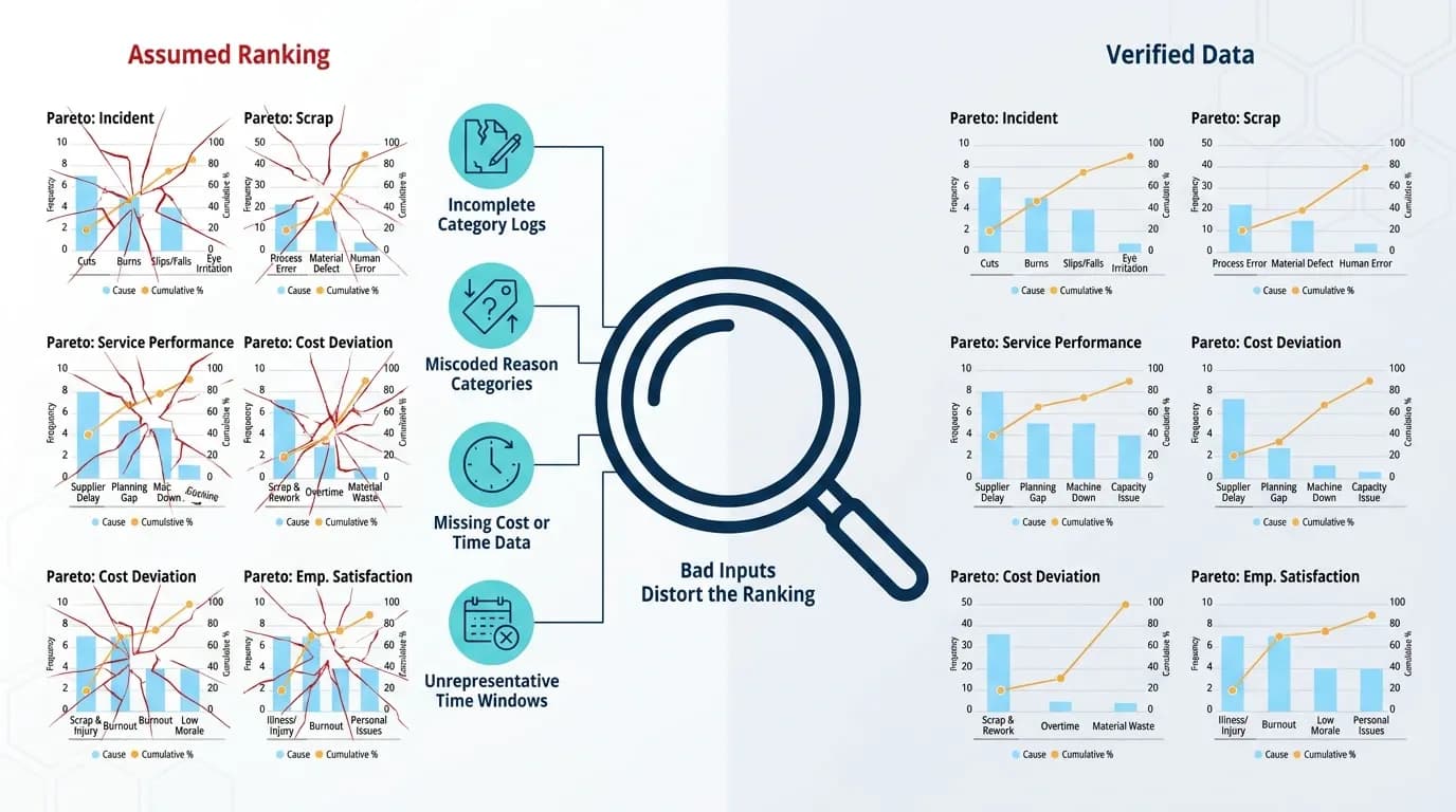
A Pareto Chart is only as accurate as the data feeding it. When categories are estimated from memory or built on incomplete records, the ranking can be wrong before the chart is even finished, and a mis-ranked chart sends the team after the wrong problem first.
Common gaps that skew a Pareto Chart before analysis even begins:
- Incomplete category logs: defects or downtime reasons recorded inconsistently across shifts or systems.
- Miscoded reason categories: similar issues logged under different labels, splitting what should be one bar into several smaller ones.
- Missing cost or time data: counts are recorded but the cost, severity, or duration behind each entry isn’t captured, forcing the chart to default to frequency.
- Unrepresentative time windows: a chart built on a single week’s data can rank differently from one built on a full quarter.
None of these are flaws in the Pareto method itself. They're data quality issues that surface the moment a Pareto Diagram is built, which is precisely why the chart is often useful as a diagnostic for the underlying data as well as the problem it's meant to prioritise.
Pareto Chart Example (LTS Data Point)
The real cost of ranking by the wrong measure
Ranking by count is the default in most Pareto Bar Charts, mainly because count is the easiest data to capture. It isn't always the right measure.
A defect that occurs 100 times at £1 each will rank higher on a frequency chart than one that occurs 5 times at £1,000 each, even though the second category represents five times the cost. The same distortion applies to downtime: a machine that stops often for a few seconds each time can outrank one that stops rarely but for hours, if stoppages are counted rather than timed.
When the frequency ranking and the cost ranking disagree, that gap is usually where the real priority sits. A Pareto Chart built only on count can miss it entirely.
How teams build Pareto Charts today, and where it breaks
Most teams build Pareto Bar Charts one of three ways:
- A manual tally sheet, counted by hand and transferred into a spreadsheet.
- A static Excel or Power BI export, pulled from a defect log at a point in time.
- A one-off workshop chart, built for a specific review and then archived as a slide or PDF.
All three share the same weakness: none of them update automatically as new data comes in. A chart built for last month's review still shows last month's ranking, even if the defect mix has since shifted. None of them are typically weighted by more than one measure, so switching from count to cost means rebuilding the chart from scratch rather than toggling a view. And none of them connect back to the individual record behind a bar, so confirming which job, part, or shift is driving a category means a separate manual lookup.
The result is a chart that's accurate on the day it's built and increasingly unreliable after that, with no mechanism to flag when it's due for a refresh.
What changes when Pareto Analysis is weighted and automated
The underlying method doesn't change. What changes is how much manual work sits between a shift in the data and a chart that reflects it. A weighted, automated Pareto Chart still ranks categories and calculates the cumulative percentage the same way, but it removes the lag between the data changing and the chart catching up, and it removes the extra step of rebuilding the chart every time the ranking measure needs to change.
How to build and read a Pareto Chart
Define categories
Choose categories that are mutually exclusive and cover the full dataset.
Choose a measure
Count, cost, or time, based on what decision the chart needs to support.
Set a representative time window
Long enough to reflect normal operating conditions, not a single unusual day or week.
Collect and subtotal the data
Total each category before ranking.
Rank categories in descending order
Largest first.
Calculate the cumulative percentage
The running total through each category, divided by the grand total.
Plot the bars, then overlay the cumulative line
Start at the top of the first bar and rise to 100% at the last.
Read the cutoff
Trace across from roughly 80% on the cumulative axis to where it meets the line, then down to the bars below that point. Those are the vital few.
Pareto Chart vs Fishbone Diagram vs 5 Whys: Where each one earns its place
These three tools are often taught together, which leads to them being used interchangeably when they're actually built for different stages of a root cause investigation.
A Pareto chart narrows a long list of categories down to the one or two worth investigating. A Fishbone Diagram then maps the possible causes behind that specific category. 5 Whys drills through those candidate causes to the next.
None of them replace the others. A Pareto Chart without a Fishbone or 5 Whys identifies what to prioritise but not why it's happening. A Fishbone Diagram without a preceding Pareto Chart risks mapping causes for a category that wasn't actually the highest priority to begin with.
Common pitfalls that undermine a Pareto Chart
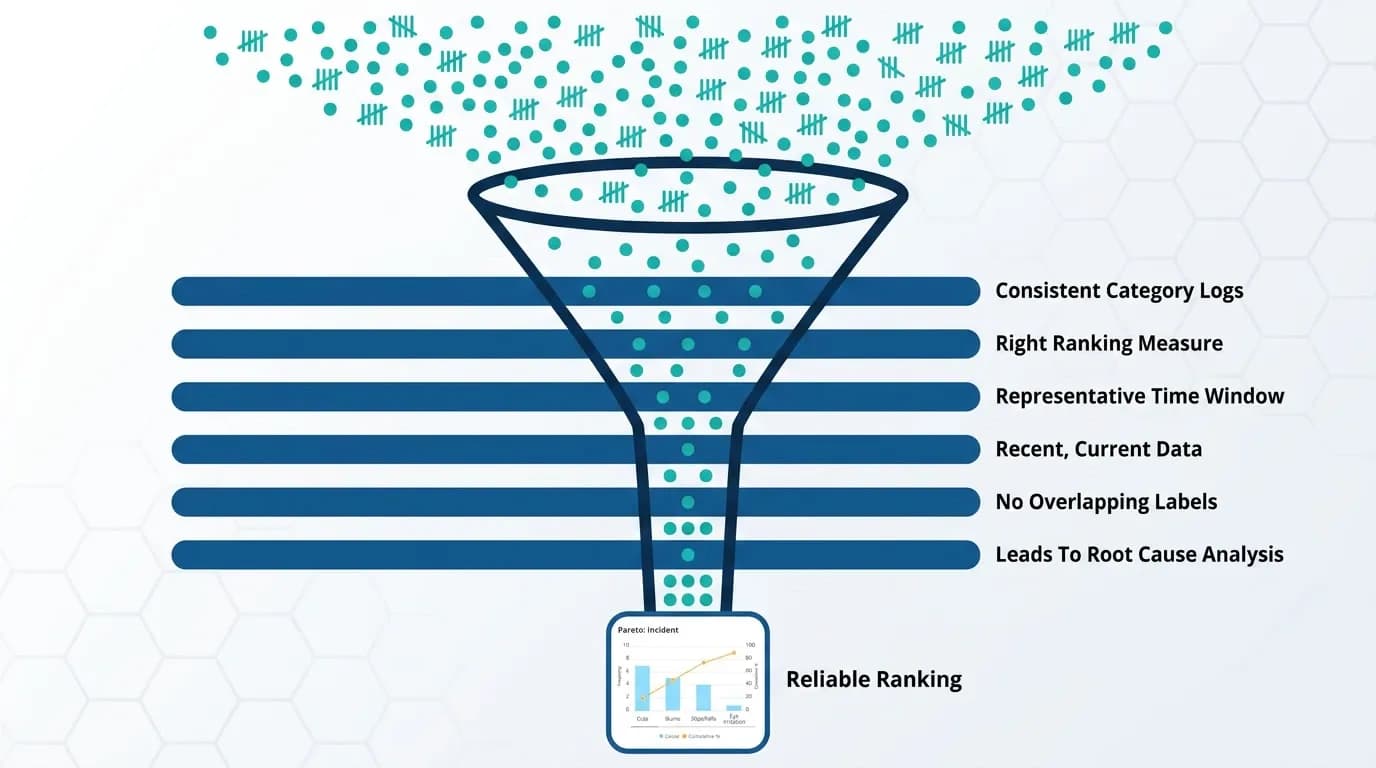
- Flat distributions: If every bar is roughly the same height, the 80/20 pattern doesn’t apply to that dataset as categorised. Re-stratifying by shift, machine, supplier, or product line often reveals a clearer concentration.
- Ranking by the wrong measure: Using count when cost or downtime is what actually matters skews the priority list toward frequent, low-impact issues.
- One-off use: A Pareto Chart built for a single review reflects that moment only. Distributions shift as processes change, and a chart from last quarter may no longer match current conditions.
- Stale data: Charts built on outdated or unrepresentative records can point a team at the wrong category entirely.
- Overlapping categories: Similar issues logged under different labels split what should be one bar into several smaller ones, understating their combined impact.
- Treating the chart as the conclusion: A Pareto Chart identifies which category to investigate. It doesn’t explain why the problem occurs or how to fix it, which is why it typically precedes a Fishbone Diagram and 5 Whys rather than standing alone.
How LTS Data Point automates Pareto Analysis
Rather than sitting as a standalone chart, Pareto Analysis in LTS Data Point is built into the tools and boards teams already use daily.
Built into the Quad Chart and root cause tools
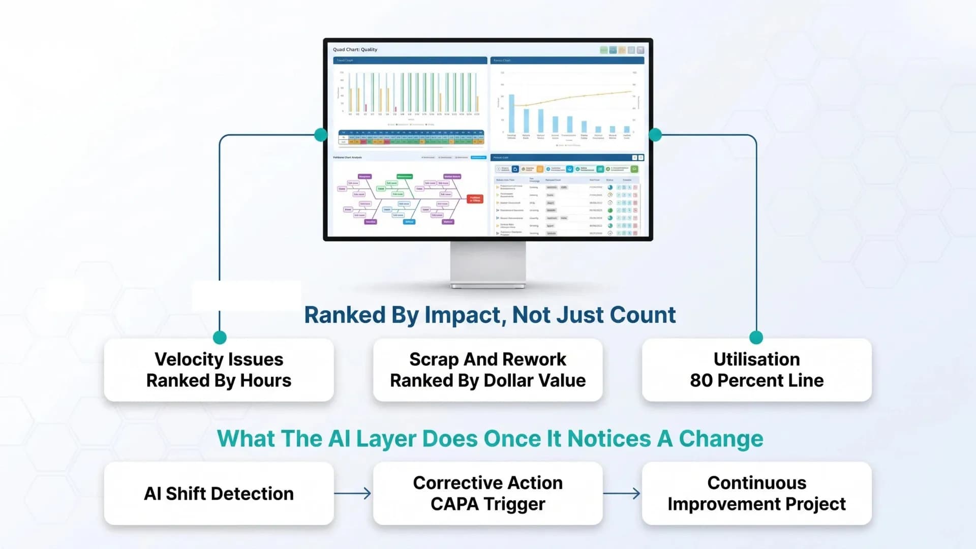
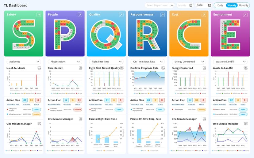
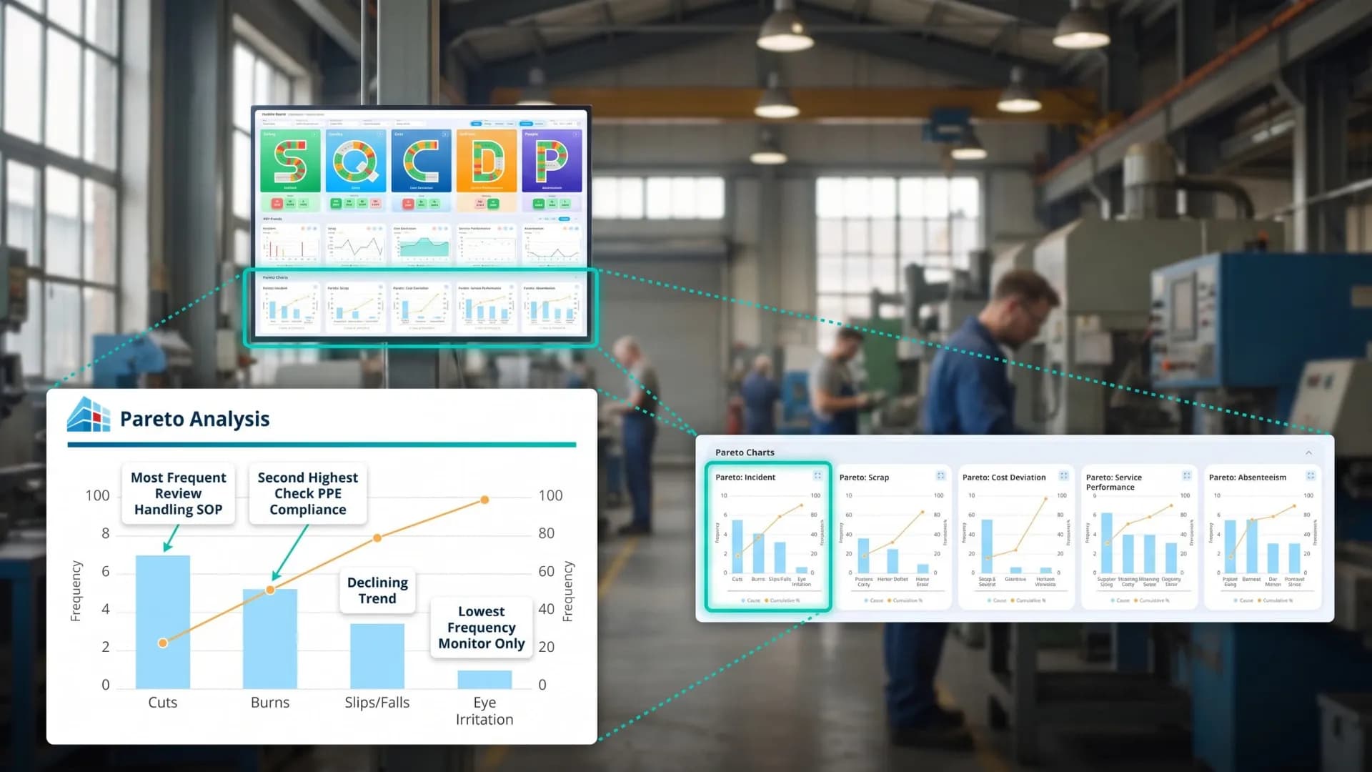
Inside LTS Data Point, Pareto Analysis is built into the Quad Chart module, alongside a trend graph, failure-reason breakdown, and Fishbone Diagram, all linked to live KPI dashboards rather than a static export. Categories update automatically as new data comes in, removing the manual rebuild step that static Pareto Charts depend on.
Ranking isn't fixed to count either. In corrective action workflows, Pareto Analysis applied to failure-reason data in the root cause stage ranks causes by frequency and impact before any corrective action is defined, used alongside the Fishbone Diagram: the Fishbone maps the full causal landscape, and the Pareto identifies which of those causes to prioritise. The same pattern runs through 8D problem-solving, where Pareto Analysis at the cause-investigation step ranks failure modes by frequency or impact, making the highest-priority target visible before resource is committed.
This extends to weighted measures in practice. One deployment shifted its Pareto and scrap/rework reporting from raw counts to hours for velocity and dollar value for scrap and rework, with drill-down into date, part, job number, and reason code, automating the same frequency-versus-cost distinction that separates a useful Pareto Chart from a misleading one.
Tracked through Daily Huddle boards like SQCDP
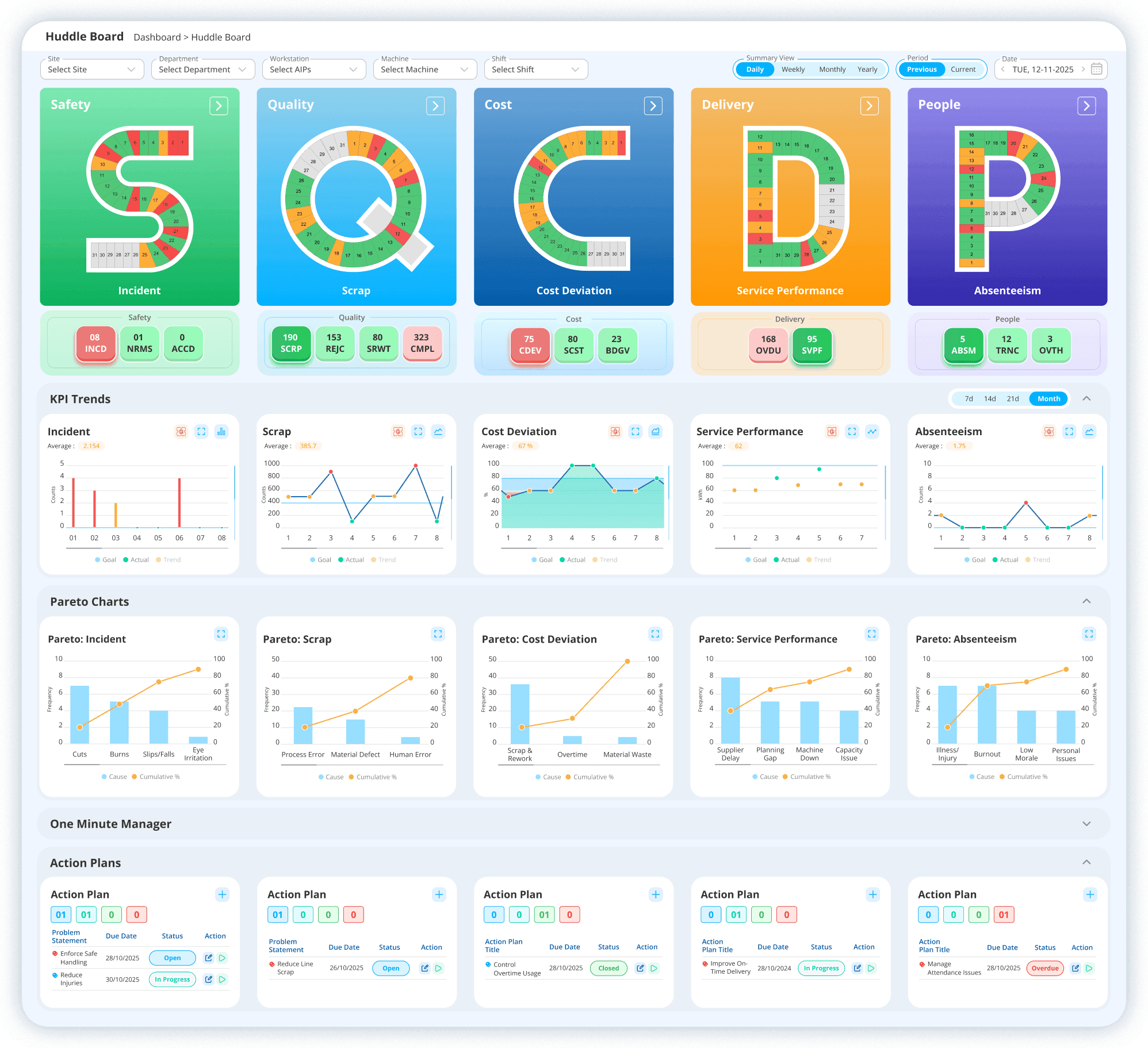
Pareto Analysis doesn't sit apart from daily performance tracking either. Data captured on SQCDP boards feeds directly into root cause and Pareto Analysis, so the categories showing up on a Pareto Chart trace back to the same Safety, Quality, Cost, Delivery, and People metrics a team already reviews each day, rather than a separate dataset pulled together only when a problem escalates.
Utilisation dashboards follow the same pattern at a more granular level, displaying Pareto Charts by both usage hours and percentage, with an 80% line used as the standard reference threshold, so a team scanning a daily huddle board can see which category is approaching that cutoff without opening a separate report.
The AI layer adds a further step on top of this: instead of waiting for someone to notice a category climbing at the next scheduled review, it flags the shift as it happens and links it to the corrective action or continuous improvement project it should trigger.
Taken together, this is what separates the chart from the analysis behind it: the ranking, the weighting, and the response to a shift is no longer dependent on someone remembering to check.
Where this leaves your next Pareto Review
A Pareto Chart is only useful if two questions have clear answers: what measure was it ranked by, and how current is the data behind it. A chart ranked by count alone, or one that hasn't been rebuilt since last quarter, can point a team at the wrong category with total confidence.
Neither problem is a flaw in the method. Both come down to whether the chart is connected to live, correctly weighted data, or whether that connection has to be rebuilt by hand every time something changes, and increasingly, whether something is watching that connection for you. An AI layer that flags a shift in ranking the moment it happens removes the third question teams don't always think to ask: who's checking, and how often.

Amer Jumah, Senior Lean Consultant
Amer is co-founder of Agile Solutions and a certified Six Sigma Black Belt, Lean Black Belt, and PMP, with over nine years of experience implementing Lean, Six Sigma, and Agile principles across diverse industries. He specialises in process optimisation, waste elimination, and delivering cost savings through organisational change.