Business Intelligence Dashboard: What It Is, How It Works, and Why It Matters
Last updated on : April 6, 2026
Running a business without clear visibility is like flying through fog with only instinct to guide you. A business intelligence dashboard – a digital platform that consolidates, analyses, and visually presents real-time business data in one unified view – acts as the cockpit panel that cuts through that fog, helping leaders see performance clearly, spot risks early, and steer decisions with confidence rather than guesswork.
What is a business intelligence dashboard and how does it work?
A business intelligence dashboard is a digital platform that consolidates, analyses, and visually presents real-time business data in a single, unified interface. It enables organisations to monitor KPIs, track performance trends, and support data-driven decision making through structured, visual reporting.
But if you’re asking, how does a business intelligence dashboard work? - it follows a structured flow:
- Data collection: Pulls information from multiple systems such as ERP, CRM, finance, HR, or operational databases.
- Data consolidation: Uses data integration tools to standardise and combine data into a centralised data layer.
- Data processing: Cleans, validates, and organises metrics to ensure consistency across departments.
- Visual presentation: Displays KPIs through charts, graphs, scorecards, and trend indicators.
- Automated updates: Functions as an automated reporting system, refreshing data at defined intervals or in real time.
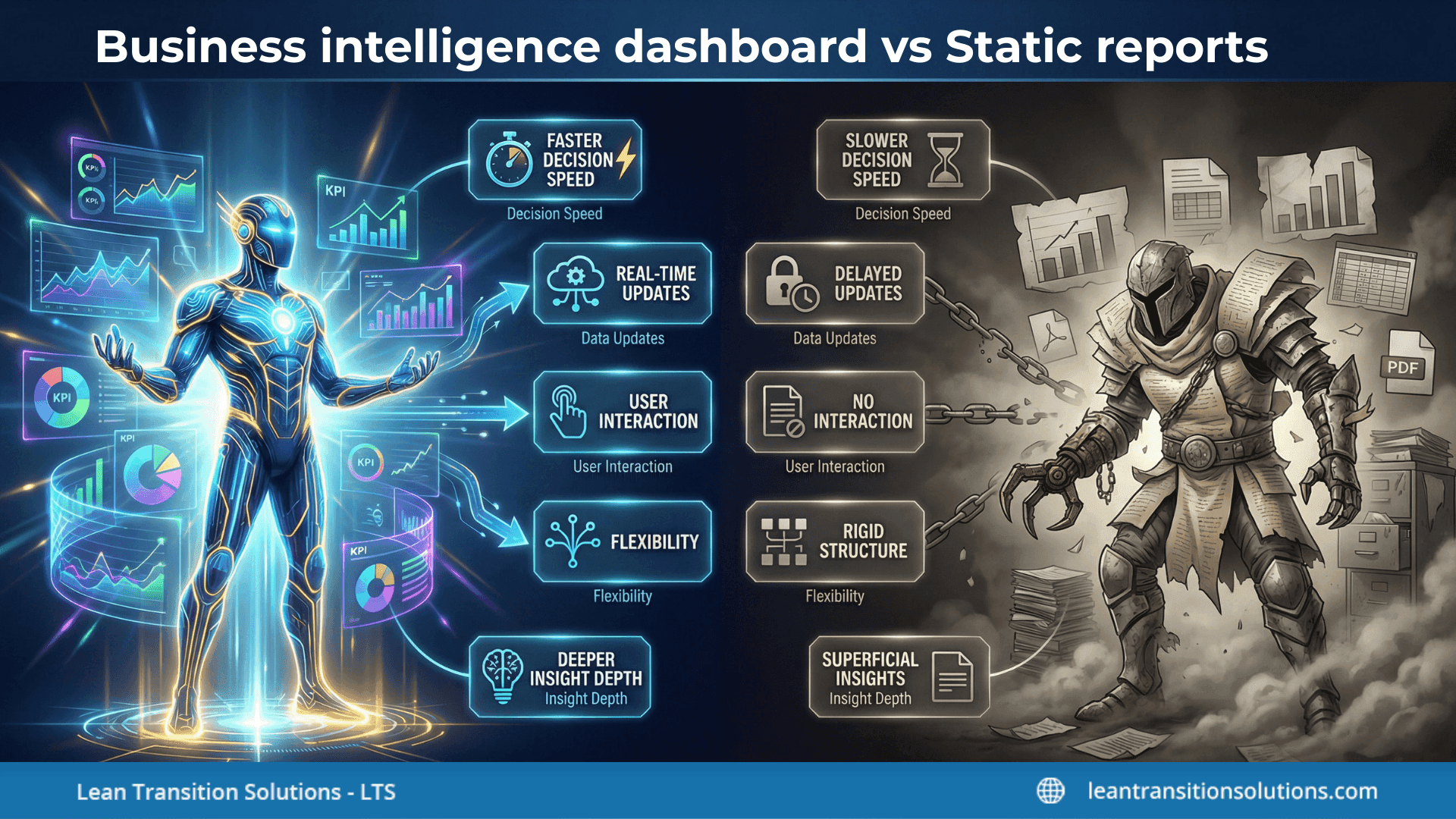
Business intelligence dashboard vs static reports
This comparison highlights why many organisations move from static reporting toward interactive dashboards for faster, more informed decision-making.
What is drill-down analytics?
One of the most valuable capabilities within a business intelligence dashboard is drill-down analytics:
- Users can click on a high-level key performance indicator (KPI) such as overall sales.
- The system breaks it down into regions, teams, products, or time periods.
- This layered visibility enables root cause analysis, helping teams identify underlying issues rather than just surface-level performance gaps.
In practice, this structured flow – from integration to automation to visualisation – explains clearly how a business intelligence dashboard works and why it is central to modern data-driven decision making.
Why a business intelligence dashboard is critical for KPI visibility
A BI dashboard is critical because it transforms disconnected metrics into structured, real-time performance visibility. Instead of reviewing outdated reports, leaders gain a live view of what is happening across the organisation – enabling faster, more confident decisions.
How it strengthens KPI visibility
- Live data visualisation: Metrics update automatically, allowing leaders to see performance trends as they evolve rather than weeks later.
- Centralised KPI tracking dashboard: Brings strategic and operational KPIs into one view, reducing reliance on multiple spreadsheets.
- Cross-functional KPI visibility: Aligns departments around metrics, minimising silos and conflicting data interpretations.
- Standardised performance views: Ensures teams are measuring outcomes consistently across sites and functions.
From reactive reporting to proactive performance monitoring
Traditional reporting often explains what already happened. A business intelligence dashboard shifts the focus to what is happening now and what may happen next:
- Identifies performance dips early through live trend tracking
- Flags exceptions or threshold breaches instantly
- Supports faster corrective actions
- Encourages structured review cycles supported by performance monitoring software
This transition reduces delays between insight and action, which is critical in fast-moving operational environments.
Enabling data-driven decision making
When KPI visibility improves, decision-making improves:
- Leaders rely on evidence rather than assumptions
- Strategic objectives can be directly linked to measurable KPIs
- Teams prioritise actions based on performance impact
- Accountability becomes clearer because data is transparent
In essence, a business intelligence dashboard supports data-driven decision making by turning raw performance metrics into shared, visible, and actionable insight across the organisation.
Types of business intelligence dashboard: Strategic, operational and analytical
Not all dashboards serve the same purpose. Understanding the different types of business intelligence dashboard helps organisations align reporting with decision-making levels – from boardroom strategy to daily operations.
1. Strategic business intelligence dashboard
Designed for senior leadership and executives, this type focuses on long-term direction and high-level performance.
- Tracks strategic KPIs linked to organisational goals
- Highlights trends over months or quarters rather than hourly updates
- Summaries performance across regions, sites, or departments
- Often functions as an executive reporting dashboard during leadership reviews
These dashboards prioritise clarity over detail. They answer questions such as: Are we on track to meet annual targets?
This is where leadership dashboard software typically plays a central role – providing a consolidated view for board-level discussions.
2. Operational business intelligence dashboard
Operational dashboards support frontline managers and department heads in managing daily activities.
- Displays real-time or near real-time performance data
- Monitors production rates, service levels, quality metrics, or response times
- Flags exceptions and threshold breaches immediately
- Supports rapid decision and corrective actions
Unlike strategic dashboards, these are highly detailed and frequently updated. They are often embedded into daily review routines and function as active management reporting tools.
3. Analytical business intelligence dashboard
Analytical dashboards are designed for deeper exploration and trend investigation.
- Enables drill-down into historical data
- Supports comparison across time periods, products, or teams
- Helps identify root causes behind performance shifts
- Often used by analysts and performance teams
These dashboards are less about real-time monitoring and more about insight generation.
Don’t just track performance, take action with it. Get LTS Data Point, the all-in-one business intelligence dashboard with action plan framework.
Operational vs strategic business intelligence dashboards explained
Together, these types of business intelligence dashboards create a layered performance structure, ensuring visibility from frontline operations to executive decision-making.
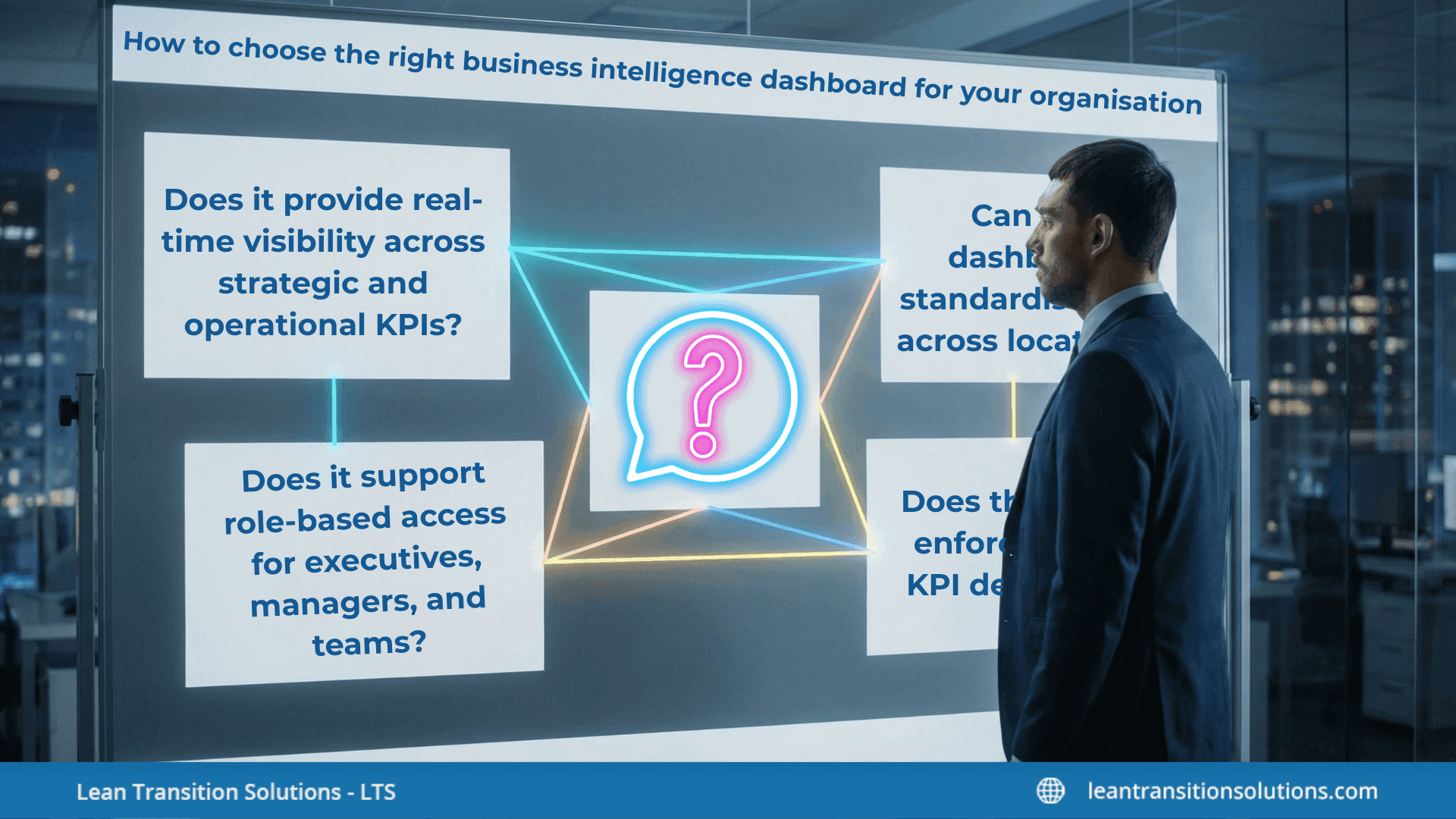
Choosing the right business intelligence dashboard requires more than comparing features. It involves evaluating how well the solution supports performance visibility, scalability, and long-term organisational alignment. If you’re exploring how to choose a business intelligence dashboard, start with clarity on business outcomes – not just visual appeal.
Key questions to ask before selecting a solution:
- Does it provide real-time visibility across strategic and operational KPIs?
- Can it integrate with existing systems without complex manual processes?
- Does it support role-based access for executives, managers, and teams?
- Can it function as a structured enterprise reporting solution rather than just a visual tool?
- Does it enable interactive exploration or only static output?
These questions help distinguish between a surface-level reporting interface and a performance-driven system.
Scalability for multi-site performance tracking:
- Can the dashboard standardise KPIs across locations?
- Does it support multi-site performance tracking without duplicating systems?
- Can leadership compare sites, regions, or business units in one consolidated view?
- Will the system handle increasing data volume as operations expand?
A scalable dashboard ensures consistency as complexity grows.
Standardisation of metrics across teams
- Does the system enforce shared KPI definitions?
- Can metrics be centrally configured and rolled out across departments?
- Does it reduce discrepancies caused by independent spreadsheets?
Standardisation strengthens accountability and improves cross-functional alignment.
Dashboard implementation challenges and change management
Many dashboard implementation challenges arise not from technology, but from adoption:
- Resistance to new reporting structures
- Poor data quality during integration
- Overloading dashboards with too many metrics
- Lack of training on interpreting insights
Successful implementation requires governance, clear ownership, and structured review routines.
Business intelligence dashboard vs reporting tool: What’s the difference?
The right choice depends on whether your priority is retrospective reporting, deep analytics experimentation, or continuous performance management aligned to leadership and operational oversight.
Common challenges when implementing a business intelligence dashboard
Implementing a BI dashboard can significantly improve business performance visibility – but only if common pitfalls are addressed early. Many organisations invest in dashboards expecting instant clarity, yet struggle with data consistency, alignment, and adoption.
1. Data quality and integration gaps
A dashboard is only as reliable as the data feeding it.
- Disconnected systems create inconsistent metrics
- Manual data uploads increase the risk of errors
- Poorly defined KPIs lead to conflicting interpretations
- Weak integration processes limit real-time accuracy
Without strong data governance and integration discipline, the benefits of BI dashboards diminish quickly.
2. Overloaded dashboards with vanity metrics
More data does not mean better insight.
- Too many KPIs overwhelm decision-makers
- Vanity metrics distract from performance-critical indicators
- Lack of prioritisation reduces clarity
- Visual clutter weakens strategic focus
Effective dashboards emphasise meaningful indicators that directly link to outcomes, not just activity.
3. Lack of strategic KPI alignment
Dashboards often fail when KPIs are not tied to strategy.
- Metrics are selected based on availability rather than relevance
- Departments track independent goals without coordination
- Leadership reviews lack structured performance context
Strong strategic KPI alignment assures that every metric supports broader operational objectives.
4. Poor adoption at leadership level
Even well-designed dashboards can fail if they are not embedded into review routines.
- Leaders revert to familiar spreadsheets
- Dashboards are viewed passively rather than used for decision-making
- No structured cadence for performance discussions
Adoption improves when dashboards are integrated into formal performance reviews and management meetings.
5. How structured performance management systems improve outcomes
A dashboard works best when supported by a broader performance management system.
- Clear ownership of KPIs
- Standardised reporting structures
- Defined review cycles and escalation processes
- Accountability mechanisms linked to measurable targets
When dashboards operate within a structured system, they move beyond visual reporting and become tools for sustained improvement.
In essence, the real value – and long-term benefits of BI dashboards – emerge when technology, governance, and leadership behaviour align around transparent, measurable performance.
Business intelligence dashboard in practice: How LTS Data Point supports structured performance management
A BI dashboard becomes most effective when it is embedded within a structured performance framework. LTS Data Point is designed as a performance management system and KPI tracking dashboard that connects operational execution with strategic oversight – turning visibility into measurable accountability.
1. Centralised data visibility across sites
LTS Data Point supports multi-site performance tracking by consolidating KPIs from different locations into one unified environment.
- Standardised KPI definitions across departments and sites
- Consolidated executive view with the ability to drill into individual units
- Real-time performance visibility without manual spreadsheet consolidation
- Custom KPI dashboards tailored to leadership and operational teams
This structured ensures consistent reporting across complex organisational landscapes.
2. Structured accountability tracking
Visibility alone does not drive improvement – accountability does.
- Clear KPI ownership assigned at team and site level
- Action tracking linked directly to performance gaps
- Escalation pathways embedded into review routines
- Transparent performance discussions supported by shared data
By linking metrics to ownership, LTS Data Point strengthens execution discipline across the organisation.
3. Designed for operational and strategic alignment
As leadership dashboard software, LTS Data Point supports both operational and strategic layers of performance:
- Operational dashboards for daily monitoring
- Strategic dashboards for executive oversight
- Standardised reporting frameworks across business units
- Integrated performance review cadence aligned to KPIs
This dual structure ensures that frontline activity remains aligned with long-term objectives.
4. Typically used when structured performance reviews are required
LTS Data Point is typically used when organisations need:
- Standardised reporting across multiple sites
- Cross-functional KPI alignment
- Formalised management review processes
- A scalable system to replace fragmented spreadsheets
Rather than functioning as a standalone visual tool, it operates as a connected performance management system – ensuring that a BI dashboard is not just a reporting interface, but a structured mechanism for sustained performance improvement.
A business intelligence dashboard is more than a visual reporting tool – it is a structured mechanism for turning data into direction. When designed with clear KPIs, standardised metrics, and defined review routines, it strengthens business performance visibility across every level of the organisation. From real-time operational monitoring to strategic executive oversight, the true value lies not just in seeing the numbers, but in aligning teams, decisions, and accountability around them.
Connect with a specialist to learn how LTS Data Point helps organisations align dashboards with structured performance management.
FAQs
1. What is the difference between a business intelligence dashboard and a data visualisation tool?
A data visualisation tool focuses primarily on creating charts and graphs. A BI dashboard goes further by integrating multiple data sources, structuring KPIs, and supporting ongoing performance monitoring and decision-making.
2. Who typically uses a business intelligence dashboard?
Business intelligence dashboards are used by executives, department heads, operations managers, and performance teams. Access levels usually vary based on role, ensuring relevant KPI visibility for each user group.
3. Can small businesses benefit from a business intelligence dashboard?
Yes. While often associated with enterprises, smaller organisations can benefit from improved KPI tracking, reduced manual reporting, and clearer decision-making through a well-structured dashboard.
4. How often should a business intelligence dashboard be updated?
This depends on operational needs. Some dashboards update in real time, while others refresh daily or weekly. The update frequency should align with how quickly decisions need to be made.
5. Does a business intelligence dashboard require technical expertise to manage?
Modern dashboards are designed for usability, but initial setup, data integration, and KPI configuration may require technical support. Ongoing use is typically designed to be business-user friendly.
6. How long does it take to implement a business intelligence dashboard?
Implementation timelines vary based on data complexity, integration requirements, and organisational readiness. It can range from a few weeks for simple setups to several months for enterprise-wide systems.
7. What industries benefit most from business intelligence dashboards?
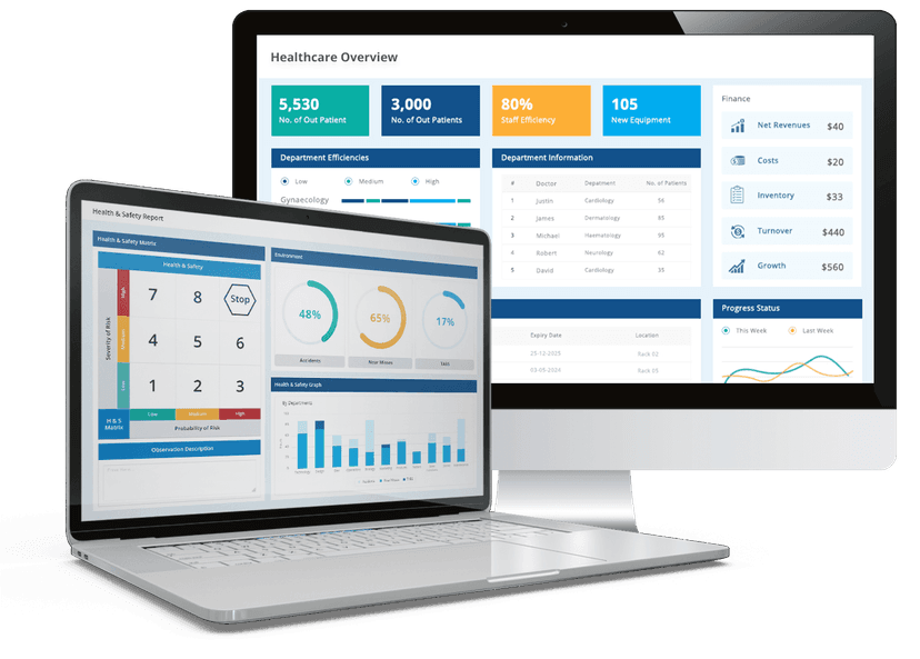
Industries with complex operations and multiple KPIs – such as manufacturing, healthcare, retail, logistics, and financial services – often gain significant value from structured dashboard visibility.
8. How do business intelligence dashboards improve accountability?
By making KPIs transparent and accessible, dashboards clarify ownership and performance expectations. When integrated into structured review routines, they help link performance data directly to responsible teams or individuals.